
# Flex、Grid 布局面试题答案解析
关于答案解析
- Flex、Grid 布局相关面试题答案解析过程是根据自身项目实践以及查阅官方文档等最终的得出结论。
- 仅供学习参考,评论区感谢补充和纠错 !
# 1、说一下你对 Flex 布局的理解,以及其中属性的默认值 ?(百度、58、快手、字节)
答案解析
flex 布局又称为弹性布局。
- 当我们给一个容器元素设置
display:flex;时,这个容器就变成了 flex 容器,容器中所有直接子元素就成了容器成员(flex 项目)。 - flex 容器默认存在两根轴:水平的主轴和垂直的交叉轴,flex 布局主要是围绕这两根轴来进行布局的。
- 所以 flex 布局相对于 grid 网格布局来说,他更适合一维布局(单行或单列布局)
要详细弄懂 flex 布局,我们就要了解 Flex 容器的属性和 Flex 项目的属性。
具体如下:
① Flex 容器的属性
| 属性 | 属性值 |
|---|---|
| flex-direction | row:(默认值)主轴为水平方向,起点在左端。 row-reverse:主轴为水平方向,起点在右端。 column:主轴为垂直方向,起点在上沿。 column-reverse:主轴为垂直方向,起点在下沿。 |
| flex-wrap | nowrap:(默认)不换行。 wrap:换行,第一行在上方。 wrap-reverse:换行,第一行在下方。 |
| flex-flow | flex-flow属性是flex-direction属性和flex-wrap属性的简写形式`默认值为 row nowrap。 |
| justify-content | flex-start:(默认值)左对齐 flex-end:右对齐 center: 居中 space-between:两端对齐,项目之间的间隔都相等。 space-around:每个项目两侧的间隔相等。所以,项目之间的间隔比项目与边框的间隔大一倍。 |
| align-items | stretch:(默认值)如果项目未设置高度或设为 auto,将占满整个容器的高度。 flex-start:交叉轴的起点对齐。 flex-end:交叉轴的终点对齐。 center:交叉轴的中点对齐。 baseline:项目的第一行文字的基线对齐。 |
| align-content | align-content 属性定义了多根轴线的对齐方式。如果项目只有一根轴线,该属性不起作用。 stretch:(默认值)轴线占满整个交叉轴。 flex-start:与交叉轴的起点对齐。 flex-end:与交叉轴的终点对齐。 center:与交叉轴的中点对齐。 space-between:与交叉轴两端对齐,轴线之间的间隔平均分布。 space-around:每根轴线两侧的间隔都相等。所以,轴线之间的间隔比轴线与边框的间隔大一倍。 |
② Flex 项目的属性
| 属性 | 属性值 |
|---|---|
| order | order 属性定义项目的排列顺序。数值越小,排列越靠前,默认为 0 |
| flex-grow | 灵活分配父元素的剩余空间。默认值为 0,不分配(占有)剩余空间 |
| flex-shrink | flex 容器空间不足时,单个子项的收缩比例。默认值为 1,全部收缩 |
| flex-basis | flex-basis 属性定义了在分配多余空间之前,项目占据的主轴空间(main size)。 浏览器根据这个属性,计算主轴是否有多余空间。它的默认值为 auto,即项目的本来大小。 |
| flex | flex 属性是 flex-grow, flex-shrink 和 flex-basis 的简写,默认值为 0 1 auto。后两个属性可选。 |
| align-self | 单个项目在交轴轴上的对齐方式 auto (默认值)表示继承父元素的 align-items 属性,如果父元素没有,则等同于 stretch flex-start:弹性盒子元素的侧轴(纵轴)起始位置的边界紧靠住该行的侧轴起始边界。 flext-end:弹性盒子元素的侧轴(纵轴)起始位置的边界紧靠住该行的侧轴结束边界。 center:弹性盒子元素在该行的侧轴(纵轴)上居中放置 baseline:如弹性盒子元素的行内轴与侧轴为同一条,则该值与'flex-start'等效。其它情况下,该值将参与基线对齐。 stretch:元素被拉伸以适应容器 |
# 2、flex 布局设置水平垂直居中(字节)
答案解析
给 flex 容器添加以下三个属性,就可以实现子项水平垂直居中
display: flex;// 容器为 flex 布局justify-content: center;// 子项在主轴(水平居中)align-items: center;// 子项在交叉轴(垂直居中)
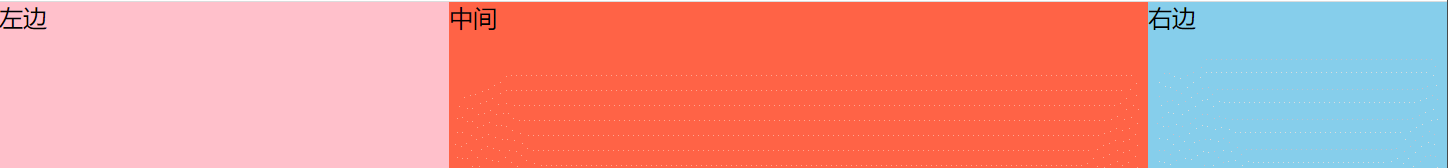
# 3、flex 实现两栏、三栏布局(百度、小米)
① flex 实现两栏布局(左固定,右自适应)
点击查看源代码
<style>
        html,body{
            margin:0;
            height: 100%;
        }
        .container{
            width:100%;
            height: 100%;
            display: flex;/*弹性布局*/
        }
        .container .left{
            width:300px;
            height: 100%;
            background-color: pink;
        }
        .container .right{
            flex-grow: 1;/*占满所有剩余空间*/
            height: 100%;
            background-color: skyblue;
        }
    </style>
</head>
<body>
    <div class="container">
        <div class="left"></div>
        <div class="right"></div>
    </div>
</body>

② flex 实现三栏布局(左右固定,中间自适应)
点击查看源代码
<style>
  html,
  body {
    margin: 0;
    height: 100%;
  }
  .container {
    width: 100%;
    height: 100%;
    display: flex; /*弹性布局*/
  }
  .container .left {
    width: 250px;
    height: 100%;
    background-color: pink;
  }
  .container .middle {
    height: 100%;
    background-color: thistle;
    flex-grow: 1; /*占满剩余空间*/
  }
  .container .right {
    width: 200px;
    height: 100%;
    background-color: skyblue;
  }
</style>
<body>
  <div class="container">
    <div class="left"></div>
    <div class="middle"></div>
    <div class="right"></div>
  </div>
</body>
# 4、CSS 实现两栏布局有多少种方法 ?(百度、小米)
答案解析
CSS 实现两栏布局(左固定,右自适应)有 8 个方法

- 方法一: 利用
float + calc计算宽度的方法
点击查看源代码
<style>
  html,
  body {
    margin: 0;
    padding: 0;
    height: 100%;
  }
  .box {
    height: 100%;
  }
  .left {
    height: 100%;
    width: 300px;
    background-color: pink;
    float: left;
  }
  .right {
    width: calc(100% - 300px);
    height: 100%;
    float: left;
  }
</style>
<body>
  <div class="box">
    <div class="left"></div>
    <div class="right"></div>
  </div>
</body>
- 方法二:利用
float + margin实现
点击查看源代码
<style>
  html,
  body {
    margin: 0;
    padding: 0;
    height: 100%;
  }
  .box {
    height: 100%;
  }
  .left {
    float: left;
    height: 100%;
    width: 300px;
    background-color: pink;
  }
  .right {
    margin-left: 300px;
    height: 100%;
    background-color: skyblue;
  }
</style>
<body>
  <div class="box">
    <div class="left"></div>
    <div class="right"></div>
  </div>
</body>
- 方法三: 利用 float 配合 overflow 实现
点击查看源代码
<style>
  html,
  body {
    margin: 0;
    padding: 0;
    height: 100%;
  }
  .box {
    height: 100%;
  }
  .left {
    height: 100%;
    width: 300px;
    background-color: pink;
    float: left;
  }
  .right {
    height: 100%;
    overflow: hidden;
    background-color: skyblue;
  }
</style>
<body>
  <div class="box">
    <div class="left"></div>
    <div class="right"></div>
  </div>
</body>
- 方法四:利用
position: absolute;配合 margin 实现
点击查看源代码
<style>
  html,
  body {
    margin: 0;
    padding: 0;
    height: 100%;
  }
  .box {
    height: 100%;
  }
  .left {
    width: 300px;
    background-color: pink;
    position: absolute;
    top: 0;
    bottom: 0;
  }
  .right {
    height: 100%;
    margin-left: 300px;
    background-color: skyblue;
  }
</style>
<body>
  <div class="box">
    <div class="left"></div>
    <div class="right"></div>
  </div>
</body>
- 方法五:利用
position: absolute;实现
点击查看源代码
<style>
  html,
  body {
    margin: 0;
    padding: 0;
    height: 100%;
  }
  .box {
    height: 100%;
  }
  .left {
    width: 300px;
    background-color: pink;
    position: absolute;
    top: 0;
    bottom: 0;
  }
  .right {
    background-color: skyblue;
    position: absolute;
    top: 0;
    bottom: 0;
    left: 300px;
    right: 0;
  }
</style>
<body>
  <div class="box">
    <div class="left"></div>
    <div class="right"></div>
  </div>
</body>
- 方法六:利用
display: table;实现
点击查看源代码
<style>
  html,
  body {
    margin: 0;
    padding: 0;
    height: 100%;
  }
  .box {
    display: table; /*表格布局*/
    height: 100%;
    width: 100%;
  }
  .left {
    width: 300px;
    background-color: pink;
    display: table-cell; /*相当于表格中的td单元格*/
  }
  .right {
    display: table-cell;
    background-color: skyblue;
  }
</style>
<body>
  <div class="box">
    <div class="left"></div>
    <div class="right"></div>
  </div>
</body>
- 方法七:利用 flex 布局实现
点击查看源代码
<style>
  html,
  body {
    margin: 0;
    padding: 0;
    height: 100%;
  }
  .box {
    height: 100%;
    display: flex;
  }
  .left {
    height: 100%;
    width: 300px;
    background-color: pink;
  }
  .right {
    flex-grow: 1;
    background-color: skyblue;
  }
</style>
<body>
  <div class="box">
    <div class="left"></div>
    <div class="right"></div>
  </div>
</body>
- 方法八:grid 网格布局
点击查看源代码
<style>
  html,
  body {
    margin: 0;
    padding: 0;
    height: 100%;
  }
  .box {
    height: 100%;
    display: grid;
    grid-template-columns: 300px auto;
  }
  .left {
    height: 100%;
    background-color: pink;
  }
  .right {
    background-color: skyblue;
  }
</style>
<body>
  <div class="box">
    <div class="left"></div>
    <div class="right"></div>
  </div>
</body>
# 5、CSS 实现三栏布局有多少种方法?(百度、小米)
答案解析
这里给大家介绍 CSS 实现三栏布局(左右固定,中间自适应)的 8 种方法
- 方法一:float+margin 正值实现
点击查看源代码
<style>
  html,
  body {
    margin: 0;
    padding: 0;
    height: 100%;
  }
  .left {
    height: 100%;
    width: 300px;
    background-color: pink;
    float: left;
  }
  .right {
    height: 100%;
    width: 200px;
    background-color: skyblue;
    float: right;
  }
  .middle {
    height: 100%;
    margin: 0px 200px 0px 300px;
    background-color: tomato;
  }
</style>
<body>
  <div class="left">左边</div>
  <div class="right">右边</div>
  <div class="middle">中间</div>
</body>
- 方法二:position 定位 + margin
点击查看源代码
<style>
  html,
  body {
    margin: 0;
    padding: 0;
    height: 100%;
  }
  .left {
    width: 300px;
    background-color: pink;
    position: absolute;
    top: 0;
    bottom: 0;
    left: 0;
  }
  .right {
    width: 200px;
    background-color: skyblue;
    position: absolute;
    top: 0;
    bottom: 0;
    right: 0;
  }
  .middle {
    margin: 0px 200px 0px 300px;
    height: 100%;
    background-color: tomato;
  }
</style>
<body>
  <div class="middle">中间</div>
  <div class="left">左边</div>
  <div class="right">右边</div>
</body>
- 方法三:calc 实现
点击查看源代码
<style>
  html,
  body {
    margin: 0;
    padding: 0;
    height: 100%;
  }
  .left {
    width: 300px;
    height: 100%;
    background-color: pink;
    float: left;
  }
  .right {
    width: 200px;
    height: 100%;
    float: left;
    background-color: skyblue;
  }
  .middle {
    width: calc(100% - 300px - 200px);
    height: 100%;
    float: left;
    background-color: tomato;
  }
</style>
<body>
  <div class="middle">中间</div>
  <div class="left">左边</div>
  <div class="right">右边</div>
</body>
- 方法四:flex 布局
点击查看源代码
<style>
  html,
  body {
    margin: 0;
    padding: 0;
    height: 100%;
  }
  body {
    display: flex;
  }
  .left {
    width: 300px;
    background-color: pink;
  }
  .right {
    width: 200px;
    background-color: skyblue;
  }
  .middle {
    height: 100%;
    background-color: tomato;
    flex-grow: 1;
  }
</style>
<body>
  <div class="left">左边</div>
  <div class="middle">中间</div>
  <div class="right">右边</div>
</body>
- 方法五:table 实现
点击查看源代码
<style>
  html,
  body {
    margin: 0;
    padding: 0;
    height: 100%;
  }
  body {
    display: table;
    width: 100%;
  }
  .left,
  .middle,
  .right {
    display: table-cell;
  }
  .left {
    width: 300px;
    background-color: pink;
  }
  .right {
    width: 200px;
    background-color: skyblue;
  }
  .middle {
    background-color: tomato;
  }
</style>
<body>
  <div class="left">左边</div>
  <div class="middle">中间</div>
  <div class="right">右边</div>
</body>
- 方法六:grid 网格布局
点击查看源代码
<style>
  html,
  body {
    margin: 0;
    padding: 0;
    height: 100%;
  }
  body {
    display: grid;
    grid-template-columns: 300px auto 200px;
  }
  .left {
    background-color: pink;
  }
  .right {
    background-color: skyblue;
  }
  .middle {
    background-color: tomato;
  }
</style>
<body>
  <div class="left">左边</div>
  <div class="middle">中间</div>
  <div class="right">右边</div>
</body>
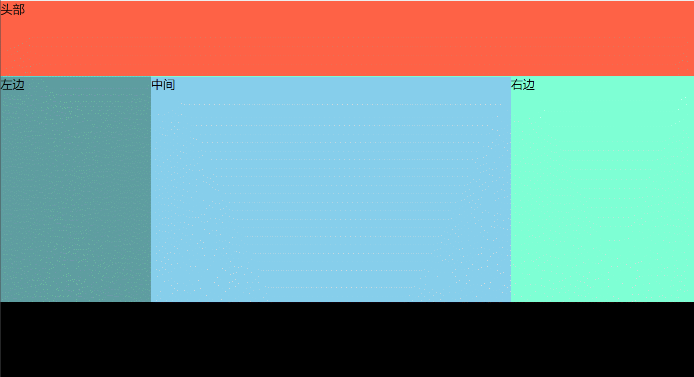
- 方法七:经典的圣杯布局(float+margin 负值)
优点
圣杯布局和双飞翼布局的优点
- 中间一栏内容最重要,最先加载和渲染,同时对搜索引擎优化最利。
- 两边内容固定,中间内容自适应
点击查看源代码
<style>
  body {
    margin: 0;
    /*核心代码*/
    min-width: 650px; /*当页面宽度不够时,出现滚动条而不会造成布局错乱*/
  }
  .clearfix::after {
    display: block;
    content: "";
    clear: both;
  }
  .fl {
    float: left; /*三个盒子一定要添加浮动*/
  }
  .header {
    height: 100px;
    background-color: tomato;
  }

  .container {
    padding-left: 200px; /*左边预留200px位置  用来放left*/
    padding-right: 250px; /*右边预留200px位置  用来放right*/
  }
  .container .center {
    width: 100%; /*自适应container的宽度,实现自适应缩放*/
    height: 500px;
    background-color: skyblue;
  }
  .container .left {
    width: 200px;
    height: 500px;
    background-color: cadetblue;
    /*核心代码*/
    margin-left: -100%; /*盒子向左移,因为加了浮动,所以会移动到上一行的最左边*/
    position: relative; /*利用相对定位,再把盒子往左移200px就占据了最左边预留的200px空间*/
    left: -200px;
  }
  .container .right {
    width: 250px;
    height: 500px;
    background-color: aquamarine;
    /*核心代码*/
    margin-right: -250px; /*加上这个代码,相当于right没有一点宽度,就会移动到上的最右边位置*/
  }
  .footer {
    height: 100px;
    background-color: #000;
  }
</style>
<body>
  <div class="header">头部</div>
  <div class="container clearfix">
    <div class="center fl">中间</div>
    <div class="left fl">左边</div>
    <div class="right fl">右边</div>
  </div>
  <div class="footer">底部</div>
</body>
- 方法八:经典的双飞翼布局 (float + margin 负值)
点击查看源代码
<style>
  body {
    margin: 0;
  }
  .fl {
    float: left; /*一定要添加浮动*/
  }
  .main {
    background-color: #ddd;
    width: 100%;
  }
  .main .main-content {
    background-color: skyblue;
    height: 300px;
    /*核心代码*/
    margin: 0 200px 0 200px; /*盒子左右两边余留200px,分别给left和right来占用*/
  }
  .left {
    width: 200px;
    height: 300px;
    background-color: coral;
    /*核心代码*/
    margin-left: -100%; /*往左移动浏览器的宽度,最后移动到上一行的最左边*/
  }
  .right {
    width: 200px;
    height: 300px;
    background-color: tomato;
    /*核心代码*/
    margin-left: -200px; /*相当于自身宽度为0了,因为加了浮动,然后就显示在了上一行的最右边*/
  }
</style>
<body>
  <div class="main fl">
    <div class="main-content">中间</div>
  </div>
  <div class="left fl">左边</div>
  <div class="right fl">右边</div>
</body>

# 6、flex 怎么实现盒子 1 在最左边,2 、3 在最右边(创业公司)
点击查看源代码
<style>
  html,
  body {
    margin: 0;
    padding: 0;
  }
  .container {
    height: 200px;
    border: 2px solid #000;
    display: flex; /*弹性布局*/
    justify-content: space-between; /*两端对齐*/
  }
  .container .left {
    width: 300px;
    background-color: tomato;
  }
  .container .right {
    display: flex; /*弹性布局,这样子元素没有添加高度时,会和父元素一样高*/
  }
  .container .right .item1 {
    width: 200px;
    background-color: pink;
  }
  .container .right .item2 {
    width: 100px;
    background-color: skyblue;
  }
</style>
<body>
  <div class="container">
    <div class="left"></div>
    <div class="right">
      <div class="item1"></div>
      <div class="item2"></div>
    </div>
  </div>
</body>

# 7、如何解决 flex 布局 7 个元素使用 space-between 最后一行两边分布的问题?(广联达)
答案解析
如果我们每一行显示的个数为 n,那我们可以最后一行子项的后面加上 n-2 个 span 元素,span 元素的宽度和其它子项元素宽度一样,但不用设置高度。
为什么是添加 n-2 个 span 元素呢 ?
- 当最后一行只有 1 个子元素时,他会默认靠左,不用处理
- 当最后一行子元素正好时,我们就不用关心这个问题。
所以要去掉这两种情况,只需要加 n-2 个 span 元素就好
案例演示:在没有加 n-2 个 span 元素前的效果
点击查看源代码
<style>
  .container {
    width: 500px;
    display: flex; /*弹性布局*/
    justify-content: space-between; /*两端对齐*/
    flex-wrap: wrap; /*超出部分换行*/
  }
  .item {
    width: 120px;
    height: 100px;
    background-color: pink;
    margin-top: 10px;
  }
</style>
<body>
  <div class="container">
    <div class="item">1</div>
    <div class="item">2</div>
    <div class="item">3</div>
    <div class="item">4</div>
    <div class="item">5</div>
    <div class="item">6</div>
    <div class="item">7</div>
  </div>
</body>

添加了 n-2个 span 元素后效果(这里每行 4 个,4-2=2,所以只需要加 2 个 span 就可以了)如下所示:
点击查看源代码
<style>
  .container span {
    width: 120px;
  } /*span宽和子项宽一样*/
</style>
<div class="container">
  <div class="item">1</div>
  <div class="item">2</div>
  <div class="item">3</div>
  <div class="item">4</div>
  <div class="item">5</div>
  <div class="item">6</div>
  <div class="item">7</div>
  <span></span>
  <span></span>
</div>

# 8、flex 实现 8 个元素分两行排列 每行 4 个平均分布-自适应(知乎)
答案解析
给父容器添加如下属性:
display: flex;// flex 布局flex-wrap: wrap;// 换行
给子项添加如下样式:
flex-basis: 25%;// 项目占据主轴(父容器宽)的空间。flex-grow: 0;// 不放大flex-shrink: 0;// 缩小
以上三个属性,也可以简写在 flex: 0 0 25%;
案例演示代码:
点击查看源代码
<style>
  .container {
    display: flex;
    flex-wrap: wrap;
  }
  .item {
    flex: 0 0 25%; /*0 不放大  0 不收缩  子项大小为父容器25%*/
    box-sizing: border-box; /*怪异盒子*/
    border: 1px solid red;
    height: 100px;
    padding: 10px; /*内容与文字有点间距*/
  }
</style>
<body>
  <div class="container">
    <div class="item">1</div>
    <div class="item">2</div>
    <div class="item">3</div>
    <div class="item">4</div>
    <div class="item">5</div>
    <div class="item">6</div>
    <div class="item">7</div>
    <div class="item">8</div>
  </div>
</body>

# 9、第二个子元素的高度是多少(字节)
点击查看源代码
<div class="container">
  <div style="height: 100px"></div>
  <div style="min-height: 10px"></div>
</div>
<style>
  .container {
    display: flex;
  }
  .container > div {
    width: 100px;
  }
</style>
答案解析
高度是:100px 当容器为 flex 时,其子元素没有指定高度时,其高度默认为父元素高度。
# 10、flex 画色子
① 1 点色子

点击查看源代码
<style>
  .dice {
    width: 100px;
    height: 100px;
    border: 1px solid #666;
    border-radius: 5px;
    display: flex; /*弹性布局*/
    justify-content: center; /*水平居中*/
    align-items: center; /*垂直居中*/
  }
  .dice span {
    width: 20px;
    height: 20px;
    background-color: #000;
    border-radius: 50%;
  }
</style>
<body>
  <div class="dice">
    <span></span>
  </div>
</body>
② 2 点色子

- 先让两色子水平两端对齐
- 让第二个色子在垂直底部对齐
点击查看源代码
<style>
  .dice {
    width: 95px;
    height: 95px;
    border: 1px solid #666;
    border-radius: 5px;
    display: flex;
    justify-content: space-between; /*先两端分布*/
    padding: 5px;
  }
  .dice span {
    width: 20px;
    height: 20px;
    background-color: #000;
    border-radius: 50%;
  }
  .dice span:last-child {
    align-self: flex-end; /*第二个色子,在垂直(交叉轴)方向的最底部*/
  }
</style>
<body>
  <div class="dice">
    <span></span>
    <span></span>
  </div>
</body>
③ 3 点色子

- 三个色子,两端对齐
- 2 色子单独控制垂直居中对齐
- 3 色子单独控制垂直底部对齐
点击查看源代码
<style>
  .dice {
    width: 95px;
    height: 95px;
    border: 1px solid #666;
    border-radius: 5px;
    display: flex;
    justify-content: space-between; /*两端对齐*/
    padding: 5px;
  }
  .dice span {
    width: 20px;
    height: 20px;
    background-color: #000;
    border-radius: 50%;
  }
  /*色子2*/
  .dice span:nth-child(2) {
    align-self: center;
  }
  /*色子3*/
  .dice span:last-child {
    align-self: flex-end;
  }
</style>
<body>
  <div class="dice">
    <span></span>
    <span></span>
    <span></span>
  </div>
</body>
④ 4 点色子

- 先让 dice 容器中的子项(项目)row 垂直两端对齐
- 再让 row 容器中的子项(项目)span 水平两端对齐
点击查看源代码
<style>
  .dice {
    width: 95px;
    height: 95px;
    border: 1px solid #666;
    border-radius: 5px;
    display: flex; /*弹性布局*/
    flex-direction: column; /*垂直方向为主轴*/
    justify-content: space-between; /*两端对齐*/
    padding: 5px;
  }
  .dice span {
    width: 20px;
    height: 20px;
    background-color: #000;
    border-radius: 50%;
  }
  .dice .row {
    display: flex;
    justify-content: space-between; /*两端对齐*/
  }
</style>
<body>
  <div class="dice">
    <div class="row">
      <span></span>
      <span></span>
    </div>
    <div class="row">
      <span></span>
      <span></span>
    </div>
  </div>
</body>
⑤ 5 点色子

实现原理和 4 一样,只是这里的 row 有三个,同是第二个 row 中的子项水平居中对齐
点击查看源代码
<style>
  .dice {
    width: 95px;
    height: 95px;
    border: 1px solid #666;
    border-radius: 5px;
    display: flex; /*弹性布局*/
    flex-direction: column; /*垂直方向为主轴*/
    justify-content: space-between; /*两端对齐*/
    padding: 5px;
  }
  .dice span {
    width: 20px;
    height: 20px;
    background-color: #000;
    border-radius: 50%;
  }
  .dice .row {
    display: flex;
    justify-content: space-between; /*两端对齐*/
  }
  .dice .row:nth-child(2) {
    justify-content: center;
  }
</style>
<body>
  <div class="dice">
    <div class="row">
      <span></span>
      <span></span>
    </div>
    <div class="row">
      <span></span>
    </div>
    <div class="row">
      <span></span>
      <span></span>
    </div>
  </div>
</body>
⑥ 6 点色子

- dice 设为弹性布局
display: flex; - 先让 dice 容器中的子项 row 两侧相等对齐
justify-content: space-around; - row 设为弹性布局
display: flex; - 改变 row 容器的主轴方向为 column,设置子项 span 两侧相等对齐
justify-content: space-around;
点击查看源代码
<style>
  .dice {
    width: 95px;
    height: 95px;
    border: 1px solid #666;
    border-radius: 5px;
    display: flex; /*弹性布局*/
    justify-content: space-around; /*两端对齐*/
    padding: 5px;
  }
  .dice span {
    width: 20px;
    height: 20px;
    background-color: #000;
    border-radius: 50%;
  }
  .dice .row {
    display: flex; /*弹性布局*/
    flex-direction: column; /*主轴为垂直方向*/
    justify-content: space-around; /*两侧间距相等*/
  }
</style>
<body>
  <div class="dice">
    <div class="row">
      <span></span>
      <span></span>
      <span></span>
    </div>
    <div class="row">
      <span></span>
      <span></span>
      <span></span>
    </div>
  </div>
</body>
# 11、说说你对 Grid 网格布局的理解 ?(小米)
答案解析
Grid 布局则是将容器划分成行和列,产生单元格,然后指定项目所在的单元格,可以看作是二维布局。
要更加详细的了解 grid 网格布局,我们需要从以下 5 个方面着手着:
- grid 网格布局相关概念
- 容器属性
- 项目属性
- 网格布局与其它布局的优缺点
- 网格布局的应用场景
详细内容如下:
# ① grid 网格布局相关概念
| 基本概念 | 说明 |
|---|---|
| 容器 与 项目 | 当我们给一个元素加上 display:grid;时,我们称这个元素为容器,元素中所有直接子元素称为子项或项目。 |
| 行和列 | 默认情况下,容器里面的水平区域称为行(row),垂直区域称为列(column) |
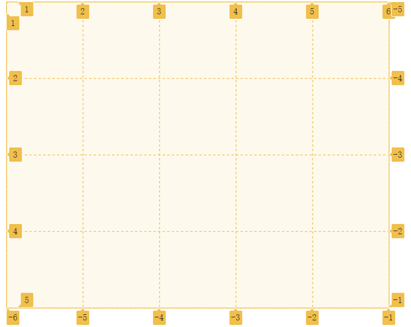
| 单元格 | 行和列的交叉区域,称为单元格(cell)。正常情况下, n行和m列会产生n x m个单元格。比如,2 行 3 列会产生 6 个单元格。 |
| 网格线 | 划分网格的线,称为"网格线"(grid line)。水平网格线划分出行,垂直网格线划分出列。 正常情况下, n行有n + 1根水平网格线,m列有m + 1根垂直网格线,比如 4 行 5 列就有 5 根水平网格线和 6 根垂直网格线(如下图)。 |
注意点
设为网格布局以后,容器子元素(项目)的float、display: inline-block、display: table-cell、vertical-align和column-*等设置都将失效。
# ② 容器属性
| 属性 | 值 |
|---|---|
| grid-template-columns | 定义每一列的列宽 |
| grid-template-rows | 定义每一行的行高。 |
| grid-template-areas | 用于定义区域 |
| grid-template | grid-template-columns、grid-template-rows和grid-template-areas这三个属性的合并简写形式 |
| grid-row-gap | 设置行与行的间隔(行间距) |
| grid-column-gap | 设置列与列的间隔(列间距) |
| grid-gap | 是grid-column-gap和grid-row-gap的合并简写形式 |
| grid-auto-flow | 网格中子项元素的排列顺序。 row(默认值),先行后列 column:先列后行 column dense:表示"先列后行",并且尽量填满空格。 row dense:表示"先行后列",并且尽可能紧密填满,尽量不出现空格。 |
| grid-auto-columns | 隐式网格(浏览器自动创建的多余网格)的列宽 |
| grid-auto-rows | 隐式网格(浏览器自动创建的多余网格)的行高 |
| justify-items | 属性设置单元格中内容的水平位置(左中右) start:对齐单元格的起始边缘。 end:对齐单元格的结束边缘。 center:单元格内部居中。 stretch:拉伸,占满单元格的整个宽度(默认值)。 |
| align-items | 属性设置单元格中内容的垂直位置(左中右) start:对齐单元格的起始边缘。 end:对齐单元格的结束边缘。 center:单元格内部居中。 stretch:拉伸,占满单元格的整个宽度(默认值)。 |
| place-items | 是align-items属性和justify-items属性的合并简写形式。 |
| justify-content | 整个内容区域在容器里面的水平位置(左中右) start:对齐单元格的起始边缘。 end:对齐单元格的结束边缘。 center:单元格内部居中。 stretch:拉伸,占满单元格的整个宽度(默认值) space-around:每个项目两侧的间隔相等。所以,项目之间的间隔比项目与容器边框的间隔大一倍 space-between:项目与项目的间隔相等,项目与容器边框之间没有间隔。 space-evenly:项目与项目的间隔相等,项目与容器边框之间也是同样长度的间隔 |
| align-content | 属性是整个内容区域的垂直位置(上中下) start:对齐单元格的起始边缘。 end:对齐单元格的结束边缘。 center:单元格内部居中。 stretch:拉伸,占满单元格的整个宽度(默认值) space-around:每个项目两侧的间隔相等。所以,项目之间的间隔比项目与容器边框的间隔大一倍 space-between:项目与项目的间隔相等,项目与容器边框之间没有间隔。 space-evenly:项目与项目的间隔相等,项目与容器边框之间也是同样长度的间隔 |
| place-content | 是align-content属性和justify-content属性的合并简写形式。 |
| grid 属性 | 是grid-template-rows、grid-template-columns、grid-template-areas、 grid-auto-rows、grid-auto-columns、grid-auto-flow这六个属性的合并简写形式 |
# 相关延伸:网格中元素宽与高设置
| 用法 | 说明 | 实例 |
|---|---|---|
| px,cm,mm,rem,em、px | 常见的设置单位 | |
| % | 可以使用百分比设置宽高 | grid-template-columns: 200px 50% 3fr; |
| fr | 子项宽或高的比例关系,如果两列宽分别为 1fr 和 2fr,后者是前者宽度 2 倍 | grid-template-columns: 200px 1fr 3fr; (容器宽600px,些时1fr=100px 3fr=300px) |
| repeat(数量,数值) | 可以统一设置某一行或列的宽高 | grid-template-columns:repeat(2,100px) |
| auto-fill | 自动填充列或行数,尽可能容纳多的单元格。 在轨道重复过程中,尽可能多的根据元素创建轨道,如果创建的轨道数量是小数比如 6.5,那么 0.5 就被称为剩余空间,剩余的空间不够一个轨道了,就相当于每个轨道 1fr 进行分配这个 0.5 的剩余空间,没有元素填充的空轨道不会折叠依然保留(相当于留了空白) | grid-template-columns:repeat(auto-fill,100px) |
| auto-fit | 在轨道重复过程中,尽可能多的根据元素创建轨道,并均分不到一个轨道的剩余空间。 轨道分配完以后如果轨道中没有元素则将所有没有元素填充的空轨道折叠为 0,即把没有元素填充的空轨道全被分配给有元素的轨道(相当于有元素填充的轨道全部为 1fr)。最后没有空轨道剩余 | grid-template-columns:repeat(auto-fit,100px) |
| auto | 由浏览器自己决定长度。 | grid-template-columns:100px auto 200px; |
| minmax(最小值,最大值) | 定义一个最小宽高以及一个最大宽高。 | grid-template-columns(1fr 1fr minmax(100px,200px)) |
| min-content | 表示网格的轨道长度自适应内容最小的那个单元格 | |
| max-content | 表示网格的轨道长度自适应内容最大的那个单元格 |
auto-fill 与 auto-fit 的差异
容器中元素数量 * 元素的最小宽度 < 容器的总宽度时,才会显示看到的差异
# ③ 项目属性
| 属性 | 值 | 实例 |
|---|---|---|
| grid-column-start | 左边框所在的垂直网格线 | grid-column-start: 2; |
| grid-column-end | 右边框所在的垂直网格线 | grid-column-end: 4; |
| grid-row-start | 上边框所在的水平网格线 | grid-row-start:1; |
| grid-row-end | 下边框所在的水平网格线 | grid-row-end:3; |
| grid-column | 是grid-column-start和grid-column-end的合并简写形式 | grid-column:2/4 |
| grid-row | 是grid-row-start属性和grid-row-end的合并简写形式 | grid-row:1/3 |
| grid-area | 属性指定项目放在哪一个区域。两种写法 grid-area: <row-start> /<column-start> / <row-end> / <column-end> | grid-area:a; grid-area:1/2/3/4; |
| justify-self | 属性设置单元格中内容的水平位置(左中右),跟justify-items属性的用法完全一致,但只作用于单个项目start:对齐单元格的起始边缘。 end:对齐单元格的结束边缘。 center:单元格内部居中。 stretch:拉伸,占满单元格的整个宽度(默认值)。 | justify-self:center; |
| align-self | 属性设置单元格中内容的垂直位置(上中下),跟align-items属性的用法完全一致,也是只作用于单个项目。start:对齐单元格的起始边缘。 end:对齐单元格的结束边缘。 center:单元格内部居中。 stretch:拉伸,占满单元格的整个宽度(默认值)。 | align-self:center; |
| place-self | 是align-self属性和justify-self属性的合并简写形式。 | place-self:center center |
# ④ 网格布局的优缺点
grid 布局的优点:
- 1、固定和灵活的轨道尺寸
- 2、可以使用行号,名称或通过定位网格区域将项目放置在网格上的精确位置。网格还包含一种算法,用于控制未在网格上显示位置的项目的放置。
- 3、在需要时添加其他行和列
- 4、网格包含对齐功能,以便我们可以控制项目放置到网格区域后的对齐方式,以及整个网格的对齐方式。
- 5、可以将多个项目放入网格单元格或区域中,它们可以彼此部分重叠。然后可以用 z-index 属性控制该分层。
grid 布局的缺点:
- 兼容性不太好
# ⑤ 网格布局的应用场景
场景
- 先行后列的自适应布局(小米二级右侧菜单)
- 单元格的栅格矩阵(百度图片展示)
- 响应式删格(布局)系统 (响应式博客,后台管理系统
大厂最新技术学习分享群

微信扫一扫进群,获取资料
X