
# CSS 画图形面试题答案解析
关于答案解析
- 有关 CSS 画图形 相关的面试题答案解析过程是根据自身项目实践以及查阅官方文档等最终的得出结论。
- 仅供学习参考,评论区感谢补充和纠错 !
# 1、CSS 如何绘制三角形 ?
① 绘制三角形方法一

点击查看源代码
<style>
  .triangle {
    width: 0;
    border-top: 50px solid red; /*上三角形*/
    border-right: 50px solid yellow; /*右三角形*/
    border-bottom: 50px solid palevioletred; /*下三角形*/
    border-left: 50px solid blue; /*左三角形*/
  }
</style>
<body>
  <div class="triangle"></div>
</body>
把其中的三个边框色,设置为transparent,就可以得到三角形了。效果和代码如下:

点击查看源代码
<style>
  .triangle {
    width: 0;
    border: 50px solid transparent; /*边框颜色为透明*/
    border-left-color: 50px solid blue; /*左三角形*/
  }
</style>
<body>
  <div class="triangle"></div>
</body>
② 绘制三角形方法 2

点击查看源代码
<style>
  .triangle {
    width: 0;
    border-top: 100px solid red; /*左三角形-红色*/
    border-right: 50px solid yellow; /*右三角形-黄色*/
  }
</style>
<body>
  <div class="triangle"></div>
</body>
# 2、css 如何画一个梯形 (腾讯)
方法一:1 个长方形和 2 个三角形组合而成

点击查看源代码
<style>
  /*长方形*/
  .trapezoid {
    width: 70px;
    height: 100px;
    background-color: skyblue;
    margin: 100px auto;
    position: relative; /*相对定位*/
  }
  .trapezoid::after,
  .trapezoid::before {
    display: block; /*转换为块级元素*/
    content: "";
    width: 0; /*宽设为0*/
    position: absolute; /*相对长方形绝对定位*/
    top: 0;
  }
  /*左三角形*/
  .trapezoid::after {
    border-top: 100px solid transparent; /*上边框颜色透明*/
    border-right: 50px solid greenyellow;
    left: -50px;
  }
  /*右三角形*/
  .trapezoid::before {
    right: -50px;
    border-top: 100px solid transparent; /*上边框颜色透明*/
    border-left: 50px solid pink;
  }
</style>
<body>
  <div class="trapezoid"></div>
</body>
方法二:利用 border 边框来绘制
当我们给盒子加上宽度后,再分别给不同边框加上不同大小和颜色,就可以得到如下图形。

点击查看源代码
<style>
  .trapezoid {
    width: 100px;
    border-top: 50px solid red;
    border-right: 50px solid skyblue;
    border-left: 50px solid yellow;
    border-bottom: 50px solid pink;
  }
</style>
<body>
  <div class="trapezoid"></div>
</body>
我们只需要把底边框颜色留下,其它三个边框颜色改为透明,就可以看到一个梯形了

点击查看源代码
<style>
  .trapezoid {
    width: 100px;
    border-top: 50px solid transparent;
    border-right: 50px solid transparent;
    border-left: 50px solid transparent;
    border-bottom: 100px solid pink; /*底边框代表梯形的高度,我们把他加高到100px*/
  }
</style>
<body>
  <div class="trapezoid"></div>
</body>
# 3、CSS 绘制爱心

步骤一:先绘制如下图形

点击查看源代码
<style>
    #heart {
        position: relative;
        width: 100px;
        height: 90px;
        background-color: #ddd;
    }
    #heart:before,
    #heart:after {
        width: 50px;
        height: 80px;
        position: absolute;
        content: "";
        left: 50px;
        top: 0;
        background: red;
        border-radius: 50px 50px 0 0;
    }
    #heart:after {
        background-color: yellow;
        left: 0;
    }
</style>
</head>
<body>
    <div id="heart"></div>
</body>
步骤二:分别旋转两个盒子

点击查看源代码
<style>
    #heart {
        position: relative;
        width: 100px;
        height: 90px;
        background-color: #ddd;
    }
    #heart:before,
    #heart:after {
        width: 50px;
        height: 80px;
        position: absolute;
        content: "";
        left: 50px;
        top: 0;
        background: red;
        border-radius: 50px 50px 0 0;
        transform: rotate(-45deg);/*逆时针旋转45deg*/
        transform-origin: 0 100%; /*旋转基点  左下角*/
    }
    #heart:after {
        background-color: yellow;
        left: 0;
        transform: rotate(45deg);/*顺时针旋转45deg*/
        transform-origin: 100% 100%;/*旋转基点 右下角*/
    }
</style>
</head>
<body>
    <div id="heart"></div>
</body>
最后把 heart 的背景色去掉,然后 ::after 和::before 两个伪元素颜色都改成红色,就看到一个小爱心了 !
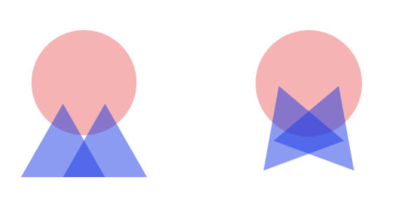
# 4、绘制 5 角星

五角星是由三个三角形组合而成

点击查看源代码
<style>
  .star-five {
    margin: 50px 0;
    position: relative;
    width: 0px;
    border-right: 100px solid transparent;
    border-bottom: 70px solid red;
    border-left: 100px solid transparent;
    transform: rotate(35deg);
  }
  .star-five::before {
    position: absolute;
    content: "";
    top: -45px;
    left: -65px;
    border-bottom: 80px solid red;
    border-left: 30px solid transparent;
    border-right: 30px solid transparent;
    transform: rotate(-35deg);
  }
  .star-five:after {
    position: absolute;
    content: "";
    top: 3px;
    left: -105px;
    border-right: 100px solid transparent;
    border-bottom: 70px solid red;
    border-left: 100px solid transparent;
    transform: rotate(-70deg);
  }
</style>
<body>
  <div class="star-five"></div>
</body>
# 5、CSS 绘制长长的指向

方法一:绘制一个长方形 和 两个三角形组合在一起。

点击查看源代码
<style>
  .pointer {
    width: 200px;
    height: 40px;
    position: relative;
    background: red;
  }
  /*白色三角形,定位在长方形最前面*/
  .pointer:after {
    content: "";
    position: absolute;
    left: 0;
    bottom: 0;
    border-left: 20px solid white;
    border-top: 20px solid transparent;
    border-bottom: 20px solid transparent;
  }
  /*红色三角形,定位在长方形最后面*/
  .pointer:before {
    content: "";
    position: absolute;
    right: -20px;
    bottom: 0;
    border-left: 20px solid red;
    border-top: 20px solid transparent;
    border-bottom: 20px solid transparent;
  }
</style>
<body>
  <div class="pointer"></div>
</body>
方法二:两个平形四边形组成

点击查看源代码
<style>
  .pointer {
  }
  .pointer::before,
  .pointer::after {
    display: block;
    content: "";
    height: 20px;
    width: 200px;
  }
  .pointer::before {
    background-color: skyblue;
    transform: skewX(45deg);
  }
  .pointer::after {
    background-color: pink;
    transform: skew(-45deg);
  }
</style>
<body>
  <div class="pointer"></div>
</body>
# 6、CSS 绘制徽章缎带

制作过程,由一个圆 + 2 个三角形组合而成
点击查看源代码
<style>
  .badge-ribbon {
    position: relative;
    background: red;
    height: 100px;
    width: 100px;
    border-radius: 50%;
    margin-left: 10px;
  }
  .badge-ribbon::before,
  .badge-ribbon::after {
    content: "";
    position: absolute;
    border-left: 40px solid transparent;
    border-right: 40px solid transparent;
    border-bottom: 70px solid red;
    top: 70px;
  }
  .badge-ribbon::before {
    left: -10px;
    transform: rotate(-140deg);
  }
  .badge-ribbon::after {
    right: -10px;
    transform: rotate(140deg);
  }
</style>
<body>
  <div class="badge-ribbon"></div>
</body>
# 7、CSS 绘制弧形尾箭头

绘制一个三角形和一个弧线,两者拼接到一起
点击查看源代码
<style>
  /*绘制三角形*/
  .curvedarrow {
    position: relative;
    width: 0;
    border-top: 90px solid transparent;
    border-right: 90px solid red;
    transform: rotate(10deg) translateX(100%);
  }
  /*绘制向下的弧线*/
  .curvedarrow:after {
    width: 120px;
    height: 120px;
    content: "";
    position: absolute;
    border: 0px solid transparent;
    border-top: 30px solid red;
    border-radius: 200px 0 0 0;
    top: -110px;
    left: -90px;
    transform: rotate(45deg);
  }
</style>
<body>
  <div class="curvedarrow"></div>
</body>
# 8、CSS 绘制无限图形

绘制两个水滴效果,然后旋转组合到一起
点击查看源代码
<style>
  .infinity {
    position: relative;
    width: 190px;
    height: 100px;
    box-sizing: content-box;
  }
  /*左边红色水滴*/
  .infinity::before {
    content: "";
    position: absolute;
    left: 0px;
    top: 0px;
    width: 50px;
    height: 50px;
    border: 20px solid red;
    border-radius: 45px 45px 0px 45px;
    transform: rotate(-45deg);
  }
  /*右边红色水滴*/
  .infinity::after {
    content: "";
    position: absolute;
    width: 50px;
    height: 50px;
    border: 20px solid yellow;
    border-radius: 45px 45px 45px 0px;
    right: 0px;
    transform: rotate(45deg);
  }
</style>
<body>
  <div class="infinity"></div>
</body>

把两个水滴的颜色都改成红色,就得到了如下的无限图形
# 9、CSS 绘制鸡蛋

- 实现方式和普通椭圆类似。
- 特点在于上半部分比下半部分要更加扁平,因此左上角和右上角圆角的垂直半径要更长,这里取整体高度的 60%,剩余的 40% 作为左下角和右下角圆角的垂直半径。
点击查看源代码
<style>
  .egg {
    width: 126px;
    height: 180px;
    background: oldlace;
    border-radius: 50% 50% 50% 50% / 60% 60% 40% 40%;
  }
</style>
<body>
  <div class="egg"></div>
</body>
# 10、CSS 绘制六角星

六角星是由两个正三角形拼接而成

点击查看源代码
<style>
  .star-six {
    width: 0;
    height: 0;
    border: 50px solid transparent;
    border-bottom: 80px solid red;
    position: relative;
  }
  .star-six::after {
    content: "";
    position: absolute;
    width: 0;
    height: 0;
    border: 50px solid transparent;
    border-top: 80px solid red;
    top: 27px;
    left: -50px;
  }
</style>
<body>
  <div class="star-six"></div>
</body>
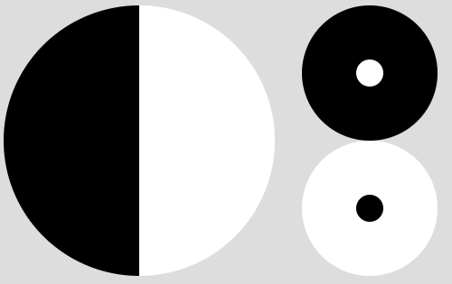
# 11、太极图
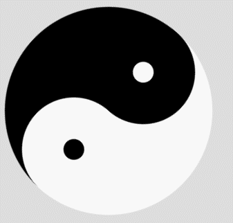
太极图是有以下三个部分组合而成的
点击查看源代码
<style>
  body {
    background-color: #ddd;
  }
  .taiji {
    width: 200px;
    height: 200px;
    border-radius: 50%;
    background-image: linear-gradient(to right, #000 50%, #fff 50%);
    position: relative;
    animation: rotate 1s linear infinite;
    animation-play-state: paused; /*最开始暂停动画*/
  }
  .taiji::after,
  .taiji::before {
    content: "";
    position: absolute;
    width: 20px;
    height: 20px;
    border-radius: 50%;
    left: 50%;
    transform: translateX(-50%);
  }
  .taiji::after {
    border: 40px solid #000;
    background-color: #fff;
  }
  .taiji::before {
    border: 40px solid #fff;
    background-color: #000;
    bottom: 0px;
  }
  /*旋转动画*/
  @keyframes rotate {
    0% {
      transform: rotate(0deg);
    }
    100% {
      transform: rotate(360deg);
    }
  }
  /*鼠标放上去,显示动画*/
  .taiji:hover {
    animation-play-state: running;
  }
</style>
<body>
  <div class="taiji"></div>
</body>
# 12、RSS 订阅

- 利用内阴影往圆里放三段相间的弧线(白色弧线、红色弧线和白色弧线)
- x 偏移量和 y 偏移量控制弧线的坐标,阴影扩散半径控制弧线的宽度
点击查看源代码
<style>
  .subscribe {
    width: 165px;
    height: 165px;
    padding: 35px;
    border-radius: 30px;
    background-color: #ff4802;
    position: relative;
  }
  .subscribe::before {
    content: "";
    position: absolute;
    width: 40px;
    height: 40px;
    border-radius: 50%;
    background-color: #fff;
    bottom: 40px;
  }
  /*制作三段弧线*/
  .subscribe::after {
    content: "";
    position: absolute;
    width: 165px;
    height: 165px;
    border-radius: 0px 165px 0px 0px;
    box-shadow:
            /* x偏移量  y偏移量 阴影模糊半径 阴影扩散半径  阴影颜色 内阴影 */ -14px
        14px 0 14px #fff inset, -28px 28px 0 28px #ff4802 inset,
      -42px 42px 0 42px #fff inset;
  }
</style>
<body>
  <div class="subscribe"></div>
</body>
# 13 、 css 怎么画一个大小为父元素宽度一半的正方形(知乎)
答案解析
- 这个题目考的 padding-top 或 padding-bottom 的百分比相对的是谁而言
- padding 和 margin 和百分比相对的都是父元素的 width 而言。
点击查看源代码
<style>
  .box {
    width: 200px;
    background-color: #ddd;
  }
  .box .item {
    width: 50%;
    padding-bottom: 50%;
    background-color: skyblue;
  }
</style>
<body>
  <div class="box">
    <div class="item"></div>
  </div>
</body>

大厂最新技术学习分享群

微信扫一扫进群,获取资料
X