
# CSS 定位面试题答案解析
关于答案解析
- CSS 定位相关面试题答案解析过程是根据自身项目实践以及查阅官方文档等最终的得出结论。
- 仅供学习参考,评论区感谢补充和纠错 !
# 1、CSS 定位 position 有几种属性,以及应用场景,最新的有没有了解过 ?(小米、字节、广联达)
CSS 定位相关的 5 中属性如下表
| 属性值 | 描述 |
|---|---|
| static | 没有定位,元素出现在正常的流中(默认值,可以忽略) |
| relative | 相对定位,相对于自身正常位置进行位置的调整 |
| absolute | 绝对定位,相对于其最近的定位的父元素进行位置调整。 |
| fixed | 固定定位,相对于浏览器窗口进行位置调整 |
| sticky | 粘性定位,是基于用户的滚动位置来定位。(最新,兼容性差) |
# 相对定位应用场景和案例
相对定位 3 大应用场景
- 微调元素位置
- 提升元素层级
- 作为绝对定位元素参考对象
相对定位 5 个应用案例
搜索框、图文对齐、滑动动画、弹性菜单、柱形图
① 文字或图标与搜索框对不齐,可以通过相对定位来微调
相对定位实现:搜索框应用案例

给元素加上 relative 相对定位和 top 值后的效果(去掉了背景色,上面加背景色是为了方便看效果)

点击查看源代码
<style>
  body,
  input {
    margin: 0;
    padding: 0;
  }
  body {
    background-image: linear-gradient(to right, pink, skyblue);
  }
  .fl {
    float: left;
  }
  .search {
    height: 50px;
    margin: 100px auto;
    width: 800px;
    background-color: #fff;
    border-radius: 25px; /*搜索框最外层两端圆角效果*/
  }
  .search .icon-search {
    width: 50px;
    height: 25px;
    background: url(images/icon-search.png) no-repeat center;
    /*background-color: red;*/
    /*给元素添加相对定位,同时设置top值,就可以轻松实现在垂直方向上居中对齐*/
    position: relative;
    top: 13px;
  }
  .search .search-input {
    width: 650px;
    height: 50px;
    border: 0px;
    outline: none;
    font-size: 18px;
  }
  .search .search-button {
    width: 100px;
    height: 50px;
    background-color: #ff8200;
    font-size: 20px;
    line-height: 50px;
    color: #fff;
    text-align: center;
    border-radius: 0px 25px 25px 0px; /*搜索按扭圆角效果*/
  }
</style>
<body>
  <div class="search">
    <span class="icon-search fl"></span>
    <input
      type="text"
      class="search-input fl"
      placeholder="输入搜索的产品名称"
    />
    <div class="search-button fl">搜索</div>
  </div>
</body>
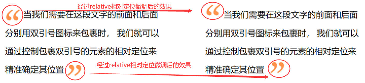
② 文字中包含小图标时,达不到预期效果,需要微调来实现
相对定位实现:图文对齐应用案例
- 需要调整元素的位置,同时元素还需要占据原来的空间。
点击查看源代码
<style>
  .desc {
    width: 300px;
    line-height: 35px;
    font-size: 16px;
    margin: 100px auto;
  }
  .desc span.icon {
    width: 30px;
    height: 30px;
    display: inline-block;
  }
  .desc span.icon-yinhao1 {
    background-image: url(images/icon-xiayinhao1.png);
    vertical-align: middle;
    /*通过相对定位来微调元素的位置*/
    position: relative;
    bottom: 10px;
  }
  .desc span.icon-yinhao2 {
    background-image: url(images/icon-xiayinhao2.png);
    vertical-align: middle;
    /*通过相对定位来微调元素的位置*/
    position: relative;
    top: -5px;
    left: 5px;
  }
</style>
<body>
  <div class="desc">
    <span class="icon icon-yinhao1"></span>
    当我们需要在这段文字的前面和后面分别用双引号图标来包裹时,
    我们就可以通过控制包裹双引号的元素的相对定位来精准确定其位置
    <span class="icon icon-yinhao2"></span>
  </div>
</body>
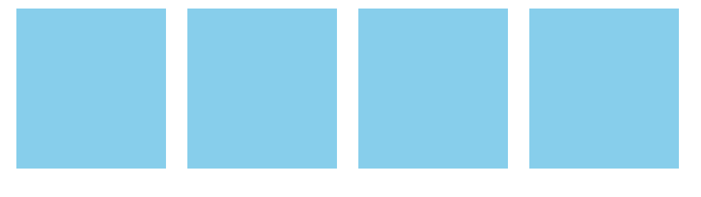
③ 鼠标滑动到元素上,元素少量移动动画效果
相对定位实现:滑动动画应用案例
- 当鼠标滑动元素上,元素会向不同方向移动一定距离。
- 我们可以通过给元素添加相对定位,然后鼠标滑上去的时候,通过修改 top,tottom,left,right 值来调整位置实现动画效果。
点击查看源代码
<style>
  body,
  ul,
  li {
    margin: 0;
    padding: 0;
  }
  ul {
    width: 640px;
    height: 150px;
    margin: 100px auto;
    list-style: none;
  }
  ul li {
    width: 140px;
    height: 150px;
    background-color: skyblue;
    margin: 0px 10px;
    float: left;
    /*通过添加相对定位,来微调元素滑动后的位置*/
    position: relative;
    top: 0px;
    /*css3中的过渡动画,在实际开发时,保证兼容要加上不同浏览器前缀*/
    transition: all 0.5s;
  }
  ul li:hover {
    /*鼠标滑动到li时,通过调整top值,来实现动画效果*/
    top: -10px;
    box-shadow: 0px 5px 5px #666; /*盒影阴效果*/
  }
</style>
<body>
  <ul>
    <li></li>
    <li></li>
    <li></li>
    <li></li>
  </ul>
</body>
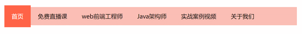
④ 通过相对定位来提高元素的层级,实现菜单弹性动画效果
相对定位实现:菜单弹性动画效果
当鼠标滑动到对应的菜单项时,红色的小滑块会在文字的下方,缓慢的滑动到当前菜单的位置上。
点击查看源代码
<style>
  body,
  ul,
  li {
    margin: 0;
    padding: 0;
  }
  ul.menu {
    width: 800px;
    height: 50px;
    line-height: 50px;
    margin: 100px auto;
    background-color: rgb(251, 190, 180);
    list-style: none;
    position: relative; /*相对定位,作为li的参考物*/
  }
  ul.menu li {
    float: left;
    position: relative; /*给li加相对定位,主要是为了提升li的层级*/
    /*这里的z-index值要大于li:last-child的z-index值,否则文字会被滑块盖掉*/
    z-index: 2;
  }
  ul.menu li a {
    display: block;
    padding: 0px 20px;
    color: #000;
    text-decoration: none;
  }
  ul.menu li:first-child a {
    color: #fff;
  }
  ul.menu li:last-child {
    width: 72px;
    height: 60px;
    background-color: tomato;
    position: absolute; /*这个li用来做底部红色滑块,需要相对ul进行绝对定位*/
    left: 0px;
    top: -5px;
    z-index: 1; /*这里的z-index值一定要小与其它li的z-index的值,否则滑块就会覆盖文字*/
  }
</style>
<body>
  <ul class="menu">
    <li><a href="#">首页</a></li>
    <li><a href="#">免费直播课</a></li>
    <li><a href="#">web前端工程师</a></li>
    <li><a href="#">Java架构师</a></li>
    <li><a href="#">实战案例视频</a></li>
    <li><a href="#">关于我们</a></li>
    <li></li>
    <!--这个li是用来做橘红色的小滑块-->
  </ul>
  <script src="js/jquery.min.js"></script>
  <script>
    $(function () {
      $("ul.menu li:not(:last)").hover(function () {
        var _width = $(this).outerWidth(); //获取当前滑动到的li宽度
        var _left = $(this).position().left; //获取当前滑动到的li与ul左边距离
        var _that = $(this); //保存当前滑动到的li对象
        $("ul.menu li:last")
          .stop()
          .animate(
            {
              width: _width + "px", //把小滑块的宽度设置为当前滑动到的li的宽度
              left: _left + "px", //把小滑块与ul左边的距离设置为当前滑动到的li与ul左边距离
            },
            300,
            function () {
              //修改所有li中a的文字颜色
              $(this).siblings().find("a").css("color", "#000");
              //修改当前滑动到的li下a的文字的颜色
              _that.find("a").css("color", "#fff");
            }
          );
      });
    });
  </script>
</body>
⑤ 相对定位元素,做为绝对定位元素的参考对象
相对定位实现:柱形图应用案例
这里的 箭头 和 长方形柱子,都是相对于其父元素来进行绝对定位实现的。

点击查看源代码
<style>
  body,
  ul,
  li {
    margin: 0;
    padding: 0;
  }
  ul {
    width: 350px;
    height: 220px;
    margin: 100px auto;
    list-style: none;
    border-left: 2px solid red;
    border-bottom: 2px solid red;
    position: relative;
  }
  ul::after,
  ul::before {
    display: block;
    content: "";
    width: 20px;
    height: 20px;
    border-top: 2px solid red;
    border-right: 2px solid red;
    position: absolute;
    right: 4px;
    bottom: -12px;
    transform: rotate(45deg);
  }
  ul::before {
    left: -12px;
    top: 4px;
    transform: rotate(-45deg);
  }
  ul li {
    width: 20px;
    height: 100px;
    float: left;
    background-color: skyblue;
    position: absolute;
    margin-right: 10px;
    /*--i是自定义属性,var函数可以调用自定义属性 calc函数可用于算术运算*/
    height: calc(var(--i) * 20px); /*动态计算高度*/
    bottom: 0px;
    left: calc((var(--i) - 1) * 30px); /*动态计算与左边距离*/
  }
</style>
<body>
  <ul>
    <li style="--i:1"></li>
    <li style="--i:2"></li>
    <li style="--i:3"></li>
    <li style="--i:4"></li>
    <li style="--i:5"></li>
    <li style="--i:6"></li>
    <li style="--i:7"></li>
    <li style="--i:8"></li>
    <li style="--i:9"></li>
  </ul>
</body>
# 绝对定位应用场景和案例
绝对定位的 7 大应用场景
- top、bottom 以及 left、right 优先级
(案例1) - 相对于直接父元素定位
(案例2) - 相对父元素的父元素定位
(案例3) - 相对于 body 定位
(案例4) - 子元素自适应父元素宽高
(案例5) - 设置元素水平垂直居中
(案例6) - 改变元素的层级关系
(案例7)
注意事项
- 定位元素未设置 width 和 height 情况下,同时设置 top 和 bottom 会改变元素高,同时设置 left 和 right 会改变元素宽
- 元素设置 width 和 height 情况下,同时设置 top 与 bottom,会以 top 值为准。同时设置 left 和 right,会以 left 值为准。
① top、bottom 以及 left、right 优先级
绝对定位应用案例
- 如果元素添加宽高,同时设置 top 与 bottom 属性,会以 top 值为主
- 如果同时设置 left 和 right 属性,以 left 为主。

点击查看源代码
<style type="text/css">
  html,
  body {
    margin: 0;
  }
  .box {
    width: 100px;
    height: 100px;
    margin: 50px auto;
    background-color: pink;
    position: relative; /*相对定位*/
  }
  .box .item {
    width: 50px;
    height: 50px;
    position: absolute; /*绝对定位*/
    left: -20px; /*与相对定位元素左边距离*/
    top: -20px; /*与相对定位元素顶部距离*/
    bottom: 0px; /*不生效*/
    right: 0px; /*不生效*/
    background-color: skyblue;
  }
</style>
② 相对于直接父元素定位
绝对定位应用案例
相对于直接父元素定位案例是太多太多,下图列举了几个
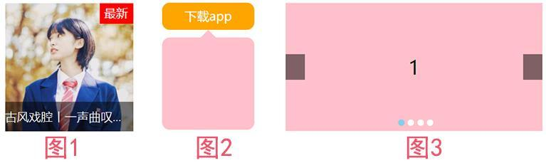
其中图1鼠标滑动悬浮效果 源码
点击查看源代码
<style>
  body,
  h3 {
    margin: 0;
    padding: 0;
  }
  .music {
    width: 150px;
    height: 150px;
    margin: 100px auto;
    position: relative;
  }
  .music h3 {
    height: 35px;
    line-height: 35px;
    width: 100%;
    background-color: rgba(0, 0, 0, 0.5);
    color: #fff;
    position: absolute;
    left: 0px;
    bottom: 0px;
    font-size: 14px;
    font-weight: 100;
    white-space: nowrap;
    overflow: hidden;
    text-overflow: ellipsis;
  }
  .music span.icon-hot {
    padding: 2px 6px 4px 5px;
    background-color: red;
    color: #fff;
    font-size: 14px;
    position: absolute;
    right: 0px;
    top: 0px;
  }
</style>
<body>
  <div class="music">
    <img src="images/music.jpg" alt="" height="150" />
    <div class="video-mask"></div>
    <span class="icon-hot">最新</span>
    <h3 class="video-title">古风戏腔丨一声曲叹,惊艳了芳华</h3>
  </div>
</body>
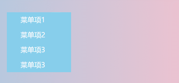
③ 相对父元素的父元素定位 - 二级右测悬浮菜单
绝对定位应用案例
点击查看源代码
<style>
  body,
  ul,
  li {
    margin: 0;
    padding: 0;
  }
  body {
    background-image: linear-gradient(to right, skyblue, pink);
  }
  ul {
    list-style: none;
    width: 150px;
    margin: 100px auto;
    position: relative; /*相对定位,.menu-item就是相对于ul来绝对定位的*/
  }
  ul li {
    height: 35px;
    line-height: 35px;
    text-indent: 2em;
    background-color: skyblue;
  }
  ul li a {
    text-decoration: none;
    color: #fff;
  }
  ul li:hover {
    background-color: salmon;
  }
  ul li .menu-item {
    width: 200px;
    height: 100%;
    background-color: #fff;
    position: absolute; /*绝对定位*/
    left: 150px;
    top: 0px;
    display: none;
  }
  ul li:hover .menu-item {
    display: block;
  }
</style>
<body>
  <ul class="menu">
    <li>
      <a href="#">菜单项1</a>
      <div class="menu-item">内容1</div>
    </li>
    <li>
      <a href="#">菜单项2</a>
      <div class="menu-item">内容2</div>
    </li>
    <li>
      <a href="#">菜单项3</a>
      <div class="menu-item">内容3</div>
    </li>
    <li>
      <a href="#">菜单项3</a>
      <div class="menu-item">内容4</div>
    </li>
  </ul>
</body>
④ 相对于 body 定位 - 右击显示桌面菜单
绝对定位应用案例
- 当鼠标在浏览器窗口右击时,会在右击的位置显示对应的桌面菜单
- 这里的菜单就是相对于 body 来绝对定位的。

点击查看源代码
<style>
  body,
  ul,
  li {
    margin: 0;
    padding: 0;
  }
  ul {
    list-style: none;
  }
  .menu {
    width: 200px;
    height: 200px;
    background-color: #fff;
    border: 1px solid #ddd;
    box-shadow: 2px 2px 5px #ddd;
    position: absolute;
    display: none;
  }
  .menu li {
    text-indent: 2em;
    font-size: 14px;
    color: #666;
    line-height: 30px;
  }
  .menu li:hover {
    background-color: #ddd;
  }
</style>
<body>
  <ul class="menu" id="menu">
    <li>返回</li>
    <li>前进</li>
    <li>重新加载</li>
    <li>新建文件夹</li>
    <li>设置背景</li>
  </ul>
  <script>
    var tag = document.getElementById("menu");
    var li = document.querySelectorAll(".menu li");
    //取消系统默认的右键弹窗
    document.oncontextmenu = function () {
      return false;
    };
    //按下右键,并抬起时
    document.onmouseup = function (e) {
      if (e.button == 2) {
        //判断鼠标按下的时右键
        //获取鼠标按下时的坐标
        var x = e.pageX;
        var y = e.pageY;
        //把鼠标按下时的坐标,分别赋值给tag元素的left和top
        tag.style.left = x + "px";
        tag.style.top = y + "px";
        /*右键后,显示右侧桌面菜单*/
        tag.style.display = "block";
      }
    };
    document.onclick = function () {
      /*在窗口任意位置点击,隐藏桌面菜单*/
      tag.style.display = "none";
    };
  </script>
</body>
⑤ 子元素自适应父元素宽高 - 黑色半透明遮罩层
绝对定位应用案例
黑色半透明遮罩层不用设置宽高,我们通过 position 的 left、right、top、bottom 来控制黑色半透明遮罩层宽度和高度。

点击查看源代码
<style>
  body,
  ul,
  li {
    margin: 0;
    padding: 0;
  }
  ul {
    list-style: none;
    width: 690px;
  }
  ul li {
    margin: 5px;
    float: left;
    background-color: skyblue;
    position: relative; /*相对定位*/
  }
  ul li:nth-child(1),
  ul li:nth-child(3) {
    width: 200px;
    height: 200px;
  }
  ul li:nth-child(2) {
    width: 250px;
    height: 200px;
  }
  ul li:nth-child(4),
  ul li:nth-child(5) {
    width: 330px;
    height: 200px;
  }
  ul li::before {
    display: block;
    content: "";
    /*通过定位,来控制元素的宽高,可以自适应父元素*/
    position: absolute;
    left: 20px;
    right: 20px;
    top: 20px;
    bottom: 20px;
    background-color: rgba(0, 0, 0, 0.5); /*黑色半透明遮罩层*/
  }
</style>
<body>
  <ul>
    <li></li>
    <li></li>
    <li></li>
    <li></li>
    <li></li>
  </ul>
</body>
⑥ 绝对定位设置元素水平垂直居中
绝对定位应用案例
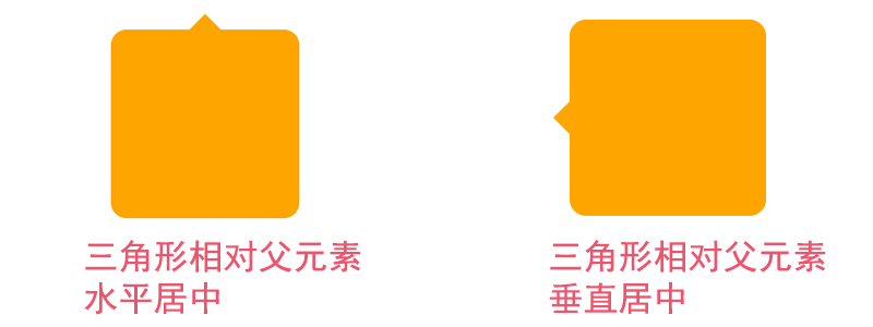
三角形相对父元素水平居中源码
点击查看源代码
<style>
  html,
  body {
    margin: 0;
    width: 100%;
    height: 100%;
  }
  .tag {
    width: 100px;
    height: 100px;
    padding: 10px;
    margin: 100px auto;
    background-color: orange;
    border-radius: 10px;
    position: relative; /*绝对定位*/
  }
  .tag::after {
    display: block;
    content: "";
    /*以下三行代码,绘制三角形*/
    width: 0;
    border: 10px solid transparent;
    border-bottom-color: orange;
    position: absolute; /*利用绝对定位设置三角形的位置*/
    /*以下两行代码,设置三角形相对父元素水平居中*/
    left: 50%;
    margin-left: -10px;
    top: -20px;
  }
</style>
<body>
  <div class="tag"></div>
</body>
⑦ 改变元素的层级关系 - 3D 图片展示效果
绝对定位应用案例
当鼠标滑动到元素上面,通过改变 z-index 的值,来提升元素层级,让其在最上方展示。

点击查看源代码
<style>
  body,
  ul,
  li {
    margin: 0;
    padding: 0;
  }
  body {
    background-color: #000;
  }
  ul {
    list-style: none;
    width: 800px;
    height: 300px;
    margin: 50px auto;
    position: relative; /*相对定位*/
    perspective: 800px; /*3D场景-景深(视距)*/
  }
  ul li {
    width: 400px;
    height: 300px;
    position: absolute; /*绝对定位*/
    left: calc(var(--i) * 100px); /*通过自定义属性动态计算元素left值*/
    transform: rotateY(20deg); /*Y轴旋转20deg*/
    box-shadow: 0px 2px 35px skyblue;
    transition: all 0.5s; /*过渡动画*/
  }
  ul li img {
    width: 100%;
    height: 100%;
    object-fit: cover;
  }
  ul li:hover {
    border: 10px solid #fff;
    transform: rotateY(0deg); /*元素Y轴旋转到0deg*/
    z-index: 2; /*改变元素层级,让元素在最上面显示*/
    top: 50px;
  }
</style>
<body>
  <ul>
    <li style="--i:0"><img src="images/rotate1.webp" alt="" /></li>
    <li style="--i:1"><img src="images/rotate2.webp" alt="" /></li>
    <li style="--i:2"><img src="images/rotate3.webp" alt="" /></li>
    <li style="--i:3"><img src="images/rotate1.webp" alt="" /></li>
    <li style="--i:4"><img src="images/rotate2.webp" alt="" /></li>
    <li style="--i:5"><img src="images/rotate3.webp" alt="" /></li>
  </ul>
</body>
# 固定定位应用场景和案例
固定定位的 6 大应用场景
- 楼梯式导航
- 浏览器右侧菜单
- 底部通栏
- 全屏黑色半透明遮罩弹出层,弹出注册和登录框
- 左上固定右自适应后台管理系统布局
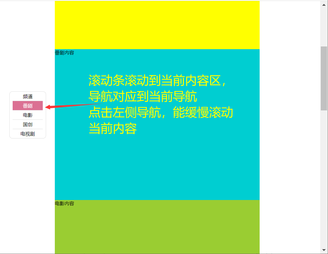
① 楼梯式导航、浏览器右侧菜单、底部通栏
固定定位应用案例
这三个案例用都是用固定定位来控制其与浏览器位置,最难是楼梯式导航的 js 部分
点击查看源代码
<style>
  body,
  ul,
  li {
    margin: 0;
    padding: 0;
  }
  .header,
  .footer {
    height: 200px;
    background-color: skyblue;
  }
  .container {
    width: 1280px;
    margin: 20px auto;
  }
  .container .item:nth-child(odd) {
    height: 600px;
    background-color: yellow;
  }
  .container .item:nth-child(even) {
    height: 700px; /*代码来自-艾编程-清心*/
    background-color: darkturquoise;
  }
  ul.louti {
    list-style: none;
    width: 100px;
    padding: 0px 10px;
    border: 1px solid #ddd;
    border-radius: 10px;
    background-color: #fff;
    position: fixed; /*通过固定定位来控制楼梯式导航的位置*/
    top: 300px;
    left: 50px;
  }
  ul.louti li {
    height: 30px;
    line-height: 30px;
    text-align: center;
    border-bottom: 1px solid #ddd;
    cursor: pointer;
  }
  ul.louti li:last-child {
    border: none;
  }
  ul.louti li.current {
    background-color: palevioletred;
    color: #fff;
  }
</style>
<body>
  <div class="header"></div>
  <div class="container">
    <div class="item">频道内容</div>
    <div class="item">番剧内容</div>
    <div class="item">电影内容</div>
    <div class="item">国创内容</div>
    <div class="item">电视剧内容</div>
  </div>
  <div class="footer"></div>
  <ul class="louti">
    <!--楼梯式导航  固定定位-->
    <li class="current">频道</li>
    <li>番剧</li>
    <li>电影</li>
    <li>国创</li>
    <li>电视剧</li>
  </ul>
</body>
<script>
  var itemTop = []; //用来保存每个区块与页面顶部距离
  var itemHeight = [];
  var oItem = document.querySelectorAll(".container .item");
  var oLi = document.querySelectorAll(".louti li");
  var len = oItem.length;
  var dirSpeed = 20; //定义方向和速度
  var flag = -1; //提高性能优化标签
  var scrollTop = 0; //保存浏览器滚动高
  var timer = null; //全局定时器
  //把每个盒子与浏览器顶部距离,和高度分别保存到数组中
  for (var i = 0; i < len; i++) {
    itemTop.push(oItem[i].offsetTop);
    itemHeight.push(oItem[i].clientHeight);
  }
  window.onscroll = function () {
    //滚动浏览器滚动条
    //获取滚动条滚动的高度
    scrollTop = document.documentElement.scrollTop || document.body.scrollTop;
    for (var i = 0; i < len; i++) {
      if (parseInt(scrollTop) <= parseInt(itemTop[i] + itemHeight[i] / 3)) {
        break;
      } /*代码来自-艾编程-清心*/
    }
    if (flag != i) {
      //如果在当前楼层滚动,则不会重复执行代码
      flag = i;
      for (var j = 0; j < len; j++) {
        oLi[j].className = "";
      }
      oLi[i].className = "current";
    }
  };
  for (var j = 0; j < oLi.length; j++) {
    oLi[j].index = j; //保存序列号,后面方便使用
    oLi[j].onclick = function () {
      //给导航加点击事件
      clearInterval(timer); //清除定时器
      var that = this; //保存this
      //首先要获取当前滚动条高度
      scrollTop = document.documentElement.scrollTop || document.body.scrollTop;
      scrollTop >= itemTop[that.index] + itemHeight[that.index] / 3
        ? (dirSpeed = -20)
        : (dirSpeed = 20);
      timer = setInterval(function () {
        /*代码来自-艾编程-清心*/ scrollTop += dirSpeed;
        if (
          (scrollTop <= itemTop[that.index] + itemHeight[that.index] / 3 &&
            dirSpeed < 0) ||
          (scrollTop >= itemTop[that.index] + itemHeight[that.index] / 3 &&
            dirSpeed > 0)
        ) {
          scrollTop = itemTop[that.index] + itemHeight[that.index] / 3;
          clearInterval(timer);
        }
        (document.documentElement.scrollTop = scrollTop) ||
          (document.body.scrollTop = scrollTop);
      }, 5);
    };
  }
</script>
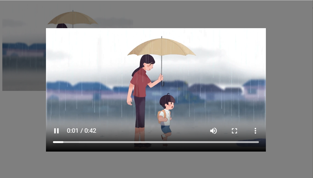
② 视频弹窗播放效果
固定定位应用案例
- 这个效果中黑色的半透明遮罩层和弹出的视频都是相对于浏览器来固定定位的
- 弹出登录注册框的原理和这个是一样的,这里以相对较为复杂的视频弹窗效是为例来讲解
点击查看源代码
<style>
        .video{
            width:300px;
            height: 200px;
        }
        .video img{
            width: 100%;
            height: 100%;
            object-fit: cover;
            cursor: pointer;
        }
        .mask{
            background-color: rgba(0,0,0,0.5);
            position: fixed;
            top:0px;
            bottom:0px;
            left:0px;
            right:0px;
            display: none;
        }
        .mask video{
            position: fixed;
            left:50%;
            top:50%;
            transform:translateX(-50%) translateY(-50%);
        }
    </style>
<body>
    <!--视频播放列表-->
    <div class="video"><!--data-src放着对应的视频地址-->
        <img src='images/mz8.jpg' data-src="mp4/meizu.mp4"></video>
    </div>
    <div class="mask"><!--黑色半透明遮罩层-->
        <video src="" controls width="70%"></video><!--视频-->
    </div>
    <script>
        var img=document.querySelector('.video img');
        var mask=document.querySelector('.mask');
        var video=document.querySelector('.mask video')
        img.onclick=function(){
            mask.style.display='block';
            video.src=this.dataset.src;//将视频地址赋值给视频播放器
            //视频弹出后,立马自动播放
            video.play();
        }
    </script>
</body>
③ 左边和顶部固定,右自适应后台管理界面布局
固定定位应用案例
顶部导航和左侧菜单相对于浏览器固定定位,右侧的内容区则自适应浏览器的宽度
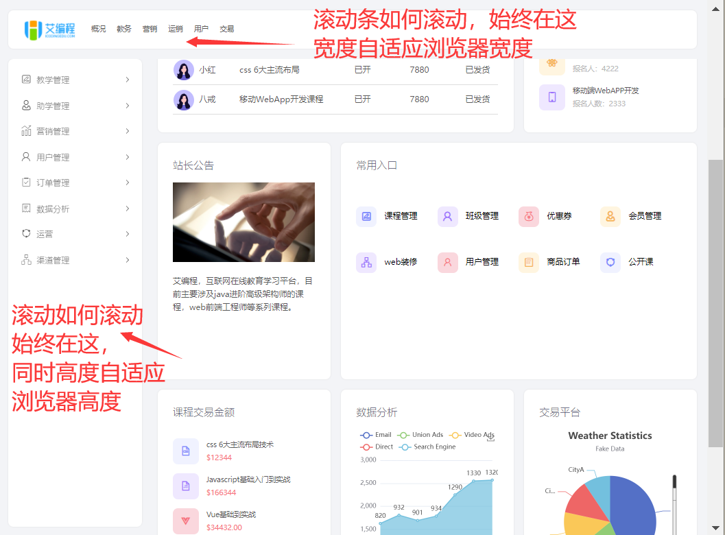
点击查看源代码
<style>
  body {
    margin: 0;
  }
  .top {
    height: 100px;
    position: fixed; /*固定定位 要实现水平自适应,就不要加宽*/
    left: 10px;
    right: 10px;
    top: 0px;
    background-color: pink;
    border-radius: 10px;
  }
  .siderbar {
    width: 250px;
    position: fixed; /*固定定位 要实现垂直自适应,就不要加高*/
    left: 10px;
    top: 110px;
    bottom: 10px;
    background-color: pink;
    border-radius: 10px;
  }
  .main {
    margin: 110px 10px 0px 270px; /*水平自适应,不要加宽*/
    min-height: 900px;
    background-color: skyblue;
  }
</style>
<body>
  <div class="top"></div>
  <!--顶部-->
  <div class="siderbar"></div>
  <!--左侧边栏-->
  <div class="main"></div>
  <!--主内容区-->
</body>
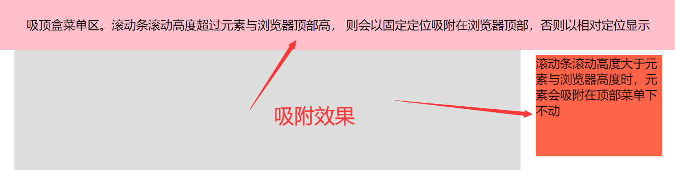
# 粘性定位应用场景和案例
常见的应用有 2 种
- 吸顶盒导航
- 滚动吸附效果
不过粘性定位的兼容性很差,所以我们一般都是通过 js 来实现的
吸顶盒导航和常见左右吸附效果
粘性定位应用案例
- 由于粘性定义目前只有火狐 和 Safari 浏览器 支持,但是这种效果在实际企业开发中必用
- 所以我们通常会用 JS 来实现,以下是完整效果的源码。
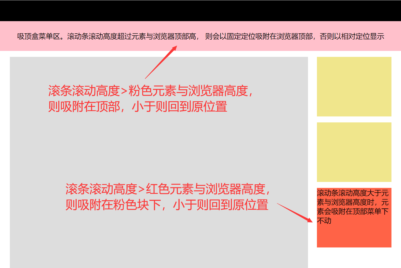
点击查看源代码
<style>
  body {
    margin: 0;
    min-width: 1280px;
  }
  .top {
    height: 70px;
    width: 100%;
    background-color: #000;
  }
  .header {
    height: 100px;
    width: 100%;
    background-color: pink;
    /* position: sticky; 兼容问题
        position: -webkit-sticky; */
    top: 0;
    text-align: center;
    line-height: 100px;
  }
  .container {
    width: 1280px;
    margin: 20px auto;
  } /*代码来自-艾编程-清心*/
  .container .main {
    width: 1000px;
    min-height: 2000px;
    background-color: #ddd;
    float: left;
  }
  .container .siderbar {
    width: 250px;
    float: right;
  }
  .container .siderbar .item {
    height: 200px;
    background-color: khaki;
    margin-bottom: 20px;
  }
  .container .siderbar .ceiling {
    height: 200px;
    width: 250px;
    background-color: tomato;
    /* position: sticky;
        position: -webkit-sticky; */
  }
</style>
<body>
  <div class="top"></div>
  <div class="header"></div>
  <!--吸附块-->
  <div class="container">
    <div class="main"></div>
    <div class="siderbar">
      <div class="item"></div>
      <div class="item"></div>
      <div class="ceiling"></div>
      <!--吸附块-->
    </div>
  </div>
  <script>
    var header = document.querySelector(".header");
    var ceiling = document.querySelector(".ceiling");
    var _top = header.offsetTop; /*元素与浏览器顶部距离*/
    var _top2 = ceiling.offsetTop - header.clientHeight - 110; //这里要记得减掉header高度和与顶部高度,因为header在前,定位后不占空间
    console.log(_top2);
    window.onscroll = function () {
      var scrollTop =
        document.documentElement.scrollTop || document.body.scrollTop;
      console.log(scrollTop);
      scrollTop >= _top
        ? (header.style.position = "fixed")
        : (header.style.position = "relative");
      if (scrollTop >= _top2) {
        /*代码来自-艾编程-清心*/
        ceiling.style.position = "fixed"; /*设置固定定位*/
        ceiling.style.top = "110px"; /*top值*/
      } else {
        ceiling.style.position = "relative";
        ceiling.style.top = "0px";
      }
    };
  </script>
</body>
# 2、absolute 和 relative 分别依据什么去定位 ?(字节)
答案解析
- absolute 绝对定位是相对于其最近的定位的父元素进行位置调整,如果找不到定位的元素,则相对于 body 进行定位
- relative 相对定位是相对于自身正常位置进行定位
大厂最新技术学习分享群
微信扫一扫进群,获取资料
X