
# CSS display 属性、背景属性、其他常用属性
TIP
本节学习 CSS 中的 display 属性,background 背景属性,CSS 精灵图,线性渐变,径向渐变 等项目中常用的属性
# 一、display 属性
TIP
- display 属性的作用,块级元素、行内元素、行内块级元素,互相转换和对比,隐藏元素,空白间隙
- 中小企业和大厂面试真题解析
# 1、display 属性的作用
TIP
display 属性可以设置元素的 内部和 外部 显示类型
- 外部显示类型:
- 元素的外部显示类型有 block 块、inline 内联等。
- 外部显示类型将决定该元素在流式布局中的表现。
- 内部显示类型:
- 内部显示类型flex 布局、grid 网格布局、流式布局等。
- 元素的内部显示类型可以控制其子元素的布局方式。
流式布局(文档流 或 常规流)
- "文档流" 或 "流式布局" 是在对布局进行任何更改之前(默认情况下),在页面上显示 "块" 和 "内联" 元素的方式。
- 简单直白点来说,他是一种排版方式,这种排版方式规定了块级和内联元素在页面中如何排版显示。
【流式布局】中 - 块级元素排版方式
- 块级盒子会从包含块的顶部开始,按序垂直排列。
- 同级盒子间的垂直距离会由“margin”属性决定。
- 相邻两个块级盒子之间的垂直间距会遵循外边距折叠原则被折叠
【流式布局】中 - 内联元素排版方式
- 盒子会从包含块的顶部开始,按序水平排列。
- 只有水平外边距、边框和水平内边距会被保留。
- 这些盒子可以以不同的方式在垂直方向上对齐:可以底部对齐或顶部对其,或者按文字底部进行对齐
内部显示类型,我们在后面讲到 flex 弹性布局和 grid 网格布局时再来讲)
# 2、元素外部显示类型
display 通过以下属性值来指定元素的显示类型
- block 块级
- inline-block 行内块
- inline 行内(内联)
元素显示类型分为:block 块级 和 inline 内联 等 inline 内联元素又分为:inline 内联元素 和 inline-block 行内块元素
# 2.1、block 块级元素
常见的块级元素有
<p>、<div>、<ul>、<ol>、<li>、<h1>~<h6>、<dl> 等
块级元素的特点:
- 独占一行
- 可以设置 width、height 属性。
- 在不设置宽情况下,宽默认为父元素内容区宽。
- 块级元素里可以放任意类型元素。
注意事项
- 文字类元素标签内不能放其它块元素,比如:
- p 标签里不能放 p 和 div 标签。
- h1-h6 标签里不能放 p,div 元素
<style>
  /*
       块级元素特点:
       1、不能并排显示,默认流体布局
       2、可以设置宽高
       3、默认width自动撑满
   */
  h2 {
    background-color: pink;
  }
  .box1 {
    width: 300px;
    height: 50px;
    background-color: skyblue;
  }
  .box2 {
    width: 300px;
    height: 50px;
    background-color: gold;
  }
</style>
<body>
  <h2>div块级元素</h2>
  <div class="box1"></div>
  <div class="box2"></div>
</body>

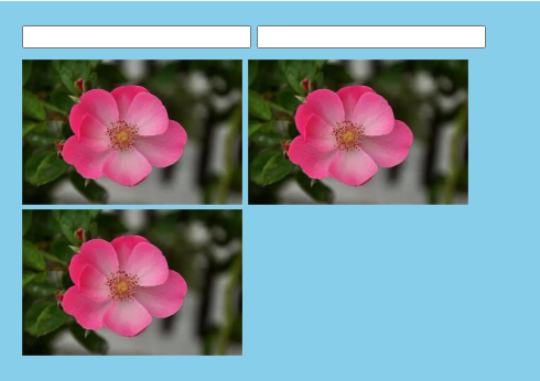
# 2.2、inline-block 行内块元素
以下元素具有行内块元素的特性:
<img>、表单类元素、<video>、<audio> 等
以上元素本质上叫 可替换元素,归类归到 inline·内联(行内)元素
行内块元素的特点:
- 相邻的行内块(或行内)元素会在一行显示,放不下会换行。
- 相邻的行内块元素之间会有空白间隙(后面案例中来解答这个问题)。
- 元素默认宽为它本身内容宽
- 可设置 width、height 属性
<style>
  .box {
    width: 450px;
    background-color: skyblue;
    padding: 20px;
  }
  /*
       img 和 表单元素是具有行内块元素的特点
       默认情况下,他们会并排显示 ,同时也支持宽度高度的设置
   */
  img {
    width: 200px;
  }
  input {
    width: 200px;
    margin-bottom: 10px;
  }
</style>
<body>
  <div class="box">
    <input type="text" />
    <input type="text" />
    <img src="images/flower.jpg" alt="" />
    <img src="images/flower.jpg" alt="" />
    <img src="images/flower.jpg" alt="" />
  </div>
</body>
# 2.3、inline 内联(行内)元素
常见的行内元素有:
<a>、<strong>、<span>、<i>、<del> 等
行内元素特点:
- 相邻的行内元素会在一行显示,放不下时会换行显示
- 设置 width、height 属性是无效的。其宽高随其内容大小而撑开。
- 行内元素里只能放文本或其它行内元素
注意:
<a>标签中不能再放<a>标签- 但
<a>标签中可以放块级元素 - 实际开发中,在某些情况下会把
<a>标签转换为块级元素
<style>
  /*
       行内元素特点:
       1、并排显示,默认从左至右布局
       2、不可以设置宽高
       3、其宽高随其内容大小而撑开
   */
  span {
    width: 200px;
    height: 200px;
    background-color: skyblue;
  }
</style>
<body>
  <span>我是span标签</span>
  <span>我是span标签</span>
  <span>我是span标签</span>
</body>

# 2.4、总结:三种元素类型对比
| 元素类型 | 排列方式 | 盒模型属性 | 元素中可以放置的元素类型 |
|---|---|---|---|
| 块级(block) | 独占一行 | width、height 有效 | 任意元素 |
| 行内块(inline-block) | 一行可显示多个 | width、height 有效 | 行内或行内块元素 |
| 内联(inline) | 一行可显示多个 | width、height 无效 | 行内或文本元素 |
# 3、行内元素和块级元素的互相转换
TIP
我们只需要给对应的元素添加对应 display 属性值,就可以把元素转换为对应的元素类型。
- 使用
display: block;即可将元素转换为 块级元素 - 使用
display: inline;即可将元素转换为 行内元素。不过将元素转换为行内元素的应用不多见 - 使用
display: inline-block;即可将元素转换为 行内块
<style>
  div {
    /* 转换为行内元素 */
    display: inline;
  }
  a {
    background-color: skyblue;
    /* 转换块级元素 */
    display: block;
    width: 200px;
    height: 50px;
    text-align: center;
    line-height: 50px;
    text-decoration: none;
    color: #fff;
    border-radius: 5px;
    margin-top: 20px;
  }
  /* 鼠标滑动到a标签上面时,背景变色 */
  a:hover {
    background-color: rgb(67, 183, 230);
  }
  span {
    background-color: gold;
    padding: 10px 20px;
    /* 转换为行内块 */
    display: inline-block;
    margin-top: 20px;
    color: #fff;
  }
</style>
<body>
  <!-- 块级元素转换为行内元素 -->
  <div>div标签</div>
  <div>div标签</div>

  <!-- 行内元素转换为块级元素 -->
  <a href="#">加入购物车 !</a>

  <!-- 行内元素转换为行内块 -->
  <span>span标签</span>
  <span>span标签</span>
  <span>span标签</span>
</body>

# 4、隐藏元素方法
| 属性 | 功能 | 描述 |
|---|---|---|
display:none; | 隐藏元素 | 可以将元素隐藏,子孙元素全部隐藏不可见。并且只要父元素隐藏,子孙没有任何办法可见。 元素隐藏后不会占空间。就好比页面当中就没有加过这个元素一样。 |
visibility:hidden; | 隐藏元素 | 将元素隐藏,子孙元素全部不可见,但是给子孙加上 visibility: visible;时,子孙可见。隐藏后仍占其位置,会留下空白的一块区域。基本不用。 |
<style>
  .sp1 {
    display: none;
  }
  /* 如果需要显示,可设为 display: inline */
  .sp2 {
    visibility: hidden;
  }
</style>
<body>
  <p>
    我在隐藏的元素前面,<span class="sp1">我是隐藏的元素里的内容</span
    >我在隐藏的元素后面。
  </p>
  <p>
    我在隐藏的元素前面,<span class="sp2">我是隐藏的元素里的内容</span
    >我在隐藏的元素后面。
  </p>
</body>
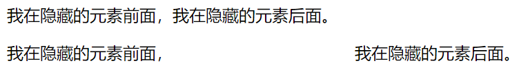
补充
display除none以外的值,均为显示元素。visibility:visible;为显示元素
# 5、常见大厂面试真题
面试题:
display:none; 与 visibility:hidden; 两者的区别 ?(字节跳动)
| 区别 | display: none | visibility: hidden |
|---|---|---|
| 空间占据性 | 不占据空间 | 占据原空间 |
| 回流与渲染性 | 会产生回流与重绘 | 不会产生回流,只会产生重绘 |
| 对子元素影响 | 子孙元素全部隐藏不可见。并且只要父元素隐藏,子孙没有任何办法可见 | 子孙元素全部不可见,但是给子孙加上 visibility: visible;时,子孙可见。 |
答案解析
# 6、去掉行内块元素默认的空白间隙
行内块元素间默认产生空隙
<style>
  span {
    /* 元素转换为行内块元素 */
    display: inline-block;
    width: 50px;
    height: 50px;
    border: 2px solid pink;
  }
</style>
<body>
  <div class="box">
    <!-- span元素转成行内块元素后,他们之间会产生空白空隙 -->
    <span>1</span>
    <span>2</span>
    <span>3</span>
    <span>4</span>
  </div>
</body>

产生间隙原因
- 元素被当成行内元素排版的时候,元素之间的空白符(空格、回车换行等)都会被浏览器处理
- 根据
white-space的处理方式(默认是 normal,合并多余空白),原来 HTML 代码中的回车换行被转成一个空白符,所以元素之间就出现了空隙。 - 这些元素之间的间距会随着字体的大小而变化
解决办法:
- 给父元素添加
font-size: 0px;同时子元素重写font-size - 给元素添加 float,但会造成父元素高度塌陷,需要清除浮动
- 图片间空隙,给图片添加
display:block;
# 6.1、给父元素添加 font-size:0; 同时子元素重写 font-size
TIP
font-size 属性有继承性,所以父元素 font-size:0; 会继承到子元素 span,则子元素需要重新设置 font-size 大小
<style>
  .box {
    /* 去掉以下span行内块元素间空隙 */
    font-size: 0;
  }
  span {
    /*
      font-size属性有继承性,所以父元素 font-size:0;
      会继承到子元素span,则子元素需要重新设置 font-size 大小
    */
    font-size: 16px;
  }
</style>

# 6.2、给元素本身添加 float
TIP
- 元素添加 float 后,会脱离文档流
- 父元素未添加高度时,会出现高度塌陷问题,则需要清除浮动造成的问题。
<style>
  span {
    /* 元素全部左浮动后,空隙就消失了 */
    float: left;
  }
</style>
# 6.3、去掉图片下面的空隙,给图片添加 display: block;
加了 display:block 之后,图片成为块级元素,独占一行
<style>
  .box {
    width: 300px;
    border: 2px solid red;
  }
  img {
    width: 300px;
    /* 把图片转成块级元素,就可以消除图片与父元素向下的间隙 */
    display: block;
  }
</style>
<body>
  <div class="box"><img src="./images/flower.jpg" alt="" /></div>
</body>
图片未加display:block;之前的效果 | 图片加上display:block;去掉向下空白间隙 |
|---|---|
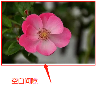 | 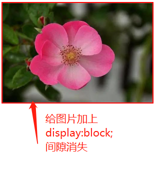 |
# 二、background 背景属性
TIP
- background 背景属性(颜色、图片、重复、位置、符合属性)
- CSS 精灵图,背景固定,背景尺寸
- 线性渐变,径向渐变,浏览器私有前缀等
# 1、background-color 背景颜色
TIP
- background-color 表示背景颜色
- 背景颜色可以用 十六进制、rgb()、rgba() 或 英文单词表示
- padding 区域是有背景颜色的
<style>
  .box {
    width: 100px;
    height: 100px;
    padding: 20px;
    /* background-color: orange; */
    /* 背景颜色及透明度 0.5 */
    background-color: rgba(245, 100, 4, 0.5);
  }
</style>
<body>
  <div class="box">1</div>
</body>

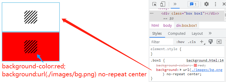
# 2、background-image 图片
TIP
background-image属性用来设置背景图片- 图片路径要写在
url()圆括号中,可以是相对路径,也可以是绝对路径
特别注意:
地址相对路径是从 css 样式的位置出发
background-image: url(./images/bg.jpg);
案例
案例目录结构
demo
├─ css
│  └─ index.css  /* css文件 */
├─ images
│  └─ luobo.png  /* 图片 */
└─ index.html
/* demo/css/index.css */
.box {
  width: 500px;
  height: 400px;
  border: 50px solid #000;
  padding: 50px 40px;
  background-color: yellow;
  /* 图片地址是从当前css样式文件位置出发,询找图片的。*/
  background-image: url(../images/luobo.png);
}
<!-- demo/index.html -->
<head>
  <link rel="stylesheet" href="css/index.css" />
</head>
<body>
  <div class="box">内容区内容区内容区内容区内容区</div>
</body>
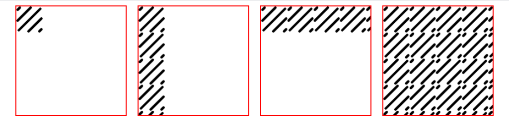
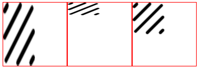
# 3、background-repeat 重复
TIP
用来设置背景图片的重复模式,在默认情况下,背景是会在 x 和 y 轴方向进行平铺。
background-repeat 属性值
| 值 | 描述 |
|---|---|
repeat; | x,y 均平铺 (默认) |
repeat-x; | x 平铺 |
repeat-y; | y 平铺 |
no-repeat; | 不平铺 |
<style>
  div {
    /* 宽度 */
    width: 200px;
    /* 高度 */
    height: 200px;
    /* 边框线 */
    border: 2px solid red;
    /* 背景图 */
    background-image: url(./images/bg48.png);
    /* 左外边距 */
    margin-left: 20px;
    /* 左浮动 */
    float: left;
  }
  .box1 {
    /* 不平铺 */
    background-repeat: no-repeat;
  }
  .box2 {
    /* y轴平铺 */
    background-repeat: repeat-y;
  }
  .box3 {
    /* x轴平铺 */
    background-repeat: repeat-x;
  }
  .box4 {
    /* x 和 y 轴平铺 */
    background-repeat: repeat;
  }
</style>
<body>
  <div class="box1"></div>
  <div class="box2"></div>
  <div class="box3"></div>
  <div class="box4"></div>
</body>
# 4、background-position 背景图片位置
TIP
- 用来控制背景图片在盒子中显示的开始位置
- 背景图片位置默认是从 padding 区开始计算
语法:
/* x与盒子左边距离  Y与盒子上边距离 */
background-position: x y;
# 4.1、数值表达法
- 固定值写法
/* 背景图与盒子左边20px  上边30px距离 */
background-position: 20px 30px;
- 单个值写法
/* 表时背景图与盒子左边间距为宽的10px,垂方向居中显示 */
background-position: 10px;
背景图片位置(数值表达法),应用案例
<style type="text/css">
  div {
    width: 100px;
    height: 100px;
    border: 2px solid red;
    /* 背景图片 */
    background-image: url(./images/bg.png);
    /* 背景图不重复 */
    background-repeat: no-repeat;
    /* 背景尺寸大小 */
    background-size: 50px 50px;
    /* 左浮动 */
    float: left;
    /* 左外边距 */
    margin-right: 10px;
  }
  .box1 {
    /* 水平30px 上边 20px */
    background-position: 30px 20px;
  }
  .box2 {
    /* 水平10px  垂直居中显示 */
    background-position: 10px;
  }
</style>
<body>
  <div class="box1"></div>
  <div class="box2"></div>
</body>

# 4.2、百分比表达法
TIP
百分比写法 x% y% ,则最后的偏移量是
- 左偏移量 =(容器 width + 左右 padding - 背景图 width)* 百分比
- 上偏移量 =(容器 height +上下 padding - 背景图 height)* 百分比
语法:
background-position: x% y%;
/*
    如果盒子宽为100px 高为200px ,内边距为0 ,
	背景图宽为 50px 高为50px
    则左边距离为 (100+0-50) * 10% = 5px;
    则上边距离为 (200+0-50) * 20% = 30px
*/
background-position: 10% 20%;
- 元素未设置 padding 属性
<style>
  .box {
    width: 200px;
    height: 100px;
    border: 2px solid red;
    /* 背景图片 */
    background-image: url(flower.jpg);
    /* 背景图片大小 */
    background-size: 50px 50px;
    /* 背景图片重复度 */
    background-repeat: no-repeat;
  }
  .box1 {
    /*
        左侧距离为 (容器宽200+0-背景图宽50) * 10 = 15px
        顶部距离为 (容器高100+0-50背景图高) * 20% = 10px
        */
    background-position: 10% 20%;
  }
  .box2 {
    background-position: 15px 10px;
  }
</style>
<body>
  <div class="box box1"></div>
  <div class="box box2"></div>
</body>
- 元素设置 padding 属性值
<style>
    .box {
        padding: 50px;
        width: 200px;
        height: 100px;
        border: 2px solid red;
        background-image: url(./images/bg.png);
        background-size: 50px 50px;
        background-repeat: no-repeat;
        /*
            左偏移量=(容器width + 左右padding - 背景图width)*百分比
            左边距=((200+50*2)-50) *20%=50px
            上偏移量=(容器height +上下padding  -  背景图 height)*百分比
            上边距=((100+50*2)-50) *30%=45px
        */
        background-position: 20% 30%;
    }
    .box1 {
        background-position: 50px 45px;
    }
</style>
<body>
    <div class="box"></div>
    <div class="box box1"></div>
</body>

- 单个值写法
语法
/*
	如果容器宽为200px 高为100px ,padding为0 ,背景图片宽为50px 高为50px;
	则背景图片与容器左边(水平)距离为 (200-50)*10%=15px
	则背景图在垂直方向上居中显示
*/
background-position: 10%;
<style type="text/css">
    div {
        width: 200px;
        height: 100px;
        border: 2px solid red;
        /* 背景图片 */
        background-image: url(bg.png);
        /* 背景图不重复 */
        background-repeat: no-repeat;
        /* 背景尺寸大小 */
        background-size: 50px 50px;
        /* 左外边距 */
        margin-right: 10px;
    }
    .box1 {
        /*
        	背景图与容器左边距离(水平)为 (200-50)*10=15px
        	背景图与容器在垂直方向上居中显示
        */
        background-position: 10%;
    }
    .box2 {
        /* 水平15px  垂直居中显示 */
        background-position: 15px;
    }
</style>
<body>
    <div class="box1"></div>
    <div class="box2"></div>
</body>

- 负值情况
<style>
  div {
    width: 200px;
    height: 100px;
    border: 2px solid red;
    /* 背景图片 */
    background-image: url(bg.png);
    /* 背景图不重复 */
    background-size: 50px 50px;
    background-repeat: no-repeat;
    /* 左外边距 */
    margin-right: 10px;
  }
  .box1 {
    /* 水平-15px 上边 -30px */
    background-position: -15px -30px;
  }
  .box2 {
    /*
        左边 (200-50) * (-10%) = -15px
        上边 (100-50) * -60% = -30px
    */
    background-position: -10% -60%;
  }
</style>
<body>
  <div class="box1"></div>
  <div class="box2"></div>
</body>

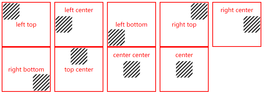
# 4.3、关键词表达法
TIP
- 可以用
(top、bottom)、(center)、(left、right)三组中的任意两个组中的一个值组合来确定位置 - 也可以用以上三组中的任意一个单个词来确定位置
/* 左上角 */
background-position: top left;
/* 左边中间 */
background-position: left center;
/* 上中间 */
background-position: top;
....
单一关键字与对应组合关键字表示法
| 单一关键字 | 等价的组合关键字 |
|---|---|
| center | center center |
| top | top center 或 center top |
| bottom | bottom center 或 center bottom |
| right | right center 或 center right |
| left | left center 或 center left |
<style>
  div {
    width: 110px;
    height: 100px;
    /* 内边距 */
    padding: 10px;
    border: 2px solid red;
    /* 浮动 */
    float: left;
    /* 左外边距 */
    margin-right: 10px;
    /* 文本水平居中 */
    text-align: center;
    /* 文本垂直居中 */
    line-height: 100px;
    /* 文字颜色 */
    color: red;
    /* 背景图片 */
    background-image: url(images/bg.png);
    /* 背景不重复 */
    background-repeat: no-repeat;
  }
  /* 左上角 */
  .box1 {
    background-position: left top;
  }
  /* 左中间 */
  .box2 {
    background-position: left center;
    line-height: 20px;
  }
  /* 左下角 */
  .box3 {
    background-position: left bottom;
  }
  /* 右上角 */
  .box4 {
    background-position: right top;
  }
  /* 右中间 */
  .box5 {
    background-position: right center;
    line-height: 20px;
  }
  /* 左下角 */
  .box6 {
    background-position: right bottom;
  }
  /* 上中间 */
  .box7 {
    background-position: top center;
  }
  /* 水平垂居中 */
  .box8 {
    background-position: center center;
    line-height: 20px;
  }
  /* 水平垂居中 */
  .box9 {
    background-position: center;
    line-height: 20px;
  }
</style>
<body>
  <div class="box1">left top</div>
  <div class="box2">left center</div>
  <div class="box3">left bottom</div>
  <div class="box4">right top</div>
  <div class="box5">right center</div>
  <div class="box6">right bottom</div>
  <div class="box7">top center</div>
  <div class="box8">center center</div>
  <div class="box9">center</div>
</body>
# 5、background-size 背景尺寸
| 属性值 | 说明 | 实例 |
|---|---|---|
| x y | x y 数值,分别表示背景图片宽高大小 | background-size: 100px 200px; |
| x% y% | 百分比是相对于盒子的宽高而言, | background-size: 50% 20%; |
| x auto | auto 是相对于第一个值宽来自动缩放 第一个值可以是数值,也可以是百分形式 | background-size: 100px auto; |
| contain | 背景图片等比缩放到正好全部容纳到盒子里 | background-size: contain; |
| cover | 背景图片等比缩放到正好撑满整个盒子,所以部分有可能会被裁剪掉 | background-size: cover; |
background-size 属性的默认值为 auto;
# 5.1、数值表示法
<style>
  div {
    width: 200px;
    height: 200px;
    border: 2px solid red;
    background-image: url(images/bg48.png);
    background-repeat: no-repeat;
  }
  .box1 {
    background-size: 100px 200px;
  }
  .box2 {
    background-size: 50% 20%;
  }
  .box3 {
    background-size: 50% auto;
  }
</style>
<body>
  <div class="box1"></div>
  <div class="box2"></div>
  <div class="box3"></div>
</body>
# 5.2、contain 和 cover 表示法
<style>
    div{
        width:200px;
        height:200px;
        border:2px solid red;
        background-image: url(images/yw.png);
        background-repeat: no-repeat;
        float: left;
        margin-right: 10px;
    }

    .box2{
        background-size: contain;
    }
    .box3{
        background-size: cover;
    }

</style>
<body>
    <div class="box1"></div>
    <div class="box2"></div>
    <div class="box3"></div>
</body>
</html>
# 6、background-attachment 背景固定
TIP
决定背景图像的位置是在 视口 内固定,或者随着包含它的区块滚动
| 属性值 | 描述 |
|---|---|
| scroll | 默认值。背景图片随着页面的滚动而滚动,相对于元素本身固定,而不是随着它的内容滚动 |
| fixed | 此关键属性值表示背景相对于视口固定。即使一个元素拥有滚动机制,背景也不会随着元素的内容滚动 |
| local | 背景相对于元素的内容固定。如果一个元素拥有滚动机制,背景将会随着元素的内容滚动,同时背景图图片随着页面的滚动而滚动 |
# 6.1、scroll 值
TIP
背景图片随着页面的滚动而滚动,相对于元素本身固定,而不是随着它的内容滚动
<style>
  body {
    height: 2000px;
  }
  .box {
    width: 400px;
    height: 400px;
    background: url("./images/flower.jpg") no-repeat;
    /* scroll为默认值,不加值也是scroll,所以加和不加效果一样 */
    background-attachment: scroll;
  }
</style>
<body>
  <div class="box"></div>
</body>
# 6.2、fixed 值
TIP
- 此关键属性值表示背景相对于视口固定。
- 即使一个元素拥有滚动机制,背景也不会随着元素的内容滚动
<style>
  body {
    height: 2000px;
  }
  .box {
    width: 400px;
    height: 400px;
    background: url("./images/flower.jpg") no-repeat;
    /* 背景图相对视口固定,拖动浏览器滚动条和元素自身滚动条,背景图都固定,不会随着内容滚动 */
    background-attachment: fixed;
    /* Y轴内容溢出显示滚动条 */
    overflow-y: auto;
  }
  .box1 {
    height: 800px;
    width: 20px;
    background-color: pink;
  }
</style>
<body>
  <div class="box">
    <div class="box1">1-2-3-4-5-6-7-8-9</div>
  </div>
</body>
# 6.3、local 值
TIP
- 背景相对于元素的内容固定
- 如果一个元素拥有滚动机制,背景将会随着元素的内容滚动,同时背景图图片随着页面的滚动而滚动
<style>
  body {
    height: 2000px;
  }
  .box {
    width: 400px;
    height: 400px;
    background: url("images/flower.jpg") no-repeat;
    /* 背景图相对视口固定,拖动浏览器滚动条和元素自身滚动条,背景图都固定,不会随着内容滚动 */
    background-attachment: local;
    /* Y轴内容溢出显示滚动条 */
    overflow-y: auto;
  }
  .box1 {
    height: 800px;
    width: 20px;
    background-color: pink;
  }
</style>
<body>
  <div class="box">
    <div class="box1">1-2-3-4-5-6-7-8-9</div>
  </div>
</body>
# 6.4、经典应用:视觉差滚动
<style>
    html,body{
        margin:0;
    }
    .one{
        height:700px;
        background-image: url(./images/1.png) ;
        background-repeat: no-repeat;
        background-position: center;
        background-size: cover;
        background-attachment: fixed; /* 背景相对于视口固定 */
    }
    .two{
        height:1000px;
        background-image: url(./images/2.png) ;
        background-repeat: no-repeat;
        background-position: center;
        background-size: cover;
    }
</style>
</head>
<body>
    <div class="one"></div>
    <div class="two"></div>
</body>
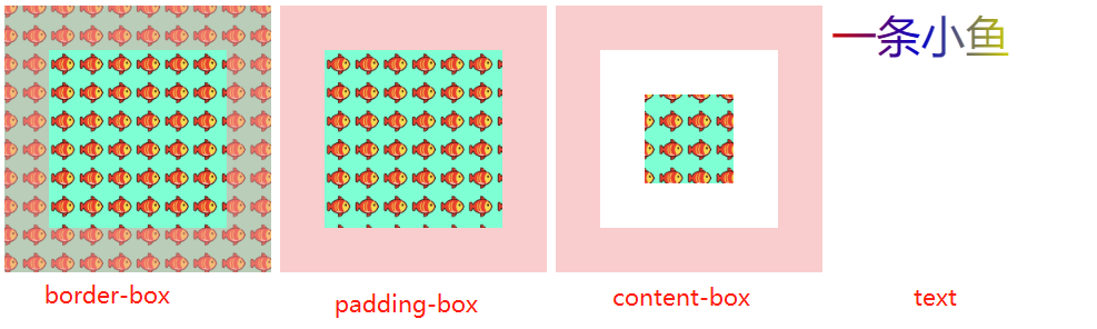
# 7、background-clip
TIP
background-clip 设置元素的背景(背景图片或颜色)是否延伸到边框、内边距盒子、内容盒子下面。
| 值 | 说明 |
|---|---|
| border-box | 默认值。背景绘制在边框方框内。 |
| padding-box | 背景绘制在内边距方框内。 |
| content-box | 背景绘制在内容方框内。 |
| text | 背景被裁剪成文字的前景色。 |
<style type="text/css">
  .box {
    width: 100px;
    height: 100px;
    border: 50px solid rgba(244, 155, 155, 0.5);
    padding: 50px;
    background-image: url(images/fish.png);
    background-color: aquamarine;
    float: left;
    margin-right: 10px;
  }
  .box1 {
    background-clip: border-box;
  }
  .box2 {
    background-clip: padding-box;
  }
  .box3 {
    background-clip: content-box;
  }
  .box4 {
    float: left;
    width: 200px;
    height: 200px;
    font-size: 50px;
    /* 背景图片 - 从红到蓝到黄的渐变色背景图 */
    background-image: linear-gradient(to right, red, blue, yellow);
    /* 背景被裁剪成文字的前景色 */
    background-clip: text;
    -webkit-background-clip: text;
    /* 文字颜色一定要设置为透明,才能看到效果 */
    color: rgba(0, 0, 0, 0.2);
  }
</style>
<body>
  <div class="box box1"></div>
  <div class="box box2"></div>
  <div class="box box3"></div>
  <div class="box4">一条小鱼</div>
</body>
# 8、background-origin
TIP
背景图片的定位区域
| 值 | 描述 |
|---|---|
| padding-box | 默认值。背景图片的摆放以 padding 区域为参考 |
| border-box | 背景图片的摆放以 border 区域为参考 |
| content-box | 背景图片的摆放以 content 区域为参考 |
<style type="text/css">
  div {
    width: 100px;
    height: 100px;
    border: 50px solid rgba(0, 0, 0, 0.5);
    padding: 50px;
    background-image: url(images/bg16.png);
    background-color: aquamarine;
    float: left;
    margin-right: 10px;
    background-repeat: no-repeat;
  }
  .box1 {
    /* 背景图片的摆放以 padding 区域为参考  默认值 ; */
    background-origin: padding-box;
  }
  .box2 {
    /* 背景图片的摆放以 border 区域为参考 */
    background-origin: border-box;
  }
  .box3 {
    /* 背景图片的摆放以 content 区域为参考 */
    background-origin: content-box;
  }
</style>
<body>
  <div class="box1"></div>
  <div class="box2"></div>
  <div class="box3"></div>
</body>

# 9、background 复合属性
TIP
- 常用的背景相关小属性,可以合写到一条 background 属性中
- background 是的 background-color、background-image、background-repeat、background-position、background-size、background-origin background-clip、属性的简写
- 工作中用的非常多
语法
background: 背景颜色 背景图 背景位置/背景大小 背景重复度 背景固定 背景定位区域
  背景延伸区域;
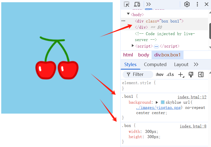
# 9.1、省略值
TIP
background 复合写法,其后面的值如果省略未写,会以默认值代替。
.box1 {
  /*
        background 综合属性
        skyblue 背景颜色
        url(./images/yingtao.png) 背景图片地址
        no-repeat 背景不重复
        center center 背景位置
    	背景大小采用默认值 auto
    	背景定位区域采用默认值 padding-box
    	背景延伸区域采用默认值 border-box

  */
  background: skyblue url(./images/yingtao.png) no-repeat center center;
}
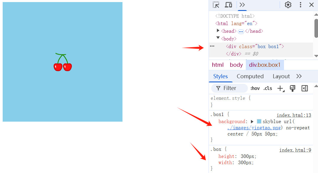
# 9.2、复合写法定义背景大小
TIP
background 属性后如果要定义背景大小,一定要定义背景位置。并且一定要遵守 背景位置/背景大小 的写法。
.box1 {
  /*
        background 综合属性
        skyblue 背景颜色
        url(./images/yingtao.png) 背景图片地址
        no-repeat 背景不重复
        center 背景位置
    	背景大小 50px  50px
    	背景定位区域采用默认值 padding-box
    	背景延伸区域采用默认值 border-box
  */
  background: skyblue url(./images/yingtao.png) no-repeat center/50px 50px;
}
/*
    省略的 背景色为透明
    images/bg.png 背景图地址
    no-repeat 背景图不重复
    center 背景图居中显示
*/
background: url(images/bg.png) no-repeat center;
# 9.3、注意事项
TIP
background 复合写法中省略的值,会覆盖前面背景小属性中定义的值
<style>
    .box {
        width: 200px;
        height: 100px;
        border: 2px solid skyblue;
    }
    .box1 {
        /* 背景颜色为红色 */
        background-color: red;
        /*
            省略的背景色为透明
            images/bg.png 背景图地址
            no-repeat 背景图不重复
            center 背景图居中显示
            写在后面的背景色透明,会覆盖前面的red
        */
        background: url(./images/bg.png) no-repeat center;
    }
    .box2 {
        /*
            省略的背景色为透明
            images/bg.png 背景图地址
            no-repeat 背景图不重复
            center 背景图居中显示
        */
        background: url(./images/bg.png) no-repeat center;
        /* 背景颜色为红色 会覆盖上面复合写法中的默认的背景色-背景色透明*/
        background-color: red;
    }
</style>
<body>
    <div class="box box1"></div>
    <div class="box box2"></div>
</body>
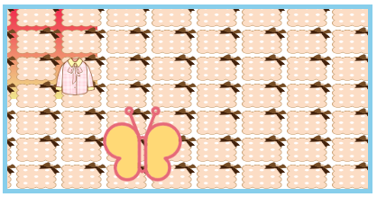
# 10、背景属性多值写法
TIP
background-image,bakground-size,bakground-position,background-repeat后面都可以设置多个值,每组值之间用逗号分隔开来。
每个属性之间用逗号分隔的值,都是按顺序一一对应的,如果对应后面的值没有写,则以当前属性设置的第一组值为默认值显示。
<style>
  .box {
    width: 400px;
    height: 200px;
    border: 5px solid skyblue;
    /*
      hd.png为蝴蝶
      yf.png为衣服
      bg.png为背景图
      linear-gradient为绘制线性渐变背景
    */
    background-image: url(./hd.png), url(./yf.png), url(./bg.png),
      linear-gradient(rgb(240, 44, 77), khaki);
    /*
      第一个no-repeat控制蝴蝶不重复
      第二个no-repeat控制衣服不重度
      第三个repeat是控制背景图重复
      没有设置第四个值,则四张图片值为第一个值no-repeat
    */
    background-repeat: no-repeat, no-repeat, repeat;
    /*
      100px 100px 为第一个图片蝴蝶大小
      50px 50px 为第二个图片衣服大小
      50px 30px 为第三个图片背景图大小
      第四个没有设置,则第四张图片大小为第一个值100px 100px
    */
    background-size: 100px 100px, 50px 50px, 50px 30px;
    /* 和上面的同理,从左往右依次为第一,二,三,四张图片位置 */
    background-position: 100px 100px, 50px 50px, 10px 20px, 0px 0px;
  }
</style>
<body>
  <div class="box"></div>
</body>
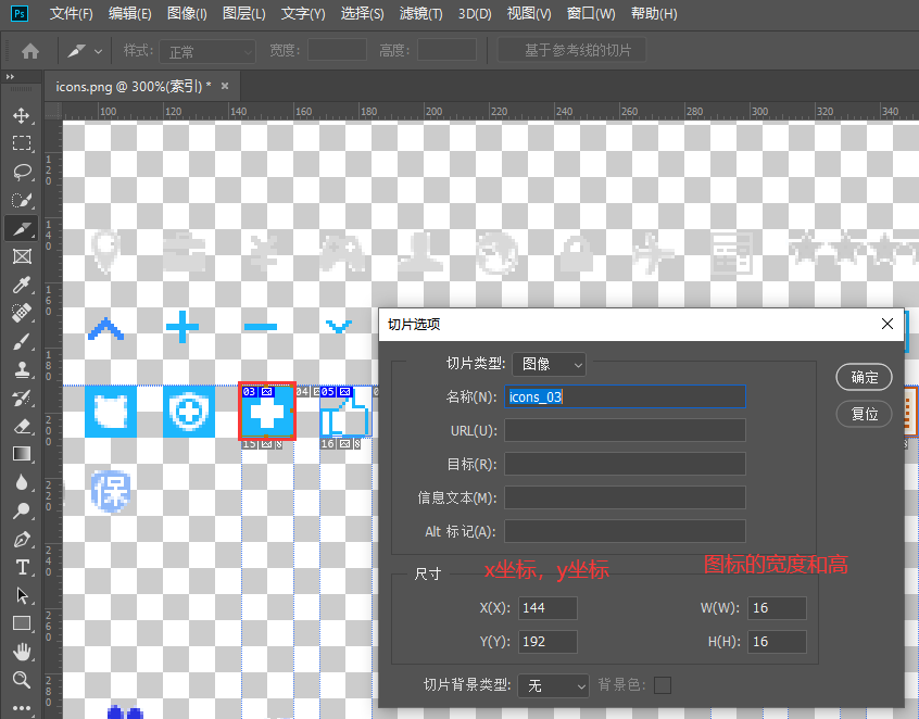
# 11、CSS 精灵图
TIP
- 将多个 小图标 合并制作到一张图片上
- 使用
background-position属性单独显示其中一个 - 这样的技术叫做 CSS 精灵技术 ,也叫作CSS 雪碧图
- CSS 精灵可以减少 HTTP 请求数,加快网页显示速度,但缺点也很明显:不方便测量,后期改动麻烦
类比法 - 方便理解
- 就好比你有 20 本本子,要从 1 楼拿到 20 楼,如果你一次拿一本,就要拿 20 次,如果你一次性把这 20 本本子拿上去,只需要拿一次就完成
- 这里一定要注意是小图,不是大图
- 就好比 20 本子你一次拿上去不费力,但是如果是 20 张桌子,那你还是得一张一张搬上去
查找百度 CSS 精灵图
点击 百度首页 logo 进入百度热搜
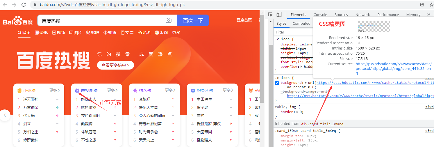
使用 PS 的切片工具,选中精灵图,测量尺寸和坐标位置
<style>
  body,
  p {
    margin: 0;
    padding: 0;
  }
  span {
    display: inline-block;
    width: 16px;
    height: 16px;
    background: url(images/icons.png);
    /* 文字和图标居中对齐 */
    vertical-align: middle;
    /* 相对定位 */
    position: relative;
    /* 向上移动 2px */
    top: -2px;
  }
  .word {
    background-position: -288px -192px;
  }
  .excel {
    background-position: -312px -192px;
  }
  .ppt {
    background-position: -336px -192px;
  }
  .pdf {
    background-position: -360px -192px;
  }
  .bbd {
    background-position: -168px -192px;
  }

  /* 通过 ::after 伪元素,添加图标 */
  .doctor::after {
    display: inline-block;
    content: "";
    width: 16px;
    height: 16px;
    background: url(images/icons.png);
    background-position: -144px -192px;
    /* 上下居中,通过相对定位移动元素 */
    position: relative;
    top: 2px;
  }
  p,
  div {
    margin: 20px;
  }
</style>
<body>
  <p>wordx<span class="word"></span>xxxx</p>
  <p>excel文档 <span class="excel"></span></p>
  <p>PPT文档 <span class="ppt"></span></p>
  <p>PDF文档 <span class="pdf"></span></p>
  <p>太棒啦 <span class="bbd"></span></p>
  <div class="doctor">严防严控</div>
</body>

# 三、线性渐变
TIP
CSS 属性 background-image 可以用 linear-gradient()函数,用于创建线性渐变背景
语法:
background-image: linear-gradient(direction, color-stop1, color-stop2, ...);
| 值 | 描述 |
|---|---|
direction | 用角度值指定渐变的方向(或角度)。 未设置角度,则默认为 180deg(从上到下) 设置了角度,则 0deg 为竖直向上,然后顺时针旋转 指定关键词 to right、to top、to bottom 、to bottom right 等 |
color-stop1, color-stop2,... | 用于指定渐变的起止颜色 ( color-stop 色标 )。 |
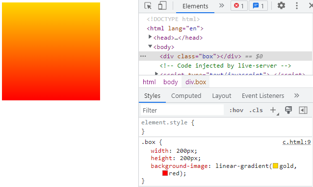
# 1、默认渐变方向
TIP
未指定渐变方向时,则默认从上向下渐变 (相当于设置了角度值 180deg)
.box1 {
  width: 200px;
  height: 200px;
  /*
      linear-gradient 线性渐变
      to right 表示渐变方向,向右ss
      gole 表示开始颜色
      red 表示结束颜色
  */
  background-image: linear-gradient(gold, red);
}
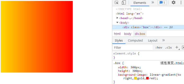
# 2、关键字指定渐变的方向
| 关键词 | 说明 |
|---|---|
| top | 从下到上渐变 |
| bottom | 从上到下渐变 |
| left | 从右到左渐变 |
| right | 从左右渐变 |
.box1 {
width: 200px;
height: 200px;
/*
linear-gradient 线性渐变
to right 表示渐变方向,向右
gole 表示开始颜色
red 表示结束颜色
*/
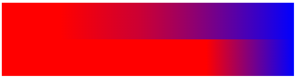
background-image: linear-gradient(to right, gold, red);
}
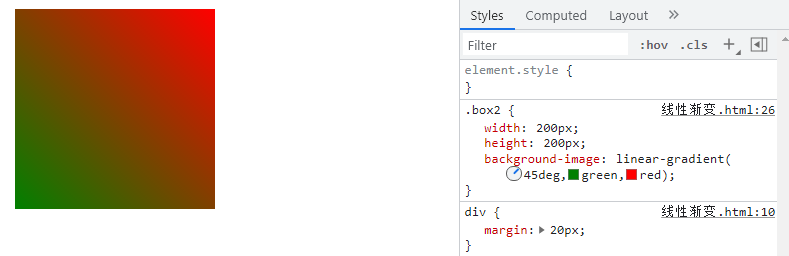
# 3、用度数指定渐变方向
TIP
渲染的效果是,颜色从下往上渐变,然后旋转一定的角度。
- 角度为正值,则顺时针旋转
- 角度为负值,则逆时针旋转
.box2 {
  width: 200px;
  height: 200px;
  /* 45deg 表示倾斜方向,deg表示度数 */
  background-image: linear-gradient(45deg, green, red);
}
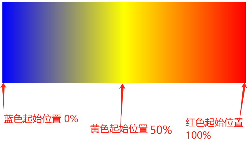
# 4、设置颜色(色标)的起始位置
TIP
在颜色的后面紧跟着一个 空格 和 值(数值或百分值都可以)来指定颜色的起始位置
<style>
  .box3 {
    width: 600px;
    height: 200px;
    /*
        blue 代表蓝色
        0% 表示蓝色出现的位置
        yellow 代表黄色
        50% 表示黄色出现的位置
        red 代表红色
        100% 表示红色出现的位置
        */
    background-image: linear-gradient(to right, blue 0%, yellow 50%, red 100%);
  }
</style>
<body>
  <div class="box3"></div>
</body>
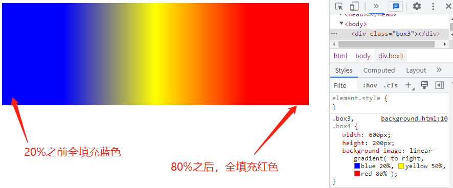
# 5、注意事项
未设置 0% 的起始色 与 100%的终止色
- 默认情况下,如果未设置 0% 的起始色,则起始色为声明的第一个颜色。
- 不管最后一种颜色出现位置有无设置,或设置值为多少,最后一个颜色都将持续到 100%的位置 。
<style>
  .box3,
  .box4 {
    width: 600px;
    height: 200px;
    /*
            blue 代表蓝色
            20% 表示蓝色出现的位置
            yellow 代表黄色
            50% 表示黄色出现的位置
            red 代表红色
            80% 表示红色出现的位置
        */
    background-image: linear-gradient(to right, blue 20%, yellow 50%, red 80%);
  }
</style>
<body>
  <div class="box3"></div>
</body>
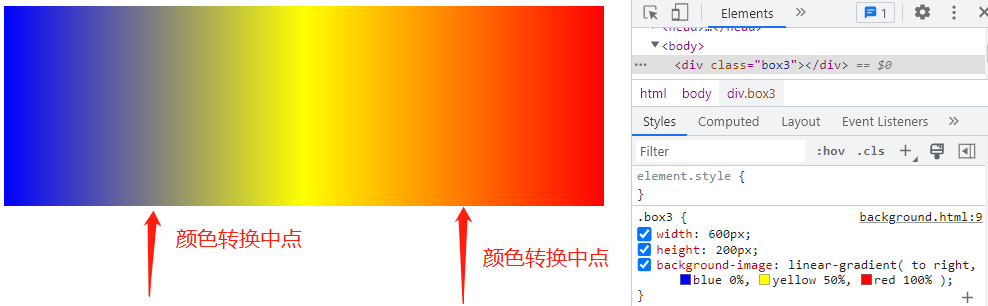
# 6、自定义转换中点
默认转换中点
默认情况下,从一个颜色的平滑的过渡到另一个颜色,两颜色之间的中点是两个颜色转换的中点(过渡中点)
<style>
  .box3 {
    width: 600px;
    height: 200px;
    /*
            blue 代表蓝色
            0% 表示蓝色出现的位置
            yellow 代表黄色
            50% 表示黄色出现的位置
            red 代表红色
            100% 表示红色出现的位置
        */
    background-image: linear-gradient(to right, blue 0%, yellow 50%, red 100%);
  }
</style>
<body>
  <div class="box3"></div>
</body>
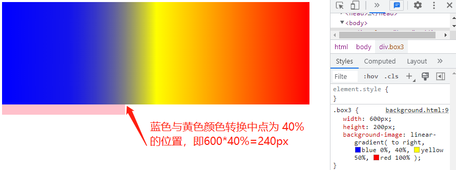
自定义转换中点
你可以将中点移动到这两个颜色之间的任意位置,方法是在两个颜色之间添加未标记颜色的 %分值,以指示颜色的中转位置
<style>
  .box3 {
    width: 600px;
    height: 200px;
    /*
            blue 代表蓝色
            0% 表示蓝色出现的位置
        	40% 表示蓝色与黄色的颜色转换中心
            yellow 代表黄色
            50% 表示黄色出现的位置
            red 代表红色
            100% 表示红色出现的位置
        */
    background-image: linear-gradient(
      to right,
      blue 0%,
      40%,
      yellow 50%,
      red 100%
    );
  }
  .box4 {
    width: 240px;
    height: 20px;
    background-color: pink;
  }
</style>
<body>
  <div class="box3"></div>
  <div class="box4"></div>
</body>
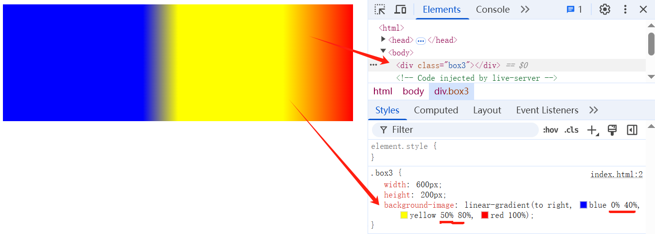
# 7、设置多位置色标
TIP
可以在一个颜色后面出现多个色标值。
background-image:
linear-gradient(to right, blue 0% 40% , yellow 50% 80%, red 100%);
}
/* 以上 css 等同于下面 */
background-image:
linear-gradient(to right, blue 0%, blue 40%, yellow 50% , yellow 80%,red 100%);
案例:色标渐变卡
这个示例使用了多位置的色标,两个相邻的颜色有相同的色标值,形成了条纹效果。

<style>
  .color-guid {
    height: 100px;
    background: linear-gradient(
      to right,
      red 20%,
      orange 20% 40%,
      yellow 40% 60%,
      green 60% 80%,
      blue 80%
    );
  }
</style>
<div class="color-guid"></div>
# 8、区分多位置色标与转换中点
<style>
  .box {
    width: 800px;
    height: 100px;
  }
  .linear1 {
    background: linear-gradient(
      to right,
      /* 0 到 20% 之间都是 红色 */ red 20%,
      /* 70% 为 红色到蓝色渐变的中心位置 */ 70%,
      blue 100%
    );
  }
  .linear2 {
    background: linear-gradient(
      to right,
      /* 0 到 70% 之间都是 红色 */ red 20% 70%,
      /* 70% 和 100% 之间为 红到蓝的渐变*/ blue 100%
    );
  }
</style>

<div class="box linear1"></div>
<div class="box linear2"></div>
案例:色标渐变卡
<style>
  .color-guid {
    height: 100px;
    background: linear-gradient(
      to right,
      red 20%,
      orange 20%,
      40%,
      yellow 40%,
      60%,
      green 60%,
      80%,
      blue 80%
    );
  }
</style>
<div class="color-guid"></div>
# 9、浏览器私有前缀
TIP
- 不同浏览器有不同的私有前缀,用来对实验性质的 CSS 属性加以标识
- 阅读 MDN 官方文档,了解浏览器引擎前缀 (opens new window)
| 浏览器 | 前缀 |
|---|---|
| Chrome 、Edeg 、Safari、Opera | -webkit- |
| Firefox 火狐 | -moz- |
| 旧版 ( IE、Edge) | -ms- |
| 旧版 Opera 欧朋 | -o- |
以下写法是为了保证兼容低版本的浏览器
background-image: -webkit-linear-gradient(to right, gold, red);
background-image: -moz-linear-gradient(to right, gold, red);
background-image: -ms-linear-gradient(to right, gold, red);
background-image: -o-linear-gradient(to right, gold, red);
background-image: linear-gradient(to right, gold, red);
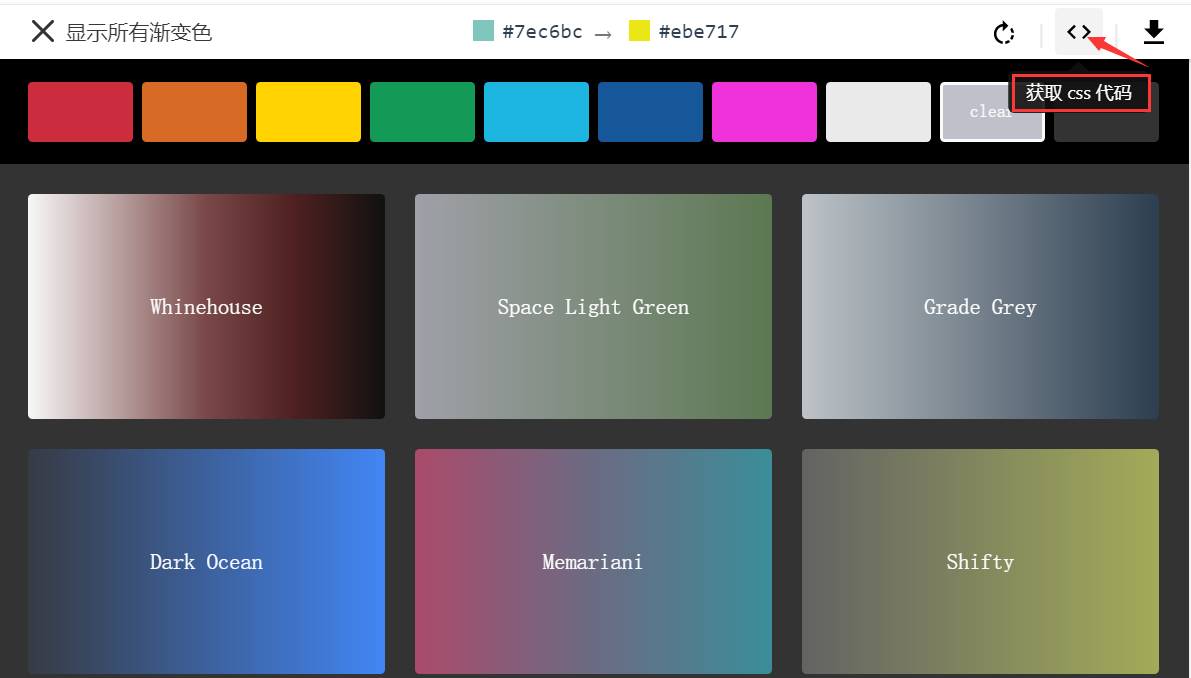
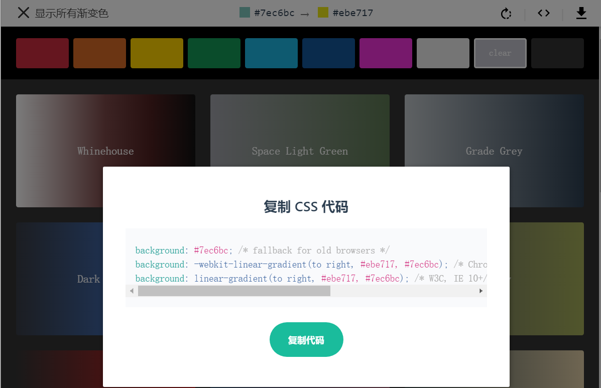
# 10、渐变色工具
# 11、实战案例 - 实现分隔线

<style>
  .line {
    width: 600px;
    height: 2px;
    background-image: linear-gradient(to right, transparent, #666, transparent);
  }
</style>

<div class="line"></div>
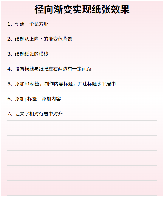
# 12、实战案例 - 绘制纸张
<style>
  h1,
  p {
    margin: 0;
  }
  .page {
    width: 500px;
    height: 650px;
    padding: 0px 20px;
    background-image: linear-gradient(to bottom, transparent 49px, #ddd 49px),
      linear-gradient(to bottom, rgb(252, 231, 235), #fff, rgb(252, 231, 235));

    /* 背景图大小 */
    background-size: auto 50px, auto auto;
    /*控制背景的延伸区域 */
    background-clip: content-box, border-box;
  }
  h1 {
    line-height: 50px;
    text-align: center;
  }
  p {
    line-height: 50px;
  }
</style>
<div class="page">
  <h1>径向渐变实现纸张效果</h1>
  <p>1、创建一个长方形</p>
  <p>2、绘制从上向下的渐变色背景</p>
  <p>3、绘制纸张的横线</p>
  <p>4、设置横线与纸张左右两边有一定间距</p>
  <p>5、添加h1标签,制作内容标题,并让标题水平居中</p>
  <p>6、添加p标签,添加内容</p>
  <p>7、让文字相对行居中对齐</p>
</div>
# 13、实战案例-绘制棋盘

<style>
  .board {
    width: 399px;
    height: 399px;
    border: 3px solid #654321;
    border-radius: 5px; /* 圆角 */
    background-color: #deb887;
    /* 绘制横线 和 竖线 */
    background-image: linear-gradient(
        to bottom,
        transparent 39px,
        #654321 39px
      ), linear-gradient(to right, transparent 39px, #654321 39px);
    background-size: auto 40px, 40px auto;
  }
  /* 以下两个css选择器代码,看不懂没关系,不做要求,
    等后面学完 grid 网格布局和flex弹性布局后再回头看,就能理解*/
  .grid {
    display: grid; /* 网格布局*/
    /* 创建15x15网格 */
    grid-template-columns: repeat(10, 1fr);
    grid-template-rows: repeat(10, 1fr);
  }
  .grid .item {
    display: flex;
    align-items: center;
    justify-content: center;
  }
</style>

<div class="board grid">
  <!-- 每一格里面要放的内容,可以用后面学到的网格布局来实现 -->
  <div class="item">1</div>
  <div class="item">2</div>
  <div class="item">3</div>
  <div class="item">4</div>
</div>
# 四、径向渐变
TIP
- CSS 属性
background-image可以用radial-gradient()函数创建径向渐变背景图 - 径向渐变是指由中心向四周的渐变
- 径向渐变 (Radial gradients) 是由 渐变形状,渐变大小、*中心点、*两个或多个色值结束点(color stops)**定义而成。
语法
background-image: radial-gradient(
  /*shap 渐变形状  size 渐变半径大小  at position 渐变中心点*/ shape size at
    position,
  /* 渐变起始色 */ start-color,
  /* 中间还可以定义多个颜色 */...,
  /* 渐变结束色 */ end-color
);
| 值 | 描述 |
|---|---|
| shape | 确定圆的类型 ellipse (默认):指定椭圆形的径向渐变 circle :指定圆形的径向渐变 |
| size | 定义渐变形状的大小 ,可能值: farthest-corner (默认) : 指定径向渐变的半径长度为从圆心到离圆心最远的角 closest-side :指定径向渐变的半径长度为从圆心到离圆心最近的边 closest-corner : 指定径向渐变的半径长度为从圆心到离圆心最近的角 farthest-side :指定径向渐变的半径长度为从圆心到离圆心最远的边 可定义一个长度值,确定渐变圆形的半径大小 可以定义两个长度值,确定渐变的椭圆大小,第一值为水平半径,第二值为垂直半径 |
| position | 定义渐变的中心位置 可能值:center(默认):设置中间为径向渐变圆心的纵坐标值。top:设置顶部为径向渐变圆心的纵坐标值。bottom:设置底部为径向渐变圆心的纵坐标值。 |
| start-color, ...,end-color | 用于指定渐变的起止颜色 |
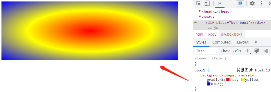
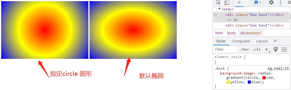
# 1、简单的径向渐变
TIP
默认起始点为元素中心点,默认形状为椭圆,默认尺寸大小为 farthest-corner,颜色节点均匀分布
<style>
    .box {
        width: 600px;
        height: 200px;
    }
    .box1 {
        /*
        red代表红色
        yellow代表黄色
        blue代表蓝色
        未定义位置时,默认以元素中心位置为起点向四周渐变
        未定义渐变类型,默认是以椭圆形的径向渐变
        */
        background-image: radial-gradient(red, yellow, blue);
    }
</style>
<body>
    <div class="box box1"></div>
</body>
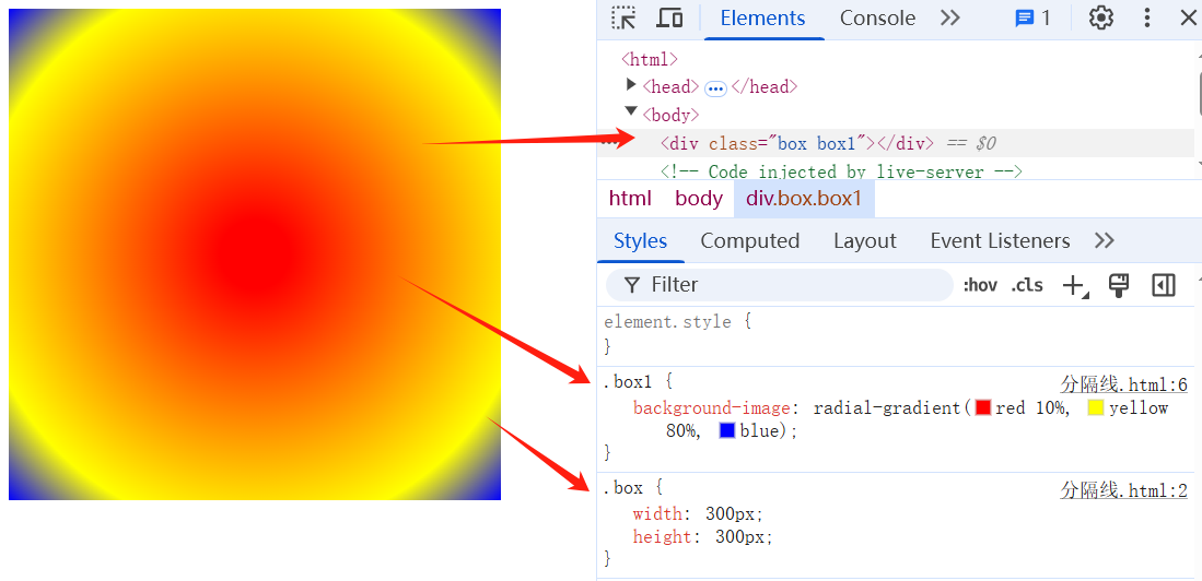
# 2、设置色标(颜色)的起始位置
TIP
在颜色的后面紧跟着一个空格和色标值(数值或百分值都可以)来指定颜色的起始位置
- 默认情况下,如果未设置 0% 的起始色,则起始色为声明的第一个颜色。
- 在径向渐变中,不管最后一种颜色出现位置有无设置,或设置值为多少,最后一个颜色都将持续到把整个容器填满 。
<style>
  .box {
    width: 300px;
    height: 300px;
  }
  .box1 {
    /*
        red代表红色
        10%代表红色起始点
        yellow代表黄色
        80% 代表黄色起始点
        blue代表蓝色
        */
    background-image: radial-gradient(red 10%, yellow 80%, blue);
  }
</style>

<body>
  <div class="box box1"></div>
</body>
# 3、自定义转换中点(过渡中点)
TIP
在两个过渡色中间填写非颜色的值(数值或百分值),指定两个过渡色转换中心位置
<style>
  .box2 {
    /*
        red代表红色
        10%代表红色起始点
        第二个10%代表红色与黄色的转换中点
        yellow代表黄色
        80% 代表黄色起始点
        blue代表蓝色
        */
    background-image: radial-gradient(red 10%, 10%, yellow 80%, blue);
  }
</style>
<div class="box box2"></div>
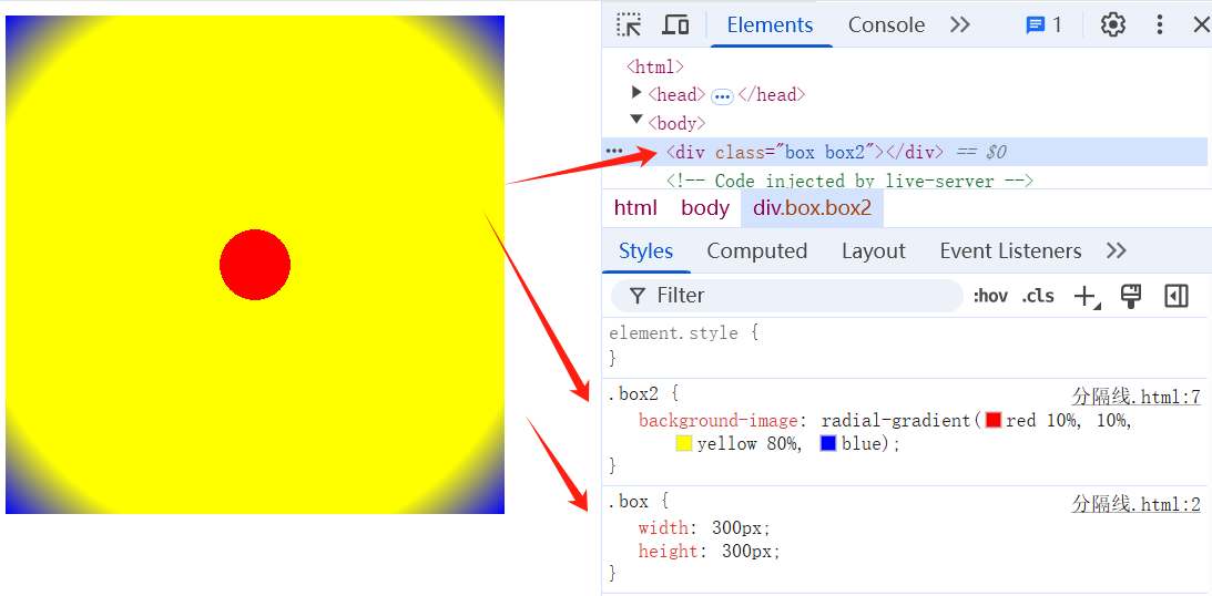
# 4、设置多位置色标(颜色)
TIP
可以在一个颜色后面出现多个色标值。
两个相邻的颜色有相同的色标值,就会形成条纹效果。
<style>
  .box {
    width: 300px;
    height: 300px;
  }
  .color-guid {
    background-image: radial-gradient(
      /* 0% 到 50% 都为红色*/ red 50%,
      /* 50% 到 60% 都为黄色 */ yellow 50% 60%,
      /* 60% 到 70% 都为绿色*/ green 60% 70% /* 70% 到 100% 都为绿色*/
    );
  }
</style>
<body>
  <div class="box color-guid"></div>
</body>

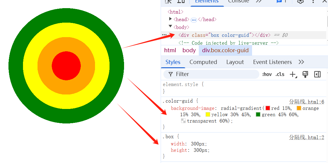
案例:环形圆盘
这个示例使用了多位置的色标,两个相邻的颜色有相同的色标值,形成了条纹效果。
<style>
  .box {
    width: 300px;
    height: 300px;
  }
  .color-guid {
    background-image: radial-gradient(
      red 15%,
      orange 15% 30%,
      yellow 30% 45%,
      green 45% 60%,
      transparent 60%
    );
  }
</style>
<body>
  <div class="box color-guid"></div>
</body>
# 5、设置径向渐变的形状 shape
TIP
shape 参数定义了形状。它可以是值 circle 或 ellipse。其中,circle 表示圆形,ellipse 表示椭圆形。默认值是 ellipse
<style>
  .box {
    width: 300px;
    height: 200px;
    border: 2px solid #fff;
    float: left;
  }
  .box1 {
    /*
        circle 指定椭圆形的径向渐变
        red 代表红色
        yellow代表黄色
        blue代表蓝色
        */
    background-image: radial-gradient(circle, red, yellow, blue);
  }
  .box2 {
    background-image: radial-gradient(red, yellow, blue);
  }
</style>
<body>
  <div class="box box1"></div>
  <div class="box box2"></div>
</body>
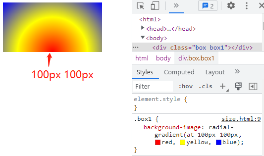
# 6、指定径向渐变中心位置 position
TIP
设置渐变中心位置与设置背景图位置相似,属性值可以采用固定值、百分比值、关键词 三种写法。
- 百分比值相对于背景图
background-size大小而言。不过如果渐变图形是圆时,百分比不会生效;只有渐变是椭圆时才会生效,并且 x y 半径都要指定。
<style>
  .box {
    width: 200px;
    height: 100px;
    margin: 0px 2px;
    float: left;
    color: #fff;
  }
  .box1 {
    /*
            at 100px 100px代表径向渐变的中心点
            red代表红色
            yellow 代表黄色
            blue代表蓝色
        */
    background-image: radial-gradient(at 100px 100px, red, yellow, blue);
  }
</style>
<body>
  <div class="box box1"></div>
</body>
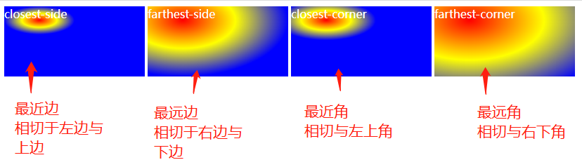
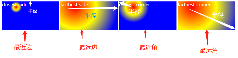
# 5、指定不同尺寸的大小 size
size 参数定义了渐变的大小。它可以是以下四个值:
| 值 | 描述 |
|---|---|
| farthest-corner | (默认) : 渐变的边缘形状与容器距离渐变中心点最远的一个角相交。 |
| closest-side | (圆形)渐变的边缘形状与容器距离渐变中心点最近的一边相切 (椭圆)距离渐变中心点最近的垂直和水平边相切。 |
| closest-corner | 渐变的边缘形状与容器距离渐变中心点最近的一个角相交(水平与垂直边相交)。 |
| farthest-side | 与 closest-side 相反,边缘形状与容器距离渐变中心点最远的一边相切(或最远的垂直和水平边)。 |
# 5.1、椭圆径向渐变
<style>
  .box {
    width: 200px;
    height: 100px;
    margin: 0px 2px;
    float: left;
    color: #fff;
  }
  .box1 {
    /*
        closest-side 最近的边
        50px 20px为径向椭圆的中心点
        red代表红色
        yellow 代表黄色
        blue代表蓝色
     */
    background-image: radial-gradient(
      closest-side at 50px 20px,
      red,
      yellow,
      blue
    );
  }
  .box2 {
    background-image: radial-gradient(
      farthest-side at 50px 20px,
      red,
      yellow,
      blue
    );
  }
  .box3 {
    background-image: radial-gradient(
      closest-corner at 50px 20px,
      red,
      yellow,
      blue
    );
  }
  .box4 {
    background-image: radial-gradient(
      farthest-corner at 50px 20px,
      red,
      yellow,
      blue
    );
  }
</style>
<body>
  <div class="box box1">closest-side</div>
  <div class="box box2">farthest-side</div>
  <div class="box box3">closest-corner</div>
  <div class="box box4">farthest-corner</div>
</body>
# 5.2、圆形径向渐变
<style>
  .box {
    width: 200px;
    height: 100px;
    margin: 0px 2px;
    float: left;
    color: #fff;
  }
  .box1 {
    /*
        circle 表示圆形的径向渐变
        closest-side 最近的边
        50px 20px为径向椭圆的中心点
        red代表红色
        yellow 代表黄色
        blue代表蓝色
     */
    background-image: radial-gradient(
      circle closest-side at 50px 20px,
      red,
      yellow,
      blue
    );
  }
  .box2 {
    background-image: radial-gradient(
      circle farthest-side at 50px 20px,
      red,
      yellow,
      blue
    );
  }
  .box3 {
    background-image: radial-gradient(
      circle closest-corner at 50px 20px,
      red,
      yellow,
      blue
    );
  }
  .box4 {
    background-image: radial-gradient(
      circle farthest-corner at 50px 20px,
      red,
      yellow,
      blue
    );
  }
</style>
<body>
  <div class="box box1">closest-side</div>
  <div class="box box2">farthest-side</div>
  <div class="box box3">closest-corner</div>
  <div class="box box4">farthest-corner</div>
</body>
# 5.3、指定渐变的半径
<style>
  .box {
    width: 300px;
    height: 300px;
    float: left;
  }
  .circle {
    background-image: radial-gradient(
      circle 50px,
      red,
      yellow,
      blue 100%,
      transparent 100%
    );
  }
  .ellipse {
    background-image: radial-gradient(
      ellipse 100px 50px,
      red,
      yellow,
      blue 100%,
      transparent 100%
    );
  }
</style>
<body>
  <div class="box circle"></div>
  <div class="box ellipse"></div>
</body>
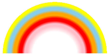
# 6、实战案例: 绘制彩虹
<style>
  .rainbow {
    width: 600px;
    height: 300px;
    border: 1px solid red;
    /*  径向渐变
      圆形渐变  最远边相切 圆心在底部中心
     */
    background-image: radial-gradient(
      circle farthest-side at bottom center,
      white 40%,
      pink 50%,
      pink 55%,
      red 60%,
      red 65%,
      orange 70%,
      orange 75%,
      skyblue 80%,
      skyblue 85%,
      yellow 90%,
      yellow 95%,
      white 95%
    );
  }
</style>

<body>
  <div class="rainbow"></div>
</body>
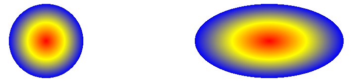
# 7、实战案例:发光的毛毛球

<style>
  body {
    background-color: #000;
  }
  .ball {
    width: 100px;
    height: 100px;
    background-image: radial-gradient(yellow 5%, transparent 60%, transparent);
  }
</style>
<div class="ball"></div>
# 8、实战案例:发光按扭
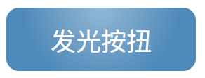
<style>
  body {
    background-color: #000;
  }
  .glow-btn {
    width: 120px;
    height: 40px;
    border-radius: 8px;
    color: white;
    text-align: center;
    line-height: 40px;
    background-color: #4d89b9; /* 按扭背景色 */
    /* 径向渐变  圆形渐变 圆心位于为元素水平 50%  垂直0% 的位置*/
    background-image: radial-gradient(
      circle at 50% 0%,
      rgba(255, 255, 255, 0.4),
      /* 超始颜色色 */ transparent 70% /* 结束颜色为透明*/
    );
  }
</style>
<div class="glow-btn">发光按扭</div>
# 9、实战案例: 波点背景

<style>
  .dot-pattern {
    width: 100%;
    height: 200px;
    /* 背景图 */
    background-image: radial-gradient(
      circle at 5px 5px,
      #4a4a4a 2px,
      transparent 3px
    );
    background-color: #fff; /* 背景颜色 */
    /* 背景图大小 */
    background-size: 20px 20px;
  }
</style>
<div class="dot-pattern"></div>
# 五、锥形渐变
TIP
- CSS 属性
background-image可以用conic-gradient()函数创建圆锥渐变背景图 - 圆锥渐变的渐变颜色围绕一个中心点旋转进行过渡。
语法
background-image: conic-gradient(
  /* angle 顺时针方向的渐变旋转角度  at position 渐变中心点 */ angle at position,
  /* 开始颜色 */ start-color,
  ...,
  /* 结束颜色 */ end-color
);
| 值 | 描述 |
|---|---|
| angle | 定义顺时针方向的渐变旋转角度 值写法: from 角度值 如 from 45deg默认值:from 0deg |
| position | 定义渐变的中心位置 使用与 background-position (opens new window) 属性相同的值,定义渐变的中心。如果省略,默认值是 center,表示渐变是居中的。 |
| start-color, ... , end-color | 定义渐变的颜色(色标) 颜色值,然后后面可以根一个或两个可选的色标位置。 两个颜色之间可以定义插值(数值),这个值决定了两个颜色的过渡中点 |
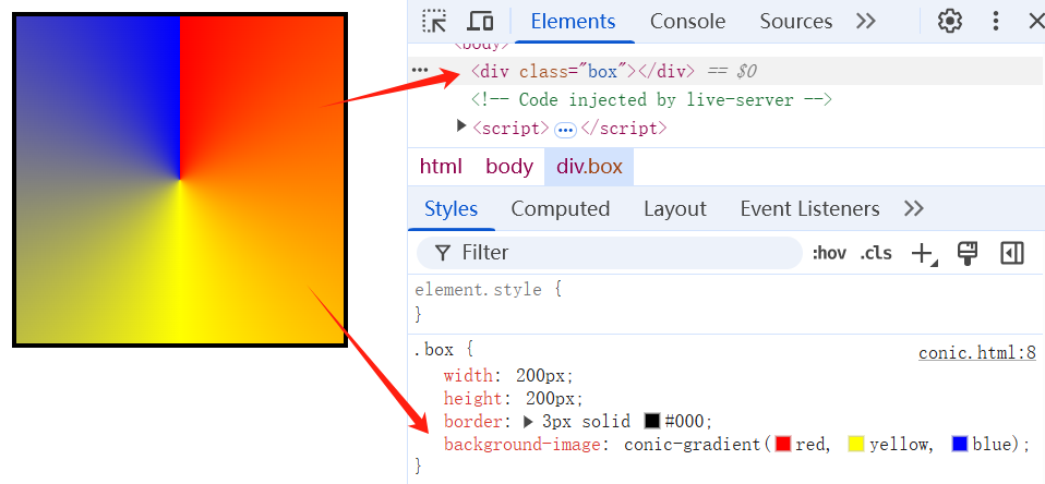
# 1、简单的径向渐变
<style>
  .box {
    width: 200px;
    height: 200px;
    border: 3px solid #000;
    /* 锥形渐变 */
    background-image: conic-gradient(red, yellow, blue);
  }
</style>

<div class="box"></div>
# 2、设置渐变旋转角度
<style>
  .box {
    width: 200px;
    height: 200px;
    border: 3px solid #000;
    /* 锥形渐变 */
    background-image: conic-gradient(from 45deg, red, yellow, blue);
  }
</style>

<div class="box"></div>
# 3、设置渐变中心位置
<style>
  .box {
    width: 200px;
    height: 200px;
    border: 3px solid #000;
    float: left;
  }
  .conic1 {
    /* 锥形渐变
        at 50px 50px 表示渐变中心点坐标
        */
    background-image: conic-gradient(
      from 45deg at 50px 50px,
      red,
      yellow,
      blue
    );
  }
  .conic2 {
    /* at left center 表示渐变中心点坐标 */
    background-image: conic-gradient(
      from 45deg at left center,
      red,
      yellow,
      blue
    );
  }
</style>

<div class="box conic1"></div>
<div class="box conic2"></div>

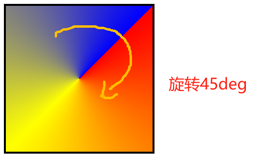
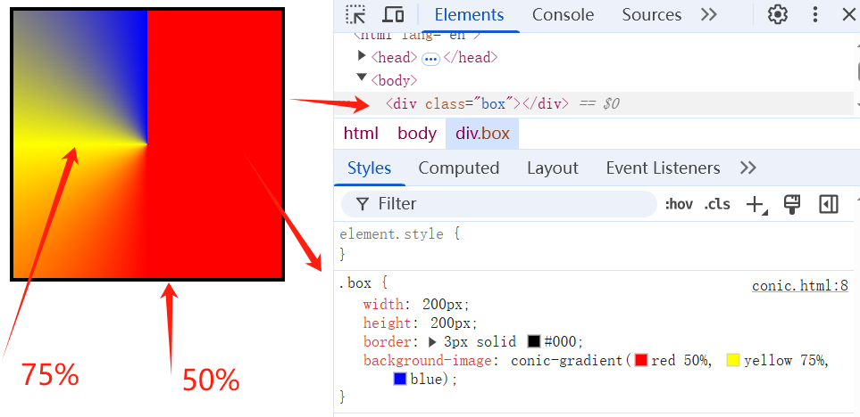
# 4、设置颜色(色标)的位置(起始位置)
TIP
在颜色的后面紧跟着一个空格和色标值(度数 或 百分值都可以)来指定颜色的起始位置
百分比值相对的是
360deg而言。比如 50% ,则相当于360 * 50%=180deg
- 默认情况下,如果未设置 0% 的起始色,则起始色为声明的第一个颜色。
- 不管最后一种颜色出现位置有无设置,或设置值为多少,最后一个颜色都将持续到 100% 的位置 。
<style>
  .box {
    width: 200px;
    height: 200px;
    border: 3px solid #000;
    /* 锥形渐变 */
    background-image: conic-gradient(red 50%, yellow 75%, blue);
    /* 上面 锥形渐变和下面的锥形渐变效果是一样的*/
    background-image: conic-gradient(red 180deg, yellow 270deg, blue);
  }
</style>
<div class="box"></div>
# 5、自定义转换中点(过渡中点)
<style>
  .box {
    width: 200px;
    height: 200px;
    border: 3px solid #000;
    float: left;
  }
  .conic1 {
    /* 锥形渐变 */
    background-image: conic-gradient(red 50%, yellow 75%, 80%, blue);
  }
  .conic2 {
    /* 锥形渐变 */
    background-image: conic-gradient(red 50%, yellow 75%, 75%, blue);
  }
</style>
<div class="box conic1"></div>
<div class="box conic2"></div>
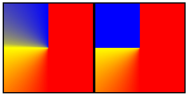
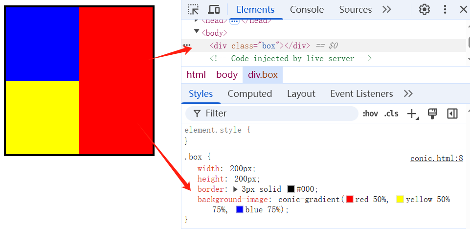
# 6、设置多位置颜色(色标)
TIP
可以在一个颜色后面出现多个色标值。
两个相邻的颜色有相同的色标值,就会形成条纹效果。
<style>
  .box {
    width: 200px;
    height: 200px;
    border: 3px solid #000;
    /* 锥形渐变 */
    background-image: conic-gradient(red 50%, yellow 50% 75%, blue 75%);
    /* 上面 锥形渐变和下面的锥形渐变效果是一样的*/
    background-image: conic-gradient(
      red 180deg,
      yellow 180deg 270deg,
      blue 270deg
    );
  }
</style>
<div class="box"></div>
# 7、实战案例:彩色饼图

<style>
  .pie-chart {
    width: 200px;
    height: 200px;
    border-radius: 50%;
    background-color: plum;
    background: conic-gradient(
      from 45deg,
      tomato 35%,
      skyblue 35% 60%,
      yellow 60% 75%,
      green 75% 90%,
      plum 90%
    );
  }
</style>
<div class="pie-chart"></div>
# 8、实战案列: 圆环加载执示器
| 本质就是锥形渐变,然后不定的旋转 | 用一个黑色圆形盖在锥形渐变层的上方,就看到如下效果 |
|---|---|
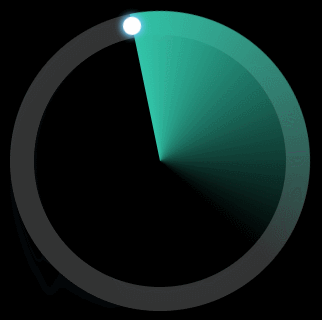 | 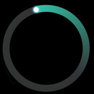 |
绘制如上图所示的锥形渐变
<style>
.loading{
    width:300px;
    height:300px;
    border-radius: 50%;
    background: conic-gradient(#32c5a9 0%, transparent 40%, transparent);
}
</style>
<div class="loading"></div>
完整源码
以下是这个案例的完整源码,目前看不懂没有关系,等后面这完 CSS3 动画时,再回过头来看代码实现,就可以看懂了。
<style>
  body {
    background-color: #000;
  }
  /* 圆环 */
  .container {
    position: relative;
    box-sizing: border-box;
    width: 200px;
    height: 200px;
    margin: 50px auto;
    border-radius: 50%;
    border: 16px solid #333;
  }
  /* 旋转的进度条 */
  .circle {
    position: absolute;
    top: -16px;
    left: -16px;
    bottom: -16px;
    right: -16px;
    border-radius: 50%;
    background: conic-gradient(#32c5a9 0%, transparent 40%, transparent);
    animation: rotate 3s ease-in-out infinite;
    transform-origin: 50% 50%;
  }
  /* 填充圆坏内区域 */
  .circle::before {
    content: "";
    position: absolute;
    top: 16px;
    left: 16px;
    bottom: 16px;
    right: 16px;
    background: #000;
    border-radius: 50%;
  }
  /* 环形头部小圆 */
  .circle::after {
    content: "";
    position: absolute;
    width: 12px;
    height: 12px;
    top: 0;
    left: 50%;
    transform: translate(-50%, 2px);
    border-radius: 50%;
    background: #fff;
    box-shadow: 0 0 4px 2px rgb(108, 199, 241);
  }

  /* 旋转动画 */
  @keyframes rotate {
    100% {
      transform: rotate(-360deg);
    }
  }
</style>

<div class="container">
  <div class="circle"></div>
</div>
# 六、其它常用属性
TIP
鼠标样式,外轮廓,超出部分隐藏,vertical-align 属性
# 1、cursor 鼠标样式
TIP
- 设置光标的类型,在鼠标指针悬停在元素上时显示相应样式
- 更多属性值看官方文档 👆 (opens new window)
| 值 | 描述 |
|---|---|
| url | 需使用的自定义光标的 URL。注释:请在此列表的末端始终定义一种普通的光标,以防没有由 URL 定义的可用光标。 |
| default | 默认光标(通常是一个箭头) |
| auto | 默认。浏览器设置的光标。 |
| crosshair | 光标呈现为十字线。 |
| pointer | 光标呈现为指示链接的指针(一只手) |
| move | 此光标指示某对象可被移动。 |
| e-resize | 此光标指示矩形框的边缘可被向右(东)移动。 |
| ne-resize | 此光标指示矩形框的边缘可被向上及向右移动(北/东)。 |
| nw-resize | 此光标指示矩形框的边缘可被向上及向左移动(北/西)。 |
| n-resize | 此光标指示矩形框的边缘可被向上(北)移动。 |
| se-resize | 此光标指示矩形框的边缘可被向下及向右移动(南/东)。 |
| sw-resize | 此光标指示矩形框的边缘可被向下及向左移动(南/西)。 |
| s-resize | 此光标指示矩形框的边缘可被向下移动(南)。 |
| w-resize | 此光标指示矩形框的边缘可被向左移动(西)。 |
| text | 此光标指示文本。 |
| wait | 此光标指示程序正忙(通常是一只表或沙漏)。 |
| help | 此光标指示可用的帮助(通常是一个问号或一个气球)。 |
关于 url 这个值需要注意:
- ① 图片地址,在实际开发中一般为绝对路径
- ② 图片大小最好是
32*32的大小(各浏览器支持大小不一,但 32 都 ok) - ③ 图片格式,不同浏览器格式不一,可以是 png、svg、ico、cur,一般以 ico 和 cur 为主
ico 在线图标生成器,点击查看 👆 (opens new window)
html {
  /* 图片地址,在实际开发中一般为绝对路径
    	除了前面的图片,后面还需要指定一个鼠标样式,否则不生效
    */
  cursor: url("http://127.0.0.1:5500/images/fish.ico"), pointer;
}
/* 当没有找到自定义图标,就会用pointer效果 */
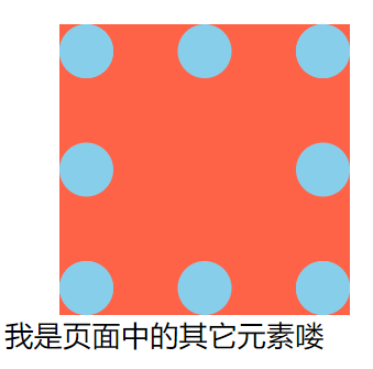
# 2、outline 外轮廓
TIP
这个属性用于设置元素周围的轮廓 ,其用法和 border 属性一样
语法
/* 边框宽 边框风格 边框颜色 */
outline: 10px solid red;
outline 的小属性
- outline-width 边框宽
- outline-style 边框风格
- outline-color 边框颜色
border 与 outline 的区别
- outline :不占据空间,绘制于元素内容周围的轮廓 ,不参于盒子模型的占位计算,不会因为添加这个属性,而造成盒子占位空间变化。
- outline 没有办法单独控制某一边效果,也就是没有 outline-left、outline-top、outline-right、outline-bottom 属性;
- border:参于盒子模型计算,会因为边框值的变化,造成盒子占位空间变化。
<style>
  .box {
    width: 100px;
    height: 100px;
    /* 上 右  下 左 */
    margin: 50px 0px 0px 30px;
    background-color: tomato;
    /* 外轮廓 */
    outline: 30px dotted skyblue;
    /* border: 30px dotted skyblue; */
  }
</style>
<body>
  <div class="box"></div>
  我是页面中的其它元素喽
</body>
| 添加 outline 效果 | 添加 border 效果 |
|---|---|
 |  |
去掉表单元素默认的 outline 属性
- 表单元素为了增中其可访问性(聚焦提示),都有默认的 outline 值。
- 将表单元素的
outline值设为0或none,可以去掉表单元素的轮廓效果
input {
  outline: none; /* 去掉元素外轮廓 */
}
| 去掉前 | 去掉后 |
|---|---|
 |  |
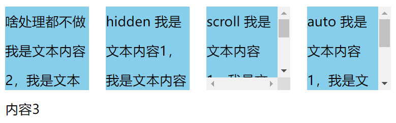
# 3、overflow 超出部分处理
TIP
overflow 属性规定当内容溢出元素框时该 做什么。
# 3.1、overflow 属性值
| 值 | 描述 |
|---|---|
| visible | 默认值。内容溢出,会呈现在元素框之外。 |
| hidden | 内容溢出,则溢出内容是不可见的。 |
| scroll | 不管内容是否溢出,都会显示滚动条。 |
| auto | 内容溢出,则显示滚动条以便查看其余的内容。如果不溢出,则不显示滚动条 |
| inherit | 规定应该从父元素继承 overflow 属性的值。 |
<style>
  .box {
    width: 100px;
    height: 100px;
    background-color: skyblue;
    line-height: 35px;
    /* 左浮动 */
    float: left;
    margin-left: 20px;
  }
  .box1 {
    overflow: hidden;
  }
  .box2 {
    overflow: scroll;
  }
  .box3 {
    overflow: auto;
  }
</style>
<body>
  <div class="box">啥处理都不做我是文本内容2,我是文本内容3</div>
  <div class="box box1">hidden 我是文本内容1,我是文本内容2,我是文本内容3</div>
  <div class="box box2">scroll 我是文本内容1,我是文本内容2,我是文本内容3</div>
  <div class="box box3">auto 我是文本内容1,我是文本内容2,我是文本内容3</div>
</body>
# 3.2、overflow-x 和 overfow-y
TIP
- overflow-x 水平方溢出设置
- overflow-y 垂直方向溢出设置
overflow-x: hidden;
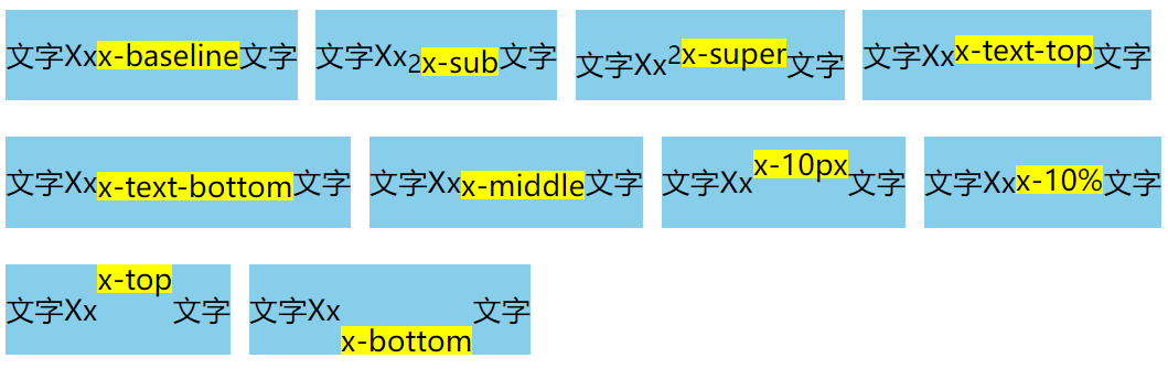
# 4、vertical-align 属性
TIP
- 指定行内元素 、行内块级元素 、表格单元格元素 的垂直对齐方式
- 对块级元素是无效的
| 属性值 | 描述 |
|---|---|
| baseline | 使元素的基线与父元素的 基线对齐 |
| sub | 使元素的基线与父元素的 下标基线对齐 |
| super | 使元素的基线与父元素的 上标基线对齐 |
| text-top | 使元素的顶部与父元素的字体顶部对齐。 |
| text-bottom | 使元素的底部与父元素的字体底部对齐。 |
| middle | 使元素的中部与父元素的基线加上父元素 x-height(x 高度) 的一半对齐。 |
| 数值(10px) | 使元素的基线对齐到父元素的基线 之上的给定长度 可以是负数 |
| 百分比 % | 使元素的基线对齐到父元素的基线之上的给定百分比,该百分比是line-height (opens new window)属性的百分比 可以是负数 |
| top | 使元素及其后代元素的顶部与整行的顶部对齐 |
| bottom | 使元素及其后代元素的底部与整行的底部对齐 |
注:
小写字母 x 的下边缘(线)就是我们的基线 (opens new window)
点击查看,详细参考地址 👆 (opens new window)

应用案例
<style>
  .box {
    height: 50px;
    float: left;
    margin: 10px 10px 10px 0px;
    background-color: skyblue;
    /* 行高 50px */
    line-height: 50px;
  }
  .box span {
    /* 行内块 */
    display: inline-block;
    line-height: 1;
    background-color: yellow;
  }
  .baseline {
    vertical-align: baseline;
  }
  .sub {
    vertical-align: sub;
  }
  .super {
    vertical-align: super;
  }
  .text-top {
    vertical-align: text-top;
  }
  .text-bottom {
    vertical-align: text-bottom;
  }
  .middle {
    vertical-align: middle;
  }
  .top10px {
    vertical-align: 10px;
  }
  .top10 {
    vertical-align: 10%;
  }
  .top {
    vertical-align: top;
  }
  .bottom {
    vertical-align: bottom;
  }
</style>
<body>
  <div class="box">文字Xx<span class="baseline">x-baseline</span>文字</div>
  <div class="box">文字Xx<sub>2</sub><span class="sub">x-sub</span>文字</div>
  <div class="box">
    文字Xx<sup>2</sup><span class="super">x-super</span>文字
  </div>
  <div class="box">文字Xx<span class="text-top">x-text-top</span>文字</div>
  <div class="box">
    文字Xx<span class="text-bottom">x-text-bottom</span>文字
  </div>
  <div class="box">文字Xx<span class="middle">x-middle</span>文字</div>
  <div class="box">文字Xx<span class="top10px">x-10px</span>文字</div>
  <div class="box">文字Xx<span class="top10">x-10%</span>文字</div>
  <div class="box">文字Xx<span class="top">x-top</span>文字</div>
  <div class="box">文字Xx<span class="bottom">x-bottom</span>文字</div>
</body>
vertical-align 的应用场景
用于控制文字与行内块元素或图片在垂直方向上的对齐方式 (但实际上任没有完全居中对齐,因为图片中心是与 x 的中心
<style>
  h3 {
    height: 50px;
    background-color: #ddd;
    line-height: 50px;
  }
  .img {
    /* 元素的中线与x的中心对齐 */
    vertical-align: middle;
  }
</style>
<body>
  <h3><img src="images/fish.png" class="img" /> x我是一直可爱的小白兔</h3>
</body>
用于设置表格单元中内容的垂直对齐方式
<style>
  table {
    height: 100px;
  }
  table tr td {
    border: 1px solid #000;
  }
  .baseline {
    vertical-align: baseline;
  }
  .top {
    vertical-align: top;
  }
  .middle {
    vertical-align: middle;
  }
  .bottom {
    vertical-align: bottom;
  }
</style>
<body>
  <table>
    <tr>
      <td class="baseline">baseline</td>
      <td class="top">top</td>
      <td class="middle">middle</td>
      <td class="bottom">bottom</td>
    </tr>
  </table>
</body>
# 七、应用案例
# 1、常用的 a 标签布局按钮
<style>
  .button {
    /* 把a标签转换为块级元素,转换后,设置宽高就会生效 */
    display: block;
    width: 200px;
    height: 50px;
    /* 去掉下划线 */
    text-decoration: none;
    /* 字体颜色 */
    color: #fff;
    /* 背景色 */
    background-color: tomato;
    /* 水平居中 */
    text-align: center;
    /* 垂直居中 */
    line-height: 50px;
  }
</style>
<body>
  <a href="#" class="button">点击进入艾编程官网</a>
</body>

# 2、水平居中的轮播图按扭
TIP
核心点:display 元素类型转换、vertical-align 控制元素垂直对齐
<style>
  .button {
    height: 50px;
    background-color: skyblue;
    text-align: center;
    /* 去掉span间间隙 */
    font-size: 0px;
    /* 元素水平居中 */
    line-height: 50px;
  }
  .button span {
    /* 行内块元素 */
    display: inline-block;
    width: 10px;
    height: 10px;
    background-color: #fff;
    /* 上下 0  左右 2px */
    margin: 0px 2px;
    /* 垂直居中 */
    vertical-align: middle;
    /* 圆角 */
    border-radius: 50%;
  }
  .button .current {
    background-color: tomato;
  }
</style>
<body>
  <div class="button">
    <span></span>
    <span></span>
    <span></span>
    <span></span>
    <span class="current"></span>
  </div>
</body>

# 八、针对性案例训练(作业)
WARNING
根据课程进度完成以下针对性案例开发,开发过程要求:
具体开发流程
- 利用 PS 软件标记好切图 -> 导出至蓝湖(国内企业用的多)中
- 前端开发人员在蓝湖打开设计稿 ->下载网页开发所需的素材 -> 在蓝湖中量取尺寸 -> 即可开发静态页面
PSD 的源文件设计稿
- 以下案例对应的 PS 设计稿,已发布到钉钉群作业中。
- PS 与蓝湖结合标注、切图开发相关视频教程已上传至钉钉群
视频讲解
有任何疑问可以联系添加的助理老师(或博客右侧的晓冉老师)
我们把 CSS/CSS3 基础知识全部学习完之后,会有 4 大项目开发(PC 端,响应式,移动端)会按照企业真实团队协作的方式,用 4 个项目来完整的实践。
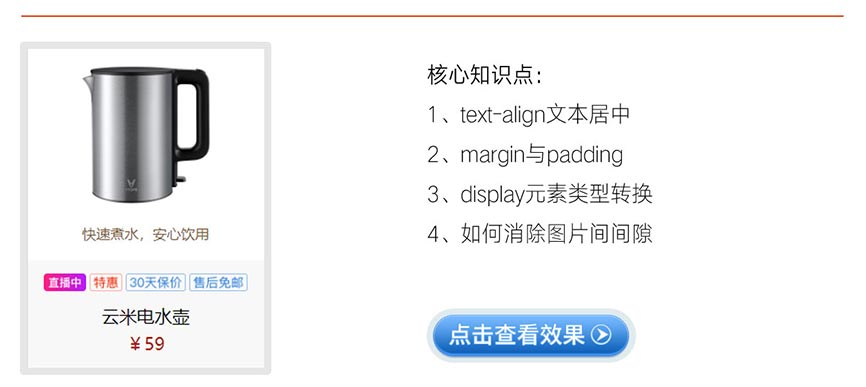
# 1、常见的产品展示效果(视频)
核心知识补充:CSS 的继承性
点击查看完整版视频讲解
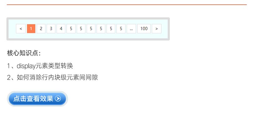
# 2、常用的分页导航(视频)
点击查看完整版视频讲解
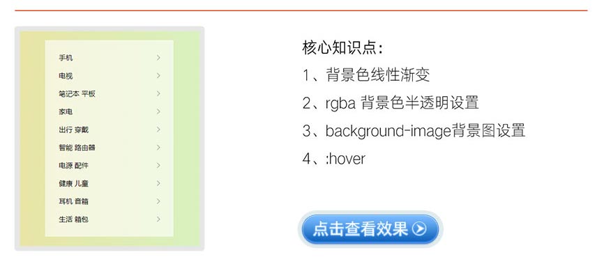
# 3、小米官网左侧菜单
点击查看完整版视频讲解
# 4、精美的 Tab 选项卡菜单(CSS 精灵图)
点击查看完整版视频讲解
# 九、总结:本章重难点
TIP
掌握 display 属性的作用和用法
- display 属性用于控制元素的显示类型,显示类型分为外部和内部两种显示类型
- display:inline/ inline-block 用于将元素设为行内元素;display:block; 用于将元素设为块级元素
- display:none; 用来隐藏元素
掌握去掉行内块元素默认空白间隙的解决方案
- 给父元素添加
font-size: 0px;同时子元素重写font-size - 给元素添加 float,但会造成父元素高度塌陷,需要清除浮动
- 图片间空隙,给图片添加
display:block;
- 给父元素添加
掌握以下所有
background背景属性的用法- background-color 背景颜色
- background-image 背景图
- background-repeat 背景重复
- background-position 背景图位置
- background-size 背景图大小
- background-attachment 背景固定
- background-clip 背景延伸区域
- background-origin 背景定位区
- background 复合写法
- 背景属性多值写法
- CSS 精灵图技术
掌握线性渐变、径向渐变、锥形渐变 三种渐变背景用法及独立手写实战案例
常握以下常用 CSS 属性用法
- cursor 鼠标样式
- outline 外轮廓
- overflow 元素溢出(超出)部分处理
- vertical-align 属性用于控制行内元素 、行内块级元素 、表格单元格元素 的垂直对齐方式
快速生成 HTML 结构的语法
- 在 VSCode 中快速生成 HTML 结构的语法是通过 Emmet 缩写(Emmet Abbreviations)实现的,这是一种高效的代码片段扩展工具。
- Emmet 已默认集成在 VSCode 中,无需额外安装插件(但可通过扩展增强功能)。
- Emmet 官网:https://emmet.io/ (opens new window),
- 官方文档中有完整的语法规则和示例,速查表:https://docs.emmet.io/cheat-sheet/ (opens new window)
大厂最新技术学习分享群

微信扫一扫进群,获取资料
X