
# 浮动、BFC 规范、清除浮动的最佳实践
TIP
在讲 CSS 浮动之前,我们要现在了解下 CSS 布局有哪些实现机制
# 一、实现 CSS 布局的几种策略
网页布局的本质是:
用 CSS 来摆放盒子,把盒子摆放到页面对应的位置。在之前的章节我们已经详细介绍了盒子模型,那接下来我们就来学习,在 CSS 中提供了哪些摆放盒子的技术?
css 中提供了以下几种不同的 CSS 布局策略,来实现页面的布局。
- 正常布局流
- 浮动布局
- 定位布局
- 表格布局 (
display: table;) - 响应式设计
- 弹性布局
- 网格布局
- 多列布局
以上每种布局方式,都有自己的用途,也有各自己的优缺点,相互辅助。 通过理解各个布局方法的设计理念,我们能够找到构建理想网页需要的布局方案。
# 二、正常布局流(Normal Flow)
正常布局流 (normal flow) 是指
- 在不对页面进行任何布局控制时,浏览器默认的 HTML 布局方式。
- 我们都知道,HTML 元素有块级元素和内联元素。所以更简单直白的理解,正常布局流就是规定了,在默认情况下块级元素和内联元素的排版方式。
# 1、正常布局流中,块级元素的排列方式
TIP
- 块级盒子会从包含块的顶部开始,按序垂直排列。
- 同级盒子间的垂直距离会由“margin”属性决定。
- 相邻两个块级盒子之间的垂直间距会遵循外边距折叠原则
# 2、正常布局流中, 内联元素排版方式
TIP
- 盒子会从包含块的顶部开始,按序水平排列。
- 只有水平外边距(垂直方向无效)、边框和内边距会被保留。
- 这些盒子可以以不同的方式在垂直方向对齐:可以底部对齐或顶部对其,或者按文字底部进行对齐
注意:
盒模型不仅仅指 div,所有 HTML 元素本质上都是一个盒子模型,并具有盒模型的结构和属性
深入研究 CSS 布局,官方文档地址:
在正常布局流中,要实现块级元素在水平方向一行排列,那是没有办法实现的,但是接下来我们要讲到的浮动布局就可以轻松实现。
# 三、浮动布局
TIP
深入浅出浮动布局的工作原理和本质
# 1、浮动布局起源
最初
引入 float 属性是为了能让 web 开发人员实现简单的布局,包括在一列文本中浮动的图像,文字环绕在它的左边或右边,
如下图的效果:
但 Web 开发人员很快意识到,任何东西都可以浮动,而不仅仅是图像,所以浮动的使用范围扩大了

# 2、浮动是如何工作的
TIP
- 把一个元素 “浮动”(float)起来,会改变该元素本身和在正常布局流(normal flow)中跟随它的其他元素的行为。
- 这一元素会浮动到左侧或右侧,并且从正常布局流 (normal flow) 中移除,这时候其他的周围内容就会在这个被设置浮动 (float) 的元素周围环绕。
简单理解:
当元素添加了浮动后,元素就会脱离文档流,按照指定方向(左右)发生移动,遇到父级边界或者相邻的浮动元素就会停下来,同时会影响到他后面元素的排版行为。
- 文档流: 文档中可显示对象在排列时所占用的位置/空间(在页面中占位置)
- 脱离文档流: 元素相当于漂浮起来,不占据页面中的位置
# 3、浮动的本质和要点
TIP
- 浮动的本质功能:用来实现并排
- 浮动使用要点:要浮动,并排的盒子都要设置浮动
- 父盒子要有足够的宽度,否则子盒子会掉下去
点击查看完整源代码
<style>
  .box {
    width: 600px;
    height: 200px;
    border: 1px solid #000;
  }

  /*
        要点:要浮动,都浮动
        父盒子要有足够的宽度,否则子盒子会掉下去
    */
  .box .c1 {
    width: 200px;
    height: 200px;
    background-color: skyblue;
    float: left;
  }

  .box .c2 {
    width: 200px;
    height: 200px;
    background-color: gold;
    float: left;
  }

  .box .c3 {
    width: 200px;
    height: 200px;
    background-color: pink;
    float: left;
  }
</style>

<body>
  <h1>浮动</h1>

  <div class="box">
    <div class="c1">float: left;</div>
    <div class="c2">float: left;</div>
    <div class="c3">float: left;</div>
  </div>
</body>

# 4、如何产生浮动
TIP
给需要浮动的元素添加 float 属性,float 属性对应的值如下:
| 属性 | 值 |
|---|---|
| float | ① none 默认值,元素不浮动 ② left 元素向左浮动 ③ right 元素向右浮动 ④ inherit 规定应该从父元素继承 float 属性的值。(一般不用,了解即可) |
# 四、元素浮动的特性
TIP
深入了解元素添加浮动后的 7 大特性
# 1、元素添加浮动后,脱离文档流
TIP
同时会影响其后面的元素,但不影响它前面的元素
点击查看完整源代码
<style>
  .box {
    width: 300px;
    height: 200px;
    border: 2px solid red;
  }
  .box1 {
    width: 100px;
    height: 50px;
    background-color: khaki;
  }
  .box2 {
    width: 200px;
    height: 50px;
    background-color: rgb(133, 206, 235, 0.5);
    /* 给元素添加左浮动 */
    /* float: left; */
  }
  .box3 {
    width: 100px;
    height: 100px;
    background-color: pink;
  }
</style>
<div class="box">
  <div class="box1">1</div>
  <div class="box2">2</div>
  <div class="box3">3</div>
</div>
| 正常布局流中 | box2(蓝色盒子浮动后效果) |
|---|---|
 |  |
| 正常布局流中,块级元素默认从上往下排列 | 蓝色 div 加了浮动后,相当于漂浮起来,不占据页面空间,这时候蓝色盒子后面的粉色盒子的位置就会发生改变,移动到上面来,就出现如图,蓝色的盒子相当于漂浮在红色的上面。但黄色的盒子不受任何影响 |
# 2、如果父元素的宽度不够
TIP
子元素在放不下的情况下会换行显示
点击查看完整源代码
<style type="text/css">
  .main {
    width: 240px;
    height: 150px;
    background-color: khaki;
  }
  .box {
    width: 50px;
    height: 50px;
    background-color: skyblue;
    margin: 10px;
    float: left;
  }
</style>
<body>
  <div class="main">
    <div class="box">框1</div>
    <div class="box">框2</div>
    <div class="box">框3</div>
    <div class="box">框4</div>
  </div>
</body>

# 3、浮动的顺序贴靠特性
TIP
子盒子会按顺序进行贴靠,如果没有足够空间,则会寻找在前一个兄弟元素
点击查看完整源代码
<style>
  .box {
    width: 300px;
    height: 200px;
    border: 1px solid #000;
  }

  /*
        浮动的顺序贴靠特性:

        子盒子会按顺序进行贴靠,
        如果没有足够空间,则会寻找在前一个兄弟元素
    */
  .box .c1 {
    width: 200px;
    height: 100px;
    background-color: orange;
    float: left;
  }

  .box .c2 {
    width: 100px;
    height: 50px;
    background-color: skyblue;
    float: left;
  }

  .box .c3 {
    width: 100px;
    height: 50px;
    background-color: tomato;
    float: left;
  }
</style>

<body>
  <h1>浮动的顺序贴靠特性</h1>

  <div class="box">
    <div class="c1"></div>
    <div class="c2"></div>
    <div class="c3"></div>
  </div>
</body>

利用贴靠性布局案例:
# 4、元素浮动后,具有行内块级元素特性
TIP
- 浮动的元素不再区分块级元素、行内元素,已经脱离了标准文档流
- 一律能够设置宽度和高度,即使它是 span 标签 或 a 标签 等等
点击查看完整源代码
<style>
  span {
    width: 100px;
    height: 30px;
    background-color: tomato;
    /*
            只要设置了浮动的元素,不再区分块级元素和行内元素
            都能设置高度和宽度
        */
    float: left;
    margin-right: 10px;
    text-align: center;
    line-height: 30px;
    color: #fff;
  }
</style>

<body>
  <h1>浮动的元素一定能设置宽高</h1>

  <span>1</span>
  <span>2</span>
  <span>3</span>
  <span>4</span>
  <span>5</span>
</body>

右浮动
float: right;即可设置右浮动- 实际工作中,右浮动没有左浮动用的多
- 原理同左浮动
# 5、浮动的元素会造成父元素高度塌陷
TIP
- 当给子元素添加了浮动后,子元素相当于漂浮起来,不占据页面空间。
- 这样就造成父级元素在没有设置高度时,高度塌陷问题。 具体看如下案例:
点击查看完整源代码
<style>
  .main {
    width: 200px;
    border: 2px solid red;
  }
  .item {
    width: 100px;
    height: 100px;
    background-color: pink;
    /* 添加浮动的前后对比 */
    float: left;
  }
</style>
<body>
  <div class="main">
    <div class="item"></div>
  </div>
</body>
| item 未设置浮动前效果 | item 设置浮动后效果 |
|---|---|
 |  " " |
如何解决父级高度塌陷问题,讲完浮动对文字的影响后,我们就会讲到。
# 6、浮动对文字的影响
TIP
- 常见的图片文字环绕效果,其实现方式主要是将图片左浮动或右浮动
- 浮动后其相邻的文字,就会环绕图片排列
点击查看完整源代码
<style>
  .box {
    width: 200px;
    background-color: #ddd;
    padding: 10px;
  }
  .img {
    width: 80px;
    height: 80px;
    background-color: skyblue;
    float: left;
    margin: 10px;
  }
</style>
<body>
  <div class="box">
    <div class="img"></div>
    最初,引入float属性是为了能让 web
    开发人员实现简单的布局,包括在一列文本中浮动的图像,文字环绕在它的左边或右边
  </div>
</body>
# 7、使用浮动实现网页布局
TIP
- 垂直显示的盒子,不要设置浮动,只有并排显示的盒子才要设置浮动
- 每一个盒子都是独立存在,每个盒子中又是一个小天地,内部可以继续使用浮动

点击查看完整源代码
<!DOCTYPE html>
<html lang="en">
  <head>
    <meta charset="UTF-8" />
    <meta http-equiv="X-UA-Compatible" content="IE=edge" />
    <meta name="viewport" content="width=device-width, initial-scale=1.0" />
    <title>使用浮动实现网页布局 - arry老师</title>
    <style>
      * {
        margin: 0;
        padding: 0;
      }

      /* topbar start */
      .topbar {
        width: 100%;
        height: 40px;
        background-color: #666;
      }
      /* end topbar */

      /* header start */
      header {
        width: 1000px;
        height: 100px;
        margin: 20px auto 0;
      }
      header .logo {
        width: 200px;
        height: 100px;
        background-color: skyblue;
        float: left;
      }
      header .login {
        width: 200px;
        height: 30px;
        background-color: orange;
        float: right;
      }

      header .top-nav {
        width: 660px;
        height: 50px;
        background-color: tomato;
        float: right;
        margin-top: 20px;
      }
      /* end header */

      /* main start */
      main {
        width: 1000px;
        height: 500px;
        margin: 30px auto;
      }
      main aside.ad {
        width: 300px;
        height: 500px;
        background-color: rgb(190, 225, 239);
        float: left;
      }
      main article {
        width: 680px;
        height: 500px;
        float: right;
      }
      main article .banner {
        width: 680px;
        height: 380px;
        background-color: orange;
      }
      main article .pics {
        width: 680px;
        height: 100px;
        margin-top: 20px;
      }
      main article .pics ul {
        list-style: none;
      }

      main article .pics ul li {
        width: 160px;
        height: 100px;
        background-color: greenyellow;
        float: left;
        margin-right: 10px;
      }
      main article .pics ul li:last-child {
        width: 170px;
        margin-right: 0;
      }
      /* end main */

      /* footer start */
      footer {
        width: 1000px;
        height: 100px;
        background-color: gray;
        margin: 0 auto;
      }
      /* end footer */
    </style>
  </head>
  <body>
    <!-- topbar start -->
    <div class="topbar"></div>
    <!-- end topbar -->

    <!-- header start -->
    <header>
      <div class="logo"></div>
      <div class="login"></div>
      <nav class="top-nav"></nav>
    </header>
    <!-- end header -->

    <!-- main start -->
    <main>
      <aside class="ad"></aside>
      <article>
        <div class="banner"></div>
        <div class="pics">
          <ul>
            <li></li>
            <li></li>
            <li></li>
            <li></li>
          </ul>
        </div>
      </article>
    </main>
    <!-- end main -->

    <!-- footer statr -->
    <footer></footer>
    <!-- end footer -->
  </body>
</html>
# 五、BFC 规范 和 浏览器差异
TIP
- BFC (Box Formatting Context ,块级格式上下文)是页面上的一个隔离的独立容器
- 容器里的子元素不会影响到外面的元素,反之亦然
如:一个盒子不设置 height,当内容子元素都浮动时,无法撑起自身
原因是:这个盒子没有形成 BFC

# 1、创建 BFC
TIP
- 方法 1:float 的值不是 none
- 方法 2:position 的值不是 static 或者 relative
- 方法 3:display 的值是 inline-block、flex 或 inline-flex
- 方法 4:
overflow:hidden;
点击查看完整源代码
<!DOCTYPE html>
<html lang="en">
  <head>
    <meta charset="UTF-8" />
    <meta http-equiv="X-UA-Compatible" content="IE=edge" />
    <meta name="viewport" content="width=device-width, initial-scale=1.0" />
    <title>创建BFC - arry老师</title>
    <style>
      .box {
        width: 500px;
        border: 5px solid red;
        /*
            方法1:float的值不是none
            该方法可以实现效果,但没有意义,不可能随意给盒子设置浮动
        */
        /* float: left; */

        /*
            方法2:position的值不是static或者relative
            该方法可以实现效果,但不靠谱
        */
        /* position: absolute; */

        /*
            方法3:display的值是 inline-block、flex 或 inline-flex
            该方法可以实现效果,但,没有意义,可能随便改变盒子的为行内块,获取其他的
        */
        /* display: inline-block; */
        /* display: flex; */
        /* display: inline-flex; */

        /*
            方法4:overflow:hidden;
            该方法可以实现效果,但是,不能满足所有的场景
        */
        /* overflow: hidden; */
      }
      .box .c1 {
        width: 200px;
        height: 200px;
        background-color: orange;
        float: left;
      }
      .box .c2 {
        width: 200px;
        height: 200px;
        background-color: skyblue;
        float: left;
      }
    </style>
  </head>
  <body>
    <h1>创建BFC</h1>
    <p>
      BFC (Box Formatting Context
      ,块级格式上下文)是页面上的一个隔离的独立容器
    </p>

    <div class="box">
      <div class="c1"></div>
      <div class="c2"></div>
    </div>
  </body>
</html>
溢出隐藏:overflow:hidden;
- 溢出盒子边框的内容将会被隐藏
- overflow:hidden;是非常好用的让盒子形成 BFC 的方法
# 2、BFC 的其他作用
TIP
- BFC 可以取消盒子 margin 塌陷
- BFC 可以阻止元素被浮动元素覆盖
点击查看完整源代码
<style>
  p {
    width: 200px;
    height: 200px;
    background-color: orange;
    /* 垂直方向上下margin会重合 距离依然是:50 */
    margin: 50px;
  }

  /*
    BFC作用一:可以取消盒子margin塌陷
    添加overflow:hidden; 创建BFC
  */
  div {
    overflow: hidden;
  }

  /*
    BFC作用二:可以阻止元素被浮动元素覆盖
    没有实际意义,实际开发不会这么用,只具有理论意义,要明白
    需要并排显示的盒子,要么都浮动,要么都不写,以下的写法是不合法规范的
  */
  .box1 {
    width: 300px;
    height: 300px;
    background-color: skyblue;
    float: left;
  }

  .box2 {
    width: 200px;
    height: 200px;
    background-color: tomato;
    /* float: left; */
    overflow: hidden;
  }
</style>

<body>
  <div>
    <p></p>
  </div>

  <div>
    <p></p>
  </div>

  <section class="box1"></section>
  <section class="box2"></section>
</body>
# 3、浏览器差异
TIP
- IE6、7 浏览器使用 haslayout 机制 和 BFC 规范略有差异
- 比如:IE 浏览器可以使用 zoom:1 属性,让盒子拥有 layout
- 如果要制作兼容到 IE6、7 的网页时,尽量让网页布局变得简单,内部有浮动的盒子要设置 height 属性,规范编程,就没有问题
# 六、清除浮动
TIP
清除浮动:浮动一定要封闭到一个盒子中,否则就会对页面后续元素产生影响
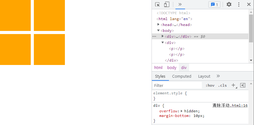
# 1、清除浮动方法 1
TIP
- 让内部有浮动的父盒子形成 BFC,它就能关闭住内部的浮动。
- 此时,最好的方法就是
overflow: hidden;属性
点击查看完整源代码
<style>
  * {
    margin: 0;
    padding: 0;
  }

  div {
    /*
        清除浮动方法1:
        让内部有浮动的父盒子形成BFC,它就能关闭住内部的浮动
        此时,最好的方法就是 overflow: hidden; 属性
      */
    overflow: hidden;
    margin-bottom: 10px;
  }

  p {
    width: 100px;
    height: 100px;
    background-color: orange;
    margin-right: 10px;
    float: left;
  }
</style>

<body>
  <div>
    <p></p>
    <p></p>
  </div>

  <div>
    <p></p>
    <p></p>
  </div>
</body>
# 2、清除浮动方法 2
TIP
- 给后面的父盒子设置
clear: both;属性 clear表示清除浮动对自己的影响,both表示左右浮动都清除
该方法不推荐
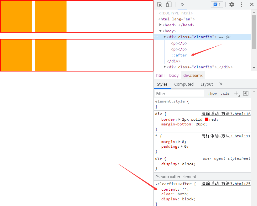
# 3、清除浮动方法 3
TIP
- 使用
::after伪元素 给盒子添加最后一个子元素 - 将
::after设置content: "";属性,让其成为一个块级元素display: block; - 并且给
::after设置clear:both;
强烈推荐使用,最佳实践(大厂都这么用)
点击查看完整源代码
<style>
  * {
    margin: 0;
    padding: 0;
  }

  div {
    border: 2px solid red;
    margin-bottom: 20px;
  }

  /*
      添加伪元素
      ::after 匹配选中的元素的最后一个子元素
    */
  .clearfix::after {
    content: "";
    clear: both;
    /* 转为块级元素 */
    display: block;
  }

  p {
    width: 100px;
    height: 100px;
    background-color: orange;
    margin-right: 10px;
    float: left;
  }
</style>

<body>
  <div class="clearfix">
    <p></p>
    <p></p>
  </div>

  <div class="clearfix">
    <p></p>
    <p></p>
  </div>
</body>
# 4、清除浮动方法 4
TIP
- 在两个父盒子之间 "隔墙" 隔一个携带
clear: both;的盒子
不推荐
点击查看完整源代码
<style>
  * {
    margin: 0;
    padding: 0;
  }

  div {
    border: 2px solid red;
  }

  p {
    width: 100px;
    height: 100px;
    background-color: orange;
    margin-right: 10px;
    float: left;
  }

  /*
      清除浮动方法4:
      在两个父盒子之间 "隔墙" 隔一个携带 `clear: both;`的盒子
    */
  .cl {
    clear: both;
  }

  .h20 {
    height: 20px;
  }
</style>

<body>
  <div>
    <p></p>
    <p></p>
  </div>

  <!-- 在两个父盒子之间 "隔墙" 隔一个携带 `clear: both;`的盒子 -->
  <div class="cl h20"></div>

  <div>
    <p></p>
    <p></p>
  </div>
</body>

# 七、浮动实战应用
TIP
- 浮动的元素一般都会在其外面套一个标准流父级搭配一起使用。
- 这样就能约束浮动元素的位置,使其只能在父元素的盒子范围内排列显示。
# 1、实现左右两列式布局

点击查看完整源代码
<style>
  .box {
    width: 600px;
    background-color: khaki;
    padding: 10px;
  }
  .box .left {
    width: 200px;
    height: 200px;
    background-color: skyblue;
    float: left;
  }
  .box .right {
    width: 380px;
    height: 200px;
    background-color: pink;
    float: right;
  }
  /*清除浮动*/
  .clearfix::after {
    display: block;
    content: "";
    clear: both;
  }
</style>
<body>
  <div class="box clearfix">
    <div class="left">左</div>
    <div class="right">右</div>
  </div>
</body>
# 2、实现一行多列式布局

点击查看完整源代码
<style>
  .box {
    width: 600px;
    background-color: khaki;
    padding: 10px;
  }
  .box .left {
    width: 150px;
    height: 200px;
    background-color: skyblue;
    float: left;
  }
  .box .middle {
    width: 280px;
    background-color: aquamarine;
    height: 200px;
    float: left;
    margin-left: 10px;
  }
  .box .right {
    width: 150px;
    height: 200px;
    background-color: pink;
    float: right;
  }
  /*清除浮动*/
  .clearfix::after {
    display: block;
    content: "";
    clear: both;
  }
</style>
<body>
  <div class="box clearfix">
    <div class="left">左</div>
    <div class="middle">右</div>
    <div class="right">右</div>
  </div>
</body>
# 3、三列式布局,中间自适应
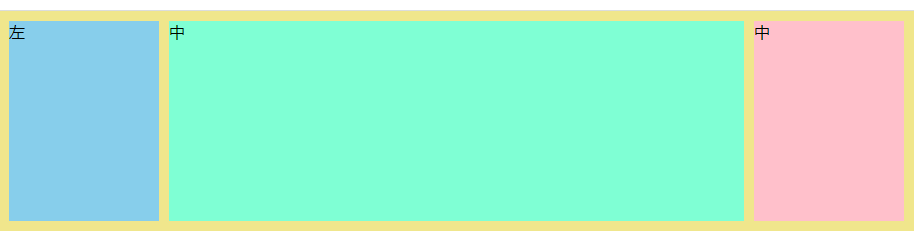
点击查看完整源代码
<style>
  body {
    margin: 0;
  }
  .box {
    width: 100%;
    background-color: khaki;
    padding: 10px;
    box-sizing: border-box;
  }
  .box .left {
    width: 150px;
    height: 200px;
    background-color: skyblue;
    float: left;
  }
  .box .middle {
    background-color: aquamarine;
    height: 200px;
    margin: 0px 160px;
  }
  .box .right {
    width: 150px;
    height: 200px;
    background-color: pink;
    float: right;
  }
  /*清除浮动*/
  .clearfix::after {
    display: block;
    content: "";
    clear: both;
  }
</style>
<body>
  <div class="box clearfix">
    <div class="left">左</div>
    <div class="right">右</div>
    <div class="middle">中</div>
  </div>
</body>
# 4、多行多列式布局

点击查看完整源代码
<style>
  .container {
    width: 800px;
    background-color: skyblue;
    margin: 0px auto;
    padding: 5px;
  }
  .item {
    width: 190px;
    height: 200px;
    background-color: khaki;
    float: left;
    margin: 5px;
  }
  /*清除浮动*/
  .clearfix::after {
    display: block;
    content: "";
    clear: both;
  }
</style>
<body>
  <div class="container clearfix">
    <div class="item">1</div>
    <div class="item">2</div>
    <div class="item">3</div>
    <div class="item">4</div>
    <div class="item">5</div>
    <div class="item">6</div>
    <div class="item">7</div>
    <div class="item">8</div>
  </div>
</body>
# 5、实现整站结构布局

点击查看完整源代码
<style>
  body,
  ul {
    margin: 0;
  }
  ul {
    padding: 0;
    list-style: none;
  }
  .clearfix::after {
    display: block;
    content: "";
    clear: both;
  }
  .top {
    height: 50px;
    background-color: skyblue;
  }
  .container {
    width: 1000px;
    margin: 10px auto;
  }
  /*header部分样式*/
  .container .header .logo {
    width: 100px;
    height: 120px;
    background-color: pink;
    float: left;
  }
  .container .header .nav {
    width: 700px;
    float: right;
  }
  .nav .nav-top {
    width: 500px;
    height: 50px;
    background-color: turquoise;
    float: right;
  }
  .nav .nav-bottom {
    height: 60px;
    width: 100%;
    background-color: tomato;
    float: right;
    margin-top: 10px;
  }
  /*main-top部分样式*/
  .main {
    margin-top: 20px;
  }
  .main-top .main-top-menu {
    width: 200px;
    height: 500px;
    background-color: lavender;
    float: left;
  }
  .main-top .main-top-content {
    width: 520px;
    height: 500px;

    float: left;
    margin-left: 15px;
  }
  .main-top .main-top-recommend {
    width: 250px;
    height: 500px;
    background-color: orange;
    float: right;
  }
  .main-top-content .top-content-banner {
    height: 300px;
    background-color: tomato;
  }
  .main-top-content .top-content-hot {
    height: 180px;
    margin-top: 20px;
  }
  .top-content-hot ul li {
    width: 120px;
    height: 180px;
    background-color: aquamarine;
    margin: 0px 5px;
    float: left;
  }
  .footer {
    height: 100px;
    background-color: #ddd;
  }
</style>
<body>
  <div class="top"></div>
  <div class="container">
    <!--header start-->
    <div class="header clearfix">
      <div class="logo"></div>
      <div class="nav clearfix">
        <div class="nav-top"></div>
        <div class="nav-bottom"></div>
      </div>
    </div>
    <!--header end-->
    <!--main start-->
    <div class="main">
      <div class="main-top clearfix">
        <div class="main-top-menu"></div>
        <div class="main-top-content">
          <div class="top-content-banner"></div>
          <div class="top-content-hot">
            <ul>
              <li>1</li>
              <li>2</li>
              <li>3</li>
              <li>4</li>
            </ul>
          </div>
        </div>
        <div class="main-top-recommend"></div>
      </div>
    </div>
    <!--main start-->
  </div>
  <div class="footer"></div>
</body>
# 八、作业
TIP
根据课程进度完成以下针对性案例开发,开发过程要求:
具体开发流程
- 利用 PS 软件标记好切图 -> 导出至蓝湖(国内企业用的多)中
- 前端开发人员在蓝湖打开设计稿 ->下载网页开发所需的素材 -> 在蓝湖中量取尺寸 -> 即可开发静态页面
PSD 的源文件设计稿
- 以下案例对应的 PS 设计稿,已发布到钉钉群作业中。
- PS 与蓝湖结合标注、切图开发相关视频教程已上传至钉钉群
视频讲解
有任何疑问可以联系添加的助理老师(或博客右侧的晓冉老师)
我们把 CSS/CSS3 基础知识全部学习完之后,会有 4 大项目开发(PC 端,响应式,移动端)会按照企业真实团队协作的方式,用 4 个项目来完整的实践。
切记
学习阶段一定要按照以上的流程学习,提前熟悉工具和整个开发步骤,企业真实项目开发就是这样的流程
# 1、前端必会的 3 种 css 布局技术
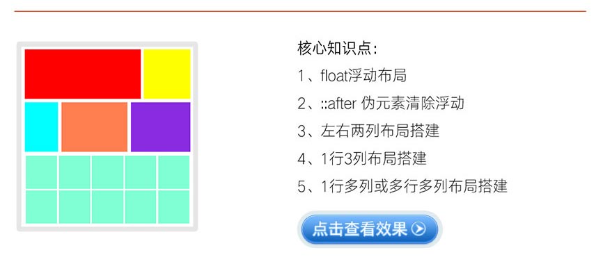
点击查看完整版视频讲解
# 2、酷狗音乐热门榜单
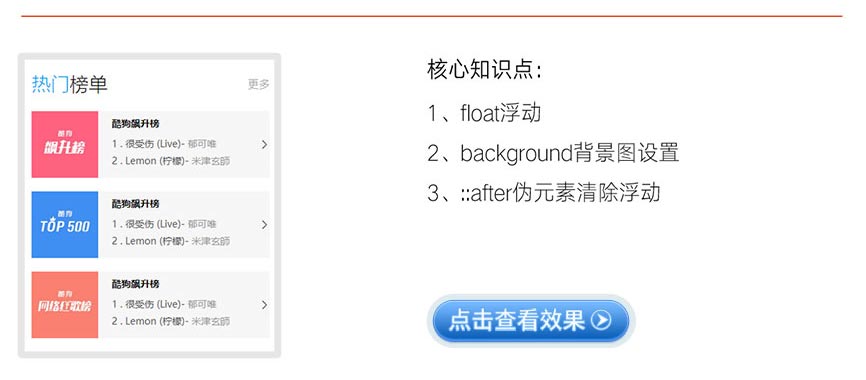
点击查看完整版视频讲解
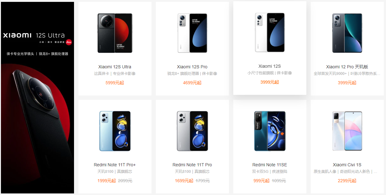
# 3、小米商城产品展示效果
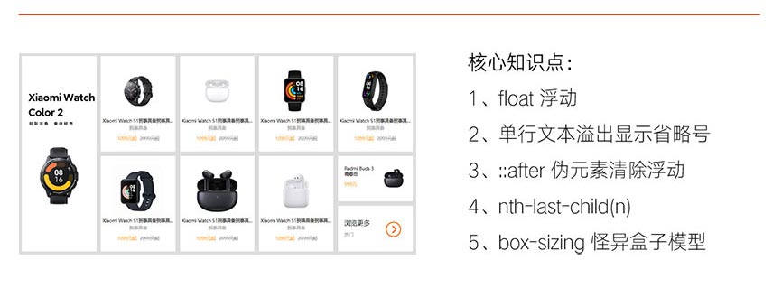
点击查看完整版视频讲解
大厂最新技术学习分享群

微信扫一扫进群,获取资料
X