
# transition 过渡动画与 animation 自定义动画
TIP
transition 过渡动画、animation 自定义动画,无论在 PC 端、还是移动端项目开发中都是高频常用的动画,对于交互体验的提升都有很大的帮助。因此,学好动画相关知识及灵活应用就非常重要。
# 一、transition 过渡动画
TIP
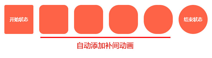
如何理解过渡动画 ?
一个元素由 A 状态经过一段时间变化成 B 状态,我们只需要定义其开始和结束的状态,而他的中间的状态会自己添加“补间动画”。如下图:
注:
- 以前,网页的特效基本都是由 JavaScript 定时器实现的,现在逐步改为使用 CSS3 过渡
- 优点:动画更细腻,内存开销小
- 兼容性:移动 PC 都兼容,但是需要加上对应的浏览器前缀
# 1、transition 基本语法
TIP
CSS transition 属性可以为一个元素在不同状态之间切换的时候定义不同的过渡效果
语法
/*
	[] 表示这个值,可以省略不写
	css属性名  过渡时间   时间函数  延迟时间
*/
transition: transition-property transition-duration [transition-timing-function]
  [transition-delay];
| 属性 | 描述 |
|---|---|
transition-property | 指定 CSS 属性的 name,哪些属性要过渡 |
transition-duration | transition 效果需要指定多少秒或毫秒才能完成,动画时间 |
transition-timing-function | 指定 transition 效果的速度变化曲线 |
transition-delay | 定义 transition 效果开始的时候(延迟时间) |
用法
/*
    width : 过渡属性为width
    1s : 动画时长1秒
    linear : 直线匀速动动
    0s : 延迟时间,不延迟
*/
transition: width 1s linear 0s;
transition: width 1s;
transition: width 1s linear;
transition: width 1s 2s;
过渡动画何时发生 ?
- 当属性值发生变化时,才会触发 transition 动画
- transition 动画主要与
:hover配合,来实现鼠标滑动动画效果
实际应用
<style type="text/css">
  div {
    width: 100px;
    height: 100px;
    background: tomato;
    /*
            transition:定义过渡动画
            border-radius:过渡的css属性
            1s :动画过渡时间
            ease: 速度慢快慢
            0s :延迟时间0s
        */
    transition: border-radius 1s ease 0s;
    margin: 50px 10px;
  }
  .box:hover {
    border-radius: 50%;
  }
</style>
<body>
  <div class="box"></div>
</body>
渲染效果:

# 2、可参与过渡的属性
可参与过渡的属性
- 所有数值类型的属性,都可以参与过渡
- 比如:width、height、left、top、border-radius、font-size、opacity
- 背景颜色和文字都可以被过渡
- 所有的变形(包括 2D 和 3D)都能被过渡,在 CSS 中 90%的属性都可以被过渡
不能参与过渡动画的属性
- float 和 position 不能
- display 无法过渡
- font-family 等
/*
	错误用法
	display属性是不可以参与过渡动画的
*/
transition: display 1s ease 0s;
# 3、all 这个特殊属性
TIP
- 需要所有属性参与过渡,即定义为 all
- all 属性不要随意使用,会引发效率问题。
- 如果只需要某一个属性过渡,最好指定该过渡的属性,而非用 all
/*
    all: 所有属性
    1s: 动画过渡时间为1s
    linear: 匀速动动
    0s: 动画延迟时间0s
*/
transition: all 1s linear 0s;
应用
<style>
  .box {
    width: 100px;
    height: 100px;
    background-color: salmon;
    border-radius: 0;
    /*
            all: 所有能过的渡的属性,发生改变时,都会发生过渡效果
            1s: 动画过渡时间为1s
            linear: 动画习速运动
            0s: 延迟时间
        */
    transition: all 1s linear 0s;
  }
  .box:hover {
    /* 宽、高、背景颜色、圆角都是可过渡属性,所以鼠标滑动后,都能呈现过渡变化效果 */
    width: 200px;
    height: 300px;
    background-color: skyblue;
    border-radius: 50%;
  }
</style>
<body>
  <div class="box"></div>
</body>
渲染效果:
# 4、定义多个过渡动画
TIP
多个过渡动画之间用 ,(逗号)隔开
语法
transition: 属性 过渡时间 时间函数 延迟时间, 属性 过渡时间 时间函数 延迟时间,
  属性 过渡时间 时间函数 延迟时间;
应用
<style>
  .box {
    width: 100px;
    height: 100px;
    background-color: red;
    opacity: 1;
    /*
            动画1: 宽度变化
            动画2:延迟1s后,高度发生变化
            动画3:延吃2s后,透明度发生变化
        */
    transition: width 1s linear 0s, height 1s ease 1s, opacity 1s linear 2s;
  }
  /* 鼠标滑动后,改变宽,高,透明度 */
  .box:hover {
    width: 200px;
    height: 200px;
    opacity: 0.2;
  }
</style>
<body>
  <div class="box"></div>
</body>
渲染效果:
# 5、过渡的四个小属性
TIP
前面我们学过 transition 这个属性,本质上 transition 这个属性是以下四个小属性的复合写法。
| 属性 | 描述 |
|---|---|
transition-property | 指定 CSS 属性的 name,哪些属性要过渡 |
transition-duration | 指定动画多少秒或毫秒才能完成,动画执行时间 |
transition-timing-function | 时间函数,指定动画速度变化曲线 |
transition-delay | 指定动画开始前,需要的延迟时间 |
- 多个值之间用
,(逗号) 隔开,没有指定的值,以属性的第一个值为准
transition-property: width, height;
transition-duration: 1s, 2s;
transition-timing-function: linear;
transition-delay: 0s, 1s;
- 小属性主要是用来层叠大属性用的。
<style>
  .box {
    width: 100px;
    height: 100px;
    background-color: red;
    opacity: 1;
    /*
            all: 所有能参与过渡的属性,都可参与过渡动画
            1s: 过渡时间1s
        */
    transition: all 1s;
    /* 过渡属性: 宽,高,不透明度 */
    transition-property: width, height, opacity;
    /* 过渡时间:
        	width 1s
        	height 2s
        	opacity 1s
        */
    transition-duration: 1s, 2s;
    /*
        	过渡延迟时间:
            1s:width宽过渡时间
            1s:height高过渡时间
            2s:opacity不透明度过渡时间
        */
    transition-delay: 0s, 1s, 2s;
  }
  .box:hover {
    width: 200px;
    height: 200px;
    opacity: 0.2;
  }
</style>
<body>
  <div class="box"></div>
</body>
渲染效果:

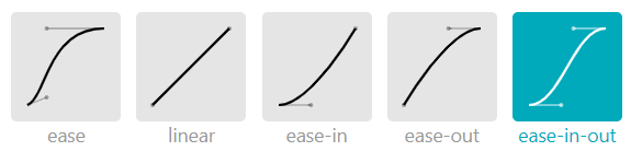
# 6、时间函数
TIP
时间函数(transition-timing-function),管理着动画在单位帧内播放的速度曲线
时间函数的预设值
| 值 | 描述 |
|---|---|
| linear | 规定以相同速度开始至结束的过渡效果(等于 cubic-bezier(0,0,1,1))。 |
| ease | 默认值,规定慢速开始,然后变快,然后慢速结束的过渡效果(cubic-bezier(0.25,0.1,0.25,1))。 |
| ease-in | 规定以慢速开始的过渡效果(等于 cubic-bezier(0.42,0,1,1))。 |
| ease-out | 规定以慢速结束的过渡效果(等于 cubic-bezier(0,0,0.58,1))。 |
| ease-in-out | 规定以慢速开始和结束的过渡效果(等于 cubic-bezier(0.42,0,0.58,1))。 |
| cubic-bezier(n,n,n,n) | 在 cubic-bezier 函数中定义自己的值。可能的值是 0 至 1 之间的数值。 |
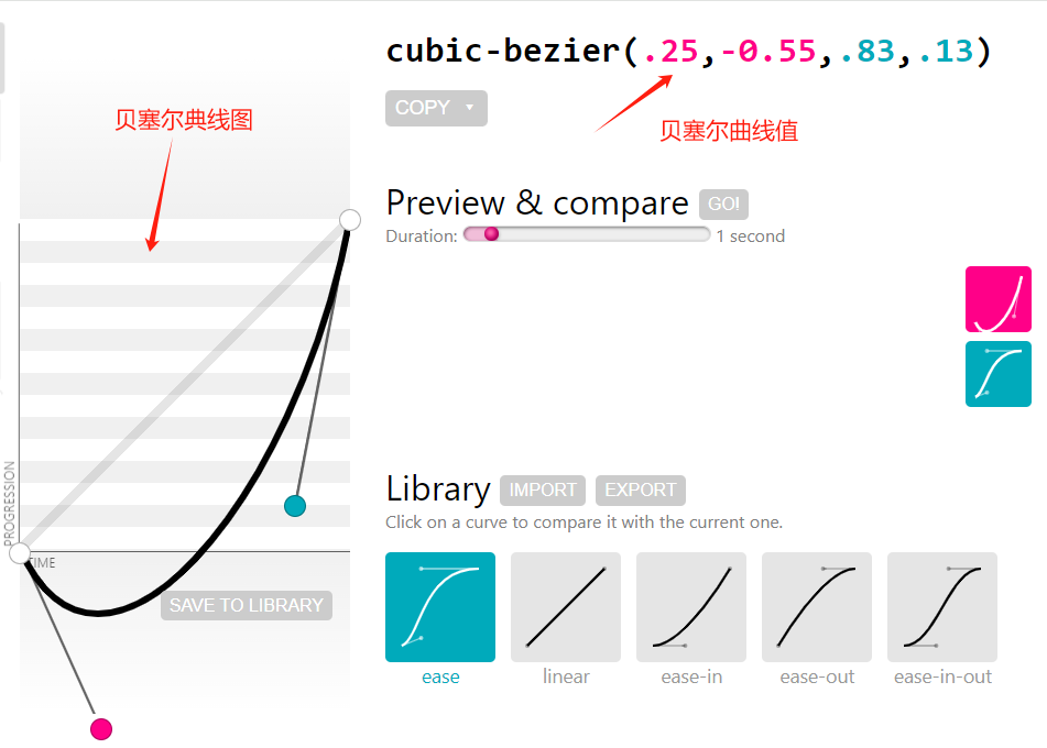
常用参数
横轴表示时间,纵轴表示变化量 .越斗表示运动速度越快。
贝塞尔曲线
官方网址:https://cubic-bezier.com/ (opens new window) 可以在线生成贝塞尔曲线,可以自定义动画时间函数
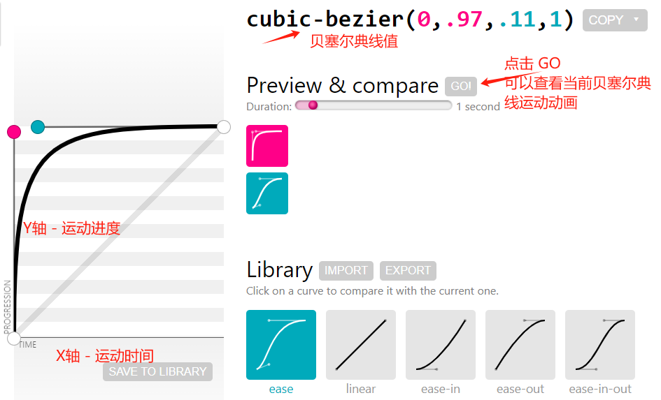
# 6.1、利用贝塞尔曲线来制定元素的运动速度
<style>
.box {
width: 100px;
height: 100px;
}
.box1 {
background-color: khaki;
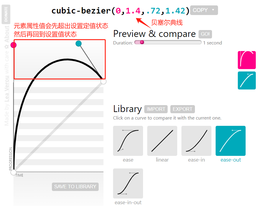
/* cubic-bezier(0, 1.4, 0.72, 1.42) 贝塞尔曲线 区线指定运动速度*/
transition: width 1s cubic-bezier(0, 1.4, 0.72, 1.42);
}
.box:hover {
width: 200px;
}
.box2 {
width: 200px;
background-color: skyblue;
}
</style>
<body>
<div class="box box1"></div>
<div class="box box2"></div>
</body>

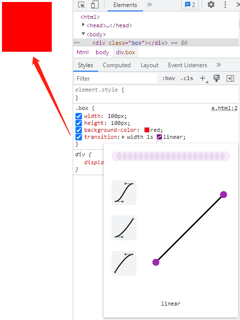
# 6.2、代码的控面板当中来调整贝塞尔曲线
TIP
我们可以在浏览器中右击审查元素,在代码的控面板当中来调整贝塞尔曲线,来调节运动速度
如下
<style>
  .box {
    width: 100px;
    height: 100px;
    background-color: red;
    /* 过渡动画 */
    transition: width 1s linear;
  }
  .box:hover {
    width: 200px;
  }
</style>
<body>
  <div class="box"></div>
</body>
# 二、transition 过渡动画实战案例
TIP
项目中常用的动画实践案例
# 1、鼠标滑动,背景从透明到半透明效果

点击查看完整源代码
<style>
  .box {
    width: 200px;
    height: 200px;
    position: relative;
  }
  .box img {
    width: 200px;
    height: 200px;
    /* 图片填充方式:图片等宽高覆盖内容框 */
    object-fit: cover;
  }
  .box::after {
    /* 绝对定位 */
    position: absolute;
    top: 0;
    bottom: 0;
    right: 0;
    left: 0;
    content: "";
    /* 背景颜色完全透明 刚开始看不到*/
    background-color: rgba(0, 0, 0, 0);
    /* 过渡动画*/
    transition: background-color 1s;
  }
  .box:hover::after {
    /* 背景颜色不透明度为0.5 */
    background-color: rgba(0, 0, 0, 0.5);
  }
</style>
<body>
  <div class="box">
    <img src="./images/pic1.jpg" alt="" />
  </div>
</body>
# 2、鼠标滑动,文字从下往上滑动效果
点击查看完整源代码
<style>
  body,
  p {
    margin: 0;
  }
  .box {
    width: 200px;
    height: 200px;
    position: relative;
    /* 超出部分隐藏 */
    overflow: hidden;
  }
  .box img {
    width: 200px;
    height: 200px;
    /* 图片等宽高填充内容区 */
    object-fit: cover;
  }
  .box p {
    /* 绝对定位 */
    position: absolute;
    left: 0px;
    /* 最开始定位到父元素外边看不到 */
    bottom: -35px;
    width: 100%;
    height: 35px;
    line-height: 35px;
    text-align: center;
    color: #fff;
    background-color: rgba(0, 0, 0, 0.5);
    /* 过渡动画 */
    transition: bottom 0.5s;
  }
  .box:hover p {
    bottom: 0px;
  }
</style>
<body>
  <div class="box">
    <img src="./images/pic1.jpg" alt="" />
    <p>上帝散落的光</p>
  </div>
</body>
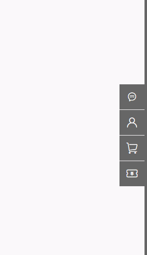
# 3、商城右侧通栏导航
在 iconfont 官网 (opens new window)搜索 会话、头像、购物车、优惠券` 找到下图中需要用到的小图标。
点击查看完整源代码
<!-- 引用阿里矢量图标 -->
<link rel="stylesheet" href="./iconfont/iconfont.css" />
<style>
  /* 清除默认样式 */
  body {
    margin: 0;
  }
  ul {
    margin: 0;
    padding: 0;
    list-style: none;
  }
  /* 侧边栏固定定位在浏览器最右边 */
  .siderbar {
    width: 5px;
    height: 100%;
    position: fixed;
    top: 0;
    right: 0;
    background-color: #666;
  }
  .siderbar ul {
    width: 50px;
    height: 208px;
    /* background-color: red; */
    /* 绝对定位在侧边栏垂直居中位置 */
    position: absolute;
    left: -50px;
    top: 50%;
    margin-top: -104px;
  }
  .siderbar ul li {
    width: 50px;
    height: 50px;
    margin: 2px 0px;
    background-color: #666;
    /* 相对定位 */
    position: relative;
  }
  .siderbar ul li i {
    display: block;
    width: 50px;
    height: 50px;
    background-color: #666;
    position: absolute;
    top: 0;
    left: 0;
    font-size: 24px;
    text-align: center;
    line-height: 50px;
    color: #fff;
  }
  .siderbar ul li span {
    display: block;
    /* 最开始隐藏不见,即width为0,同时overflow:hidden */
    width: 0px;
    overflow: hidden;
    height: 50px;
    /* 相对li绝对定位,元素的最右边与li的最左边对齐 */
    position: absolute;
    top: 0;
    right: 50px;
    background-color: #666;
    color: #fff;
    /* 文字首行缩进20px */
    text-indent: 20px;
    line-height: 50px;
    /* 宽度过渡动画效果 */
    transition: width 1s;
  }
  .siderbar ul li:hover i {
    background-color: red;
  }
  /* 鼠标滑动到li ,改变span的宽和背景颜色*/
  .siderbar ul li:hover span {
    width: 120px;
    background-color: red;
  }
</style>
<body>
  <div class="siderbar">
    <ul>
      <li>
        <i class="iconfont icon-xiaoxixinxihuihuahuida"></i>
        <span>联系客服</span>
      </li>
      <li>
        <i class="iconfont icon-jurassic_user"></i>
        <span>京东会员</span>
      </li>
      <li>
        <i class="iconfont icon-gouwuche"></i>
        <span>购物车</span>
      </li>
      <li>
        <i class="iconfont icon-wodeyouhuiquan"></i>
        <span>优惠券</span>
      </li>
    </ul>
  </div>
</body>
# 4、抛物线运动

.add {
  width: 20px;
  height: 20px;
  background-color: tomato;
  border-radius: 50%;
  /* 固定定位 */
  position: fixed;
  left: 800px;
  bottom: 600px;
}
.parabola {
  transition-duration: 1s; /* 过渡时间 */
  transition-property: left, bottom; /* 过渡属性 */
  transition-timing-function: ease, cubic-bezier(0.25, -0.55, 0.83, 0.13);
}
.end-state {
  /* 修改 left 与 bottom 的值 */
  left: 100px;
  bottom: 60px;
}
<div class="add parabola"></div>
<script>
  let add = document.querySelector(".add"); /* 获取添加按扭 */
  add.onclick = function () {
    /* 给按扭加上 end-state class */
    this.classList.add("end-state");
  };
</script>
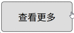
# 5、复杂的过渡动画
<style>
  a {
    text-decoration: none;
    text-align: center;
    color: #000;
  }
  a.more-button {
    display: block;
    width: 120px;
    height: 50px;
    line-height: 50px;
    border: 1px solid #666;
    background-color: #ddd;
    border-radius: 5px;
    position: relative;
    overflow: hidden;
    margin-top: 100px;
    z-index: 0;
  }

  /* 蓝色 圆形 */
  a.more-button::after {
    content: "";
    display: block;
    width: 120%;
    height: 300%;
    background-color: skyblue;
    border-radius: 50%;
    top: 50px;
    left: -10%;
    position: absolute;
    /* transition: top 1s; */
    z-index: -2;
  }

  /* 蓝色方块 */
  a.more-button::before {
    content: "";
    width: 100%;
    height: 100%;
    display: block;
    background-color: skyblue;
    position: absolute;
    left: 0;
    top: -102%;
    z-index: -1;
    /* 离开时,慢慢离开*/
    transition: top 0.5s ease 0s;
  }

  /* 蓝色方块 一开始延迟 0.5s 然后立刻调整 top值为 0*/
  a.more-button:hover::before {
    top: 0;
    transition: top 0s ease 0.5s;
  }
  /* 圆形方块,鼠标移入后,慢慢改变top值 */
  a.more-button:hover::after {
    transition: top 0.5s;
    top: -100%;
  }
</style>
<body>
  <a href="" class="more-button"> 查看更多 </a>
</body>
# 三、animation 自定义动画
TIP
使用自定义动画,需要分两步:
- 第一步是:定义动画
- 第二步是:调用动画
# 1、动画的定义
使用 @keyframes 关键帧来定义动画
- 创建动画的原理是,将一套 CSS 样式逐渐变化为另一套样式。
- 在动画过程中,您可以多次更改 CSS 样式的设定。
- 动画执行各阶段时间,可以通过百分比来规定改变发生的时间,或者通过关键词 "from" 和 "to"。
- from 和 to 等价于 0% 和 100%。from 和 0% 是动画的开始时间,to 和 100% 动画的结束时间。
@keyframes  动画名 {
    /* 起始状态 */
    from {  样式   }
    /* 结束状态 */
    to {  样式  }
}

/* 或 */

@keyframes  动画名 {
    /* 起始状态 */
	0% {  样式   }
	/* 结束状态 */
	100% {  样式  }
}
定义一个动画
/*
    @keyframes 表示定义动画
    changeBox:动画的名字
    0% :表示起始状态
    100% :表示结束状态
*/

@keyframes changeBox {
  0% {
    width: 200px;
    height: 200px;
  }
  100% {
    width: 400px;
    height: 400px;
  }
}
# 2、调用动画
TIP
动画定义好之后,我们需要使用 animation 属性来调用动画
/* 简单的 animation 动画 */
animation: 动画名 动画完成时间 [时间函数] [延迟时间];
/*
	changeBox 动画的名字
	1s 总时长
	linear 缓动效果
	0s 延迟时间
*/
animation: changeBox 1s linear 0s;
案例
点击查看完整源代码
<style>
  .box {
    width: 50px;
    height: 50px;
    background-color: red;
    /* 调用动画:动画名 动画执行时间; */
    animation: changeBox 5s;
  }
  /* 定义动画 动画名为 changeBox */
  @keyframes changeBox {
    /*
     0% {
      width: 50px;
      height: 50px;
    }

    100% {
      width: 200px;
      height: 200px;
    }
    */

    /* 起始状态 */
    from {
      width: 50px;
      height: 50px;
    }
    /* 结束状态 */
    to {
      width: 200px;
      height: 200px;
    }
  }
</style>
<body>
  <div class="box"></div>
</body>
# 3、多关键帧动画
TIP
用百分比%,分别表示动画执行的时间节点
<style>
.box {
    width: 100px;
    height: 100px;
    background-color: red;
}
/* 鼠标滑上后,再加上animation 动画 */
.box:hover {
    animation: changeBox 3s linear;
}

/* 前 1.5秒杀只改变宽,后1.5秒只改变高 */
@keyframes changeBox {
    0% {
        width: 100px;
        height: 100px;
    }
    50% {
        /* 先改变宽,高不变 这里的高一定不能省 */
        width: 200px;
        height: 100px;
    }
    100% {
        /* 再保持宽不变,改变高,这里的宽一定不能省  */
        width: 200px;
        height: 200px;
    }
}
</style>

<div class="box"></div>

# 4、多关键帧动画 - 注意事项一
TIP
如果没有指定 0% 和 100% 时间段,则元素的初始状态为 0% 和 100% 的状态
<style>
  .box {
    width: 100px;
    height: 100px;
    background-color: red;
  }
  .box:hover {
    animation: changeBox 3s linear;
  }
  @keyframes changeBox {
    50% {
      width: 200px;
      height: 200px;
    }
  }
</style>

<div class="box"></div>
上面案例中定义的 changeBox 动画,相当于以下 changeBox 动画的简写
@keyframes changeBox {
  0% {
    width: 100px;
    height: 100px;
  }
  50% {
    width: 200px;
    height: 200px;
  }
  100% {
    width: 100px;
    height: 100px;
  }
}
# 5、多关键帧动画 - 注意事项二
TIP
如果在前面的时间段中指定了某属性(如:width) 的值,在后面的时间段中没有指定该 width 属性,则动画结束时间段中,该属性 width 的值为元素的初始值。
<style>
  .box {
    width: 100px;
    height: 100px;
    background-color: red;
  }
  .box:hover {
    animation: changeBox 3s linear;
  }
  @keyframes changeBox {
    50% {
      width: 200px;
      height: 200px;
    }
    100% {
      height: 200px;
      /* 这里没有指定 width 的属性值,则 width: 100px;  */
    }
  }
</style>

<div class="box"></div>
# 6、多关键帧动画案例

<style>
  .box {
    width: 100px;
    height: 100px;
    background-color: aqua;
    position: absolute;
    /*
        调用动画
        mymove 动画名
        4s 动画执行时间
        ease 动画速度
        0s 动画延迟时间
    */
    animation: mymove 4s ease 0s;
  }

  @keyframes mymove {
    /* 起始状态 0s */
    0% {
      top: 0px;
      left: 0px;
      background: red;
    }
    /* 1秒后 */
    25% {
      top: 0px;
      left: 100px;
      background: blue;
    }
    /* 2秒后 */
    50% {
      top: 100px;
      left: 100px;
      background: yellow;
    }
    /* 3秒后 */
    75% {
      top: 100px;
      left: 0px;
      background: green;
    }
    /* 4秒 结束状态 */
    100% {
      top: 0px;
      left: 0px;
      background: red;
    }
  }
</style>
<body>
  <div class="box"></div>
</body>
# 7、animation 完整写法
TIP
animation 这个属性,相当于是下面表格中所有属性的复合写法。
语法
animation: 动画名 动画完成时间 时间函数 延迟时间 播放次数 是否返向播放
  动画开始或完成时的状态 动画是否正在运行或已暂停;
| 属性 | 说明 | 属性值 |
|---|---|---|
| animation-name | 指定应用的一系列动画名,即@keyframes 定义的动画名 | none 表示不调用动画 动画名:由大小写敏感的字母 a-z、数字 0-9、下划线 (_) 和/或横线 (-) 组成。不能以数字开头 |
| animation-duration | 指定动画周期时长,需要多少秒或毫秒完成 | 默认值为 0s,表示无动画。 时长单位为秒(s)或者毫秒(ms) 如: 1s ,2s |
| animation-timing-function | 设置动画将如何完成一个周期 | linear(直线匀速) ease(慢-快-慢) ease-in(慢-快) ease-out(快-慢) ease-in-out(慢-快-慢) 贝塞尔函数表示 cubic-bezier(0.84,-0.21, 1,-0.15) steps(n,start|end) |
| animation-delay | 设置动画在启动前的延迟间隔时间 | 默认值为 0s,表示立即执行 时长单位为秒(s)或者毫秒(ms) 如: 1s ,2s |
| animation-iteration-count | 定义动画的播放次数。 | n:一个数字,动画播放次数 infinite:无限次播放 |
| animation-direction | 指定是否应该轮流反向播放动画。 | normal: 默认值。动画正常播放reverse :动画反向播放,动画按步后退的效果alternate: 动画在奇数次(1、3、5...)正向播放,在偶数次(2、4、6...)反向播放。alternate-reverse : 动画在奇数次(1、3、5...)反向播放,在偶数次(2、4、6...)正向播放。 |
| animation-fill-mode | 设置 CSS 动画在执行之前和之后如何将样式应用于其目标元素 | none: 默认值。动画在动画执行之前和之后不会应用任何样式到目标元素。forwards: 在动画结束后,动画将停止在最后结束的状态backwards:动画正式开始之前,元素就会呈现出动画第一帧的样式。动画延迟执行的情况下,能看到动画开始前,元素应用的是动画第一帧的样式 both : 动画遵循 forwards 和 backwards 的规则。也就是说,动画会在两个方向上扩展动画属性 |
| animation-play-state | 指定动画是否正在运行或已暂停。 | paused 暂停动画running 正在运行动画 |
# 7.1、animation-iteration-count 动画播放次数
TIP
animation-iteration-count 属性定义动画的播放次数,属性值可以是以下两种
- n:一个数字,动画播放次数
- infinite:无限次播放
<style>
  .box {
    width: 100px;
    height: 100px;
    background-color: skyblue;
    position: absolute;
    left: 0;
    top: 0;
    /* 动画名 执行时间 匀速 延迟0s 执行2次*/
    /* animation: mymove 2s linear 0s 2; */
    /* infinite 无限循环 */
    animation: mymove 2s linear 0s infinite;
  }
  @keyframes mymove {
    0% {
      top: 0;
      left: 0;
    }
    50% {
      top: 0px;
      left: 200px;
    }
    100% {
      top: 200px;
      left: 200px;
    }
  }
</style>
<body>
  <div class="box"></div>
</body>
渲染效果:
# 7.2、animation-direction 指定是否应该轮流反向播放动画
TIP
animation-direction 属性用于指定是否应该轮流反向播放动画,属性值可以是以下几种
normal: 默认值。动画正常播放reverse:动画反向播放,动画按步后退的效果alternate: 动画在奇数次(1、3、5...)正向播放,在偶数次(2、4、6...)反向播放。alternate-reverse: 动画在奇数次(1、3、5...)反向播放,在偶数次(2、4、6...)正向播放。
<style>
  .box {
    width: 100px;
    height: 100px;
    background-color: skyblue;
    /* 绝对定位 */
    position: absolute;
    left: 0;
    top: 0;
    /* 动画名 执行时间 匀速 延迟0s  播放次数2次  奇数次正向播,偶数反向播 */
    animation: mymove 2s linear 0s 2 alternate;
  }
  @keyframes mymove {
    /* 0s 开始 */
    0% {
      top: 0;
      left: 0;
    }
    /* 1s 后*/
    50% {
      top: 0px;
      left: 200px;
    }
    /* 2s 后*/
    100% {
      top: 200px;
      left: 200px;
    }
  }
</style>
<body>
  <div class="box"></div>
</body>
| reverse 反向播放 | alternate 先正向后反向 | alternate-reverse 先反向后正向 |
|---|---|---|
 |  |  |
# 7.3、animation-fill-mode 属性
TIP
CSS 属性 animation-fill-mode 设置 CSS 动画在执行之前和之后如何将样式应用于其目标
animation-fill-mode 属性值
| 属性值 | 描述 |
|---|---|
| none | 默认值。动画在动画执行之前和之后不会应用任何样式到目标元素。 |
| forwards | 在动画结束后,动画将停止在最后一帧(动画结束)的状态 |
| backwards | 动画正式开始之前,元素就会呈现出动画第一帧的样式。 动画延迟执行的情况下,能看到动画开始前,元素应用的是动画第一帧的样式 |
| both | 动画遵循 forwards 和 backwards 的规则。也就是说,动画会在两个方向上扩展动画属性。动画开始应用第一帧 |
<style>
  .box {
    width: 100px;
    height: 100px;
    background-color: skyblue;
    position: absolute;
    left: 0;
    top: 0;
    /* 动画名 执行时间 匀速 延迟0s */
    /*
        animation: mymove 2s linear 2s 1 none;
        animation: mymove 2s linear 2s 1 forwards;
        animation: mymove 2s linear 2s 1 backwards; */
    animation: mymove 2s linear 2s 1 both;
  }
  @keyframes mymove {
    0% {
      top: 100px;
      left: 0;
      color: yellow;
    }
    50% {
      top: 0px;
      left: 200px;
    }
    100% {
      top: 200px;
      left: 200px;
    }
  }
</style>
<body>
  <div class="box">我是大美人</div>
</body>
| none | forwards |
|---|---|
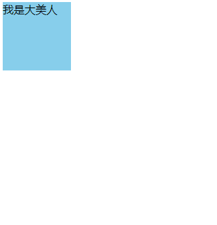 |  |
| 刚进到页面,元素在初始位置显示 2s 后,移到 top:100px 的位置,然后开始动画 动画结束后又回到初始位置 | 刚进到页面,元素在初始位置显示 2s 后,移到 top:100px 的位置,然后开始动画 动画结束后,停在结束后位置 |
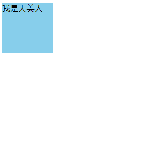
| backwards | both |
|---|---|
 |  |
| 刚进到页面,元素停在 top:100px 的位置 2s 后,开始动画 动画结束后又回到初始位置 | 刚进到页面,元素停在 top:100px 的位置 2s 后,开始动画 动画结束后,停在结束后位置 |
# 7.4、animation-play-state 指定动画是否正在运行或已暂停
| 属性值 | 说明 |
|---|---|
| paused | 暂停动画 |
| running | 正在运行动画 |
注:
animation-play-state通常与:hover配合来使用,当鼠标滑动上去时,可以暂停或开启动画
<style>
  .box {
    width: 100px;
    height: 100px;
    background-color: skyblue;
    position: absolute;
    left: 0;
    top: 0;
    /* 动画名 执行时间 匀速 延迟0s */
    animation: mymove 5s linear 0s 1;
  }
  @keyframes mymove {
    0% {
      top: 0;
      left: 0;
      color: yellow;
    }
    50% {
      top: 0px;
      left: 200px;
    }
    100% {
      top: 200px;
      left: 200px;
    }
  }
  /* 鼠标滑动上去,暂停动画执行 */
  .box:hover {
    animation-play-state: paused;
  }
</style>
<body>
  <div class="box"></div>
</body>
渲染效果:
# 8、animation 指定多组动画
TIP
animation 属性用来指定一组或多组动画,每组之间用 逗号 , 相隔。
animation: move 2s, bgcolor 2s 2s forwards;
<style>
  .box {
    width: 100px;
    height: 100px;
    background-color: skyblue;
    /*
        动画 move  执行时间2s  延迟1s执行,执行后动画停止在结束的状态
        动画 bgcolor 执行时间2s  延迟3s执行,执行后动画停止在结束的状态
        */
    animation: move 2s 1s forwards, changeBox 2s 3s forwards;
    position: absolute;
    top: 10px;
    left: 10px;
  }

  /* 动画1 */
  @keyframes move {
    50% {
      top: 10px;
      left: 100px;
    }
    100% {
      left: 100px;
      top: 100px;
    }
  }
  /* 动画2*/
  @keyframes changeBox {
    0% {
      background-color: khaki;
    }
    100% {
      width: 200px;
      height: 200px;
      background-color: red;
    }
  }
</style>
<body>
  <div class="box"></div>
</body>
渲染效果:

# 9、实战应用:抖动消失动画

左右抖动动画原理:
- 让一个元素先向左移动 5px 距离,再向右移动 5px 距离
- 再向左多动 3px 距离,再向右移动 3px 距离
- 再向左移动 2px 距离,再回到原点
<style>
  body {
    overflow: hidden;
  }
  .box {
    width: 200px;
    height: 250px;
    background-color: skyblue;
    margin: 50px auto;
    position: relative;
    left: 0;
    top: 0;
  }
  .animation-bounce {
    /* animation: bounce 1s ease-out forwards; */
    animation: bounce 1s ease-out;
  }

  /*  定义抖动动画 */
  @keyframes bounce {
    0% {
      left: -5px;
    }
    15% {
      left: 5px;
    }
    30% {
      left: -3px;
    }
    45% {
      left: 3px;
    }
    60% {
      left: -2px;
    }
    75% {
      left: 0;
      top: 0;
      opacity: 1;
    }
    100% {
      left: 0;
      top: 2000px;
      opacity: 0;
    }
  }
</style>

<div class="box"></div>

<script>
  var box = document.querySelector(".box"); // 获取 box元素
  // 给 box 元素绑定点击事件,
  box.onclick = function () {
    // 点击元素后,给当前元素添加  class属性值 animation-bounce
    this.classList.add("animation-bounce");
  };
</script>
注:
在实际的开发中,抖动动画的左右移动是通过transform:translateX() 来实现的。
因为我们现在还没有学到,所以暂时用相对定位来实现,目的是了解该动画实现原理。
# 10、steps 帧动画
TIP
steps 定义一个动画从开始到结束,每一个时间段内的步数,每个步数之间的间格时间是相等的
语法
steps(n,start|end)
n:指定了动画应该分成 多少步start:表示动画在每个步骤的开始时发生变化。这意味着动画的第一步将在动画时间线的开始处立即显示,然后跳转到下一步,依此类推。end:表示动画在每个步骤的结束时发生变化。这意味着动画将先完成当前步骤的持续时间,然后在时间线的下一步处突然显示下一步的状态。
如何区分 start 与 end
假设动画的时间是 10s,共分 5 步执行
steps(5, start);
steps(5, end);
<style>
  body {
    margin: 0;
  }
  .box {
    width: 100px;
    height: 100px;
    background-color: skyblue;
    position: absolute;
    top: 0;
    left: 0;
    /* 分五步,第一步在第一帧结束的位置 */
    animation: move 10s steps(5, start);
  }
  @keyframes move {
    0% {
      left: 0;
    }
    100% {
      left: 500px;
    }
  }
  /* 这个是用来做参考的,参考500px的位置在哪里 */
  .box2 {
    width: 500px;
    background-color: red;
    height: 20px;
  }
</style>
<body>
  <div class="box"></div>
  <div class="box2"></div>
</body>
| steps(5,end) | steps(5,start) |
|---|---|
 |  |
| 等待 2 秒后,才执行第一步 | 一上来,就执行了第一步 |
# 10.1、steps 的特殊性
TIP
steps是设置的每一步动画的跳跃步数,而不是整个动画的跳跃步数 ,具体看下面这个案例
<style>
  body {
    margin: 0;
  }
  .box {
    width: 100px;
    height: 100px;
    background-color: rgb(138, 210, 238, 0.5);
    position: absolute;
    top: 0;
    left: 0;
    /* 分五步,第一步在第一帧结束的位置 */
    animation: move 10s steps(5, start);
  }
  @keyframes move {
    0% {
      left: 0;
    }
    50% {
      left: 100px;
    }
    100% {
      left: 500px;
    }
  }
  /* 这个是用来做参考的,参考500px的位置在哪里 */
  .box2 {
    width: 500px;
    background-color: red;
    height: 20px;
  }
  /* 这个是用来做参考的,参考100px的位置在哪里 */
  .box3 {
    width: 100px;
    background-color: khaki;
    height: 10px;
  }
</style>
<body>
  <div class="box"></div>
  <div class="box2"></div>
  <div class="box3"></div>
</body>

# 10.2、steps 帧动画实战案例
TIP
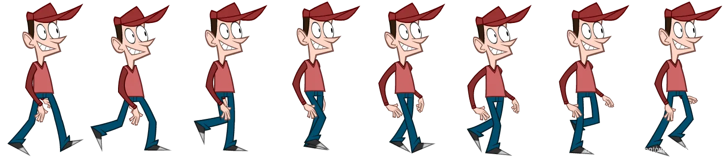
首先需要准备一张如下图所示的图片
- 图片的
宽 * 高=1472px * 325px - 图片有人物的 8 种不同状态,要求每种状态所占据的宽为
1472px / 8 = 184 px - 我们定义一个宽为 184px ,高为 325px 的长方形,将图片做为 长方形的背景图。
- 创建
steps()帧动画,将动画分为 8 步,每一步让背景图在原有的基础上向左移动184px,最终形成了如上图所示动画效果
<style type="text/css">
  html,
  body {
    margin: 0;
    padding: 0;
  }
  .box {
    width: 184px;
    height: 325px;
    margin: 50px auto;
    background-image: url("images/people.png");
    background-repeat: no-repeat;
    background-position: 0px 0px;
    /* 创建 帧动画 ,分 8步执行完  重复执行 */
    animation: move 1s steps(8, end) 0s infinite;
  }
  @keyframes move {
    0% {
      /* 动画开始时,图片的位置 */
      background-position: 0px 0px;
    }

    100% {
      /* 动画结束时,图片的位置 */
      background-position: -1472px 0px;
    }
  }
</style>
<body>
  <div class="box"></div>
</body>
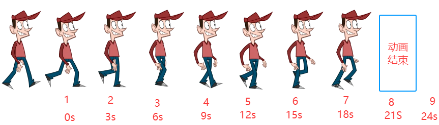
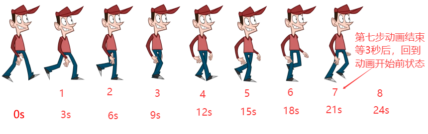
以下图解的是 在 32 秒内完成整上动画
start
一上来就执行了一步, 所以第一次进到页面,看到的是第二张,同时最后一步会出现空白
end
等待 3 秒后,才显示第一步, 所以第一次进到页面,看到的是第一张图,同时最后一步也不会出现空白。
# 11、transition 与 animation 的区别
区别
- 1、
transition是过渡,是样式值的变化的过程,只需要定义开始和结束两种状态值,中间状态会自动补全;animation其实也叫关键帧,通过和 @keyframe 结合可以设置中间每帧的一个状态 - 2、
transition需要通过 hover 或者 JS 事件来配合触发,animation配合@keyframe可以一进入页面就执行动画, - 3、
animation可以设置很多的属性,比如循环次数,动画结束的状态等等。transition不能控制循环次数,动画结束的状态等,所以transition动画只能触发一次;
温馨提示:transition 与 animation 属性都需要添加浏览器兼容性前缀。
.element {
  -webkit-transition: all 0.3s ease; /* Safari, Chrome, Opera < 15.4, iOS */
  -moz-transition: all 0.3s ease; /* Firefox < 16 */
  -o-transition: all 0.3s ease; /* Opera < 12.1 */
  transition: all 0.3s ease; /* 标准语法 */
}
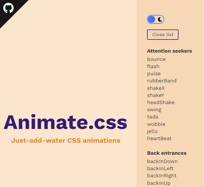
# 四、animate.css 动画库
TIP
- animate.css 是非常强大的跨平台的预设 css3 动画库
- 内置了很多典型的 css3 动画,兼容性好使用方便
- animate.css 官网:https://animate.style/ (opens new window)
# 1、深入学习 animate.css 动画库官网
TIP
点击网站 (opens new window) 右侧的导航,就能显示出对应的动画效果,如下图:
如果国外网站打不开,可以去 BootCDN 下载,往后看,我在后面提供了 BootCDN 的相关的操作步骤。
# 2、下载 animate.css 文件

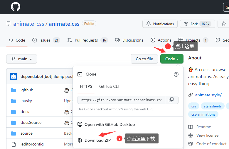
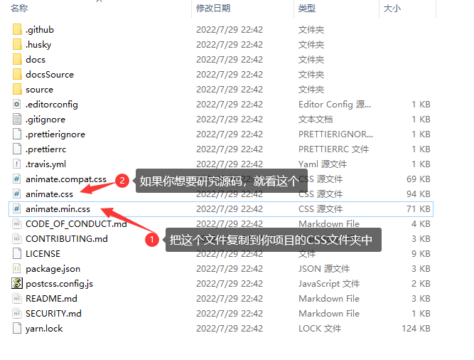
# 3、在页面引入 animate.css 文件
<!--引用时,要注意引用入的地址 -->
<link rel="stylesheet" href="./css/animate.css" />
# 4、选择对应动画效果应用
TIP
- 在网站的右侧选择你需要的效果
- 需要应用那个样式效果,在需要应用的元素上加
.animate__animated和 需要的效果样式名就 ok - 效果的样式名,在英文官网的样式标题上有个复制的小按扭,点击小按扭复制就可以获得
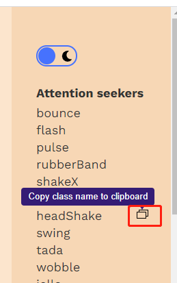
<!-- 应用  bounce 这个样式效果 -->
<div class="box animate__animated animate__bounce"></div>
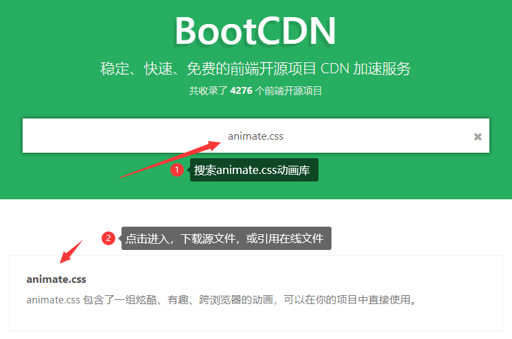
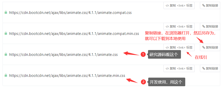
# 5、BootCDN 上下载 animate.css 文件
TIP
BootCDN 官网地址:https://www.bootcdn.cn/ (opens new window)
# 五、专项案例训练(作业)
TIP
- 作业参考视频 30 个 HTML+CSS 实战小案例详解 (opens new window)
- 有任何疑问可以联系添加的助理老师(或博客右侧的晓冉老师)
切记
学习阶段一定要按照以上的流程学习,提前熟悉工具和整个开发步骤,企业真实项目开发就是这样的流程
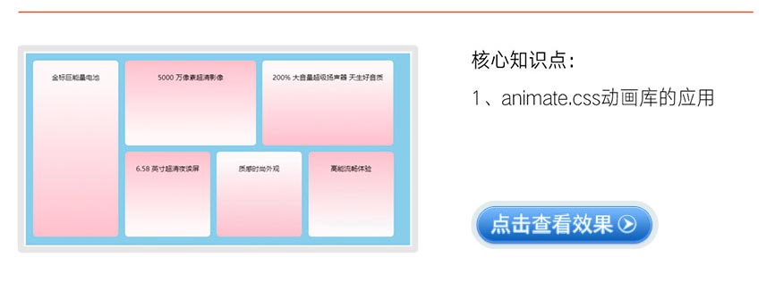
# 1、CSS3 网站全屏加载动画
点击查看完整版视频讲解
大厂最新技术学习分享群

微信扫一扫进群,获取资料
X