
# CSS 定位、层叠顺序、层叠上下文
TIP
CSS 中 position 属性用于指定一个元素在文档中的定位方式,元素的定位方式有 5 种类型。
如下表
定位类型值
| 属性值 | 描述 |
|---|---|
| static | 没有定位,元素出现在正常的流中(默认值,可以忽略) |
| relative | 相对定位,相对于自身正常位置进行位置的调整 |
| absolute | 绝对定位,相对于其最近的定位的父元素定位,进行位置调整 |
| fixed | 固定定位 相对于浏览器窗口进行位置调整 |
| sticky | 粘性定位 是基于用户的滚动位置来定位 |
注:
static 相当于元素没有加定位效果,如果元素加了定位,后面需要去掉,可以添加 position: static;
# 一、相对定位
TIP
盒子可以相对自己原来的位置进行位置调整,称之为 相对定位
- 给需要添加相对定位的元素,加上
position: relative; - 元素的位置通过(位置描述词):
"left","top","right","bottom"属性进行调整位置 - 属性值可以是正数,也可以是负数
| 定位的位置属性 | 描述 |
|---|---|
| top | 向下移动 |
| bottom | 向上移动 |
| left | 向右移动 |
| right | 向左移动 |
| 值可以为负数 | 即往规定方向相反移动 |
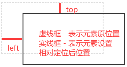
# 1、相对定位的特点
TIP
- 相对定位:相对于 自己本身正常位置(即:未使用定位前的位置) 进行定位
- 元素的初始位置占据的空间会被保留
- 相对定位元素不会对其它元素产生任何影响
- 自身的层级会提升半层
案例演示:值为正值
<style type="text/css">
  .box {
    width: 100px;
    height: 100px;
    background-color: skyblue;
    float: left;
  }
  .box2 {
    background-color: pink;
  }
  .box2 {
    /* 相对定位 */
    position: relative;
    /* 左偏移 20px */
    left: 20px;
    /* 上偏移20px */
    top: 20px;
  }
</style>
<body>
  <div class="box box1">box1</div>
  <div class="box box2">box2</div>
  <div class="box box3">box3</div>
</body>
| 未设置相对定位前效果 | 设置相对定位后效果 |
|---|---|
 |  |
案例演示:值为负数
当把上面案例中的 .box2 中的 left 和 top 值改为负数时,其效果如下
.box2 {
  /* 左偏移 -20px */
  left: 20px;
  /* 上偏移 -20px */
  top: 20px;
}

总结:相对定位特性
- 相对定位的元素,会在 "老家留坑" ,本质上仍然是在原来的位置,即:元素的初始位置占据的空间会被保留
- 只不过渲染在新的地方而已,渲染的图形可以比喻成影子,不会对页面其他元素产生任何影响
# 二、相对定位应用场景
TIP
- 用来微调元素自身的位置(案例 1,2)
- 可以当做绝对定位的参考盒子(绝对定位中会讲到)
- 用来提升自身的层级(综合实践 - 弹性滑动导航)
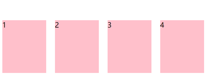
# 1、悬停卡片效果
TIP
鼠标滑动到元素,元素少量位置偏移动画
点击查看完整源代码
<style>
  ul {
    list-style: none;
    padding: 0;
    margin: 0;
    width: 480px;
    margin: 150px auto;
  }
  ul li {
    width: 100px;
    height: 120px;
    background-color: pink;
    margin: 0px 10px;
    float: left;
  }
  /*
        鼠标滑动到li上,li设置为相对定位
        然后相对自身向上偏移10px
        向右偏移2px
    */
  ul li:hover {
    position: relative;
    top: -10px;
    left: 2px;
  }
</style>
<body>
  <ul>
    <li>1</li>
    <li>2</li>
    <li>3</li>
    <li>4</li>
  </ul>
</body>
# 2、水平步骤条
TIP
- 右浮动实现元素从右往左开始排列成一行,第一个排在最后面,最后一个排在最左边
- 通过相对定位微调线条位置,使其与圆形在垂直方向对齐
- 利用 ~ 后续兄弟选择器,来选择他后面的元素,修改样式

点击查看完整源代码
<style>
  .order-progress {
    text-align: center;
  }
  ul {
    /* border: 1px solid red; */
    font-size: 0;
    list-style: none;
    display: inline-block;
  }
  ul li {
    /* 右浮动实现元素从右往左开始排列 */
    float: right;
  }
  ul li:nth-child(even) {
    width: 150px;
    border-top: 2px dashed #ddd;
    /* 通过相对定位来微调线条位置,实现线条与圆垂直居中对齐 */
    position: relative;
    top: 24px;
  }
  ul li:nth-child(odd) {
    background-color: #ddd;
    width: 50px;
    height: 50px;
    font-size: 16px;
    margin: 0px 5px;
    line-height: 50px;
    text-align: center;
    border-radius: 50%;
  }
  /* 当前进度 */
  ul li.current {
    background-color: skyblue;
    color: #fff;
  }
  /* 当前进度前面的元素偶数项样式 */
  ul li.current ~ li:nth-child(odd) {
    background-color: skyblue;
    color: #fff;
  }
  /* 当前进度前面的元素奇数项样式 */
  ul li.current ~ li:nth-child(even) {
    border-color: skyblue;
  }
</style>
<body>
  <div class="order-progress">
    <ul>
      <li>5</li>
      <li></li>
      <li>4</li>
      <li></li>
      <li class="current">3</li>
      <li></li>
      <li>2</li>
      <li></li>
      <li>1</li>
    </ul>
  </div>
</body>
# 三、绝对定位
TIP
绝对定位的元素,是相对离自己最近的定位祖先元素进行位置调整
- 给需要添加绝对定位的元素,加上
position: absolute; - 元素的位置通过(位置描述词):
"left","top","right","bottom"属性进行调整位置 - 属性值可以是正数,也可以是负数
| 定位的位置属性 | 描述 |
|---|---|
| top | 到上边的距离 |
| bottom | 到下边的距离 |
| left | 到左边的距离 |
| right | 到右边的距离 |
绝对定位元素 7 大特性
- 绝对定位元素脱离文档流,释放原本所占据的空间,同时层级提升
- 绝对定位的元素,相对离自己最近的定位祖先元素进行位置调整
- 如果没有定位的祖先元素,则相对 body 进行位置调整
- 行内元素加上定位后,其具有行内块元素特性,支持宽高设置
- 块级元素 没有设置宽度的情况下,如果加了绝对定位,宽度自动为内容宽
margin:0 auto;水平居中失效- 定位元素未设置宽高情况下,同时设置 top 和 bottom 会改变元素高,同时设置 left 和 right 会改变元素宽
- 在元素设置宽高情况下,同时设置 top 与 bottom ,会以 top 值为主 bottom 不生效,同时设置 left 与 right,则以 left 为主,right 不生效。
# 1、脱离文档流,层级提升
TIP
绝对定位元素完全脱离文档流,释放其原本所占据的空间,同时层级提升,会覆盖在其它元素上面。
点击查看完整源代码
<style>
  .container {
    width: 300px;
    height: 100px;
    border: 2px solid red;
    margin: 100px auto;
    /* 相对定位,是.box2绝对定位的参考对象 */
    position: relative;
  }
  .box {
    width: 100px;
    height: 100px;
    background-color: skyblue;
    float: left;
  }
  .box3 {
    background-color: khaki;
  }
  .box2 {
    background-color: pink;
    /* 绝对定位 */
    position: absolute;
    /* 与.container元素左边距离为 10px */
    left: 10px;
    /* 与.container元素上边距离50px */
    top: 50px;
  }
</style>
<body>
  <div class="container">
    <div class="box box1">1</div>
    <div class="box box2">2</div>
    <div class="box box3">3</div>
  </div>
</body>
上面这个案例,我们让
.box2相对于.container相对定位元素来进行绝对定位,调整自身位置。
| .box2 未绝对定位前效果 | .box2 绝对定位后效果 |
|---|---|
 |  |
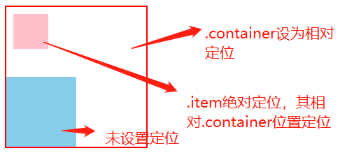
# 2、相对于离自己最近的定位的祖先元素定位
TIP
- 绝对定位元素相对于离自己最近的定位的祖先元素定位
- 假如元素的父元素未采用定位,祖先元素采用了定位,则绝对定位相对于离自己最近的祖先元素定位
点击查看完整源代码
<style>
  .container {
    width: 200px;
    height: 200px;
    border: 2px solid red;
    margin: 100px auto;
    /* 相对定位,是.box2绝对定位的参考对象 */
    position: relative;
  }
  .box {
    width: 100px;
    height: 100px;
    background-color: skyblue;
    margin-top: 100px;
  }
  .item {
    width: 50px;
    height: 50px;
    background-color: pink;
    /* 绝对定位 */
    position: absolute;
    /* 与.container元素左边距离为 10px */
    left: 10px;
    /* 与.container元素上边距离50px */
    top: 10px;
  }
</style>
<body>
  <div class="container">
    <div class="box">
      <div class="item"></div>
    </div>
  </div>
</body>
上面案例中
.item的直接父元素.box不是定位元素,而祖先元素.container是定位元素,所以.item最终相对于.continaer相对定位元素进行绝对定位。
| .item 未使用绝对定位前效果 | .item 使用绝对定位后效果 |
|---|---|
 |  |
# 3、父元素及祖先元素都未定位,则相对于 body 定位
点击查看完整源代码
<style>
  .container {
    width: 200px;
    height: 200px;
    border: 2px solid red;
    margin: 100px auto;
  }
  .box {
    width: 100px;
    height: 100px;
    background-color: skyblue;
    margin-top: 100px;
  }
  .item {
    width: 50px;
    height: 50px;
    background-color: pink;
    /* 绝对定位 其父元素和祖先元素都未设置定位,则其相对body定位 */
    position: absolute;
    /* 与body左边距离为 10px */
    left: 10px;
    /* 与body上边距离10px */
    top: 10px;
  }
</style>
<body>
  <div class="container">
    <div class="box">
      <div class="item"></div>
    </div>
  </div>
</body>
| .item 未使用定位前效果 | .item 设置绝对定位后效果 |
|---|---|
|  |
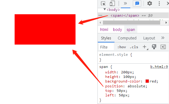
# 4、行内元素绝对定位后,具有行内块元素特性
点击查看完整源代码
<style>
  span {
    /* 行内元素加上绝对定位后,支持宽高设置 */
    width: 200px;
    height: 100px;
    background-color: red;
    /* 绝对定位 */
    position: absolute;
    /* 上偏移50px */
    top: 50px;
    /* 左偏移 */
    left: 50px;
  }
</style>
<body>
  <span></span>
</body>
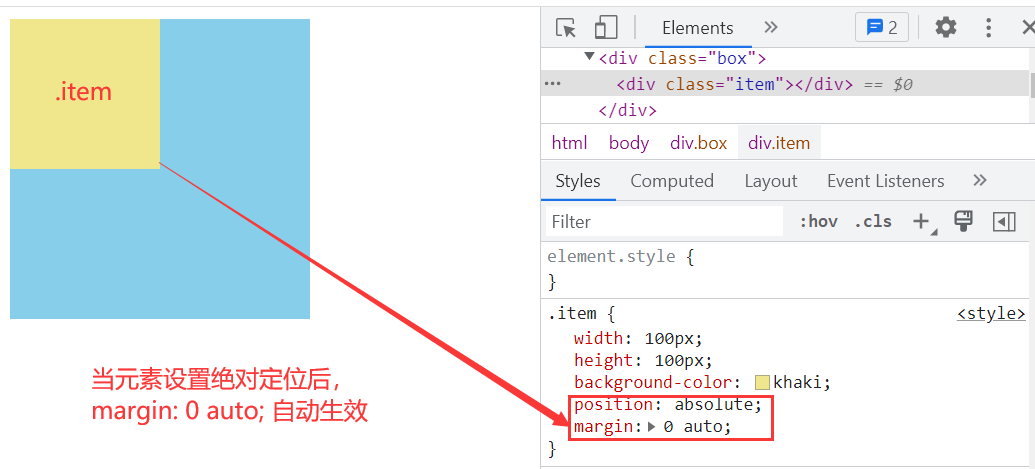
# 5、margin:0 auto 水平居中失效
TIP
绝对定位的元素,使用 margin:auto 水平居中无效
点击查看完整源代码
<style>
  .box {
    width: 200px;
    height: 200px;
    background-color: skyblue;
  }
  .item {
    width: 100px;
    height: 100px;
    background-color: khaki;
    /* 元素绝对定位 */
    position: absolute;
    /* 元素绝对定位后,margin:0 auto;水平居中失效 */
    margin: 0 auto;
  }
</style>
<body>
  <div class="box">
    <div class="item"></div>
  </div>
</body>
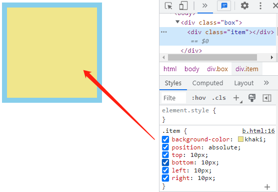
# 6、 同时设置 top、 bottom、 right、 left 值,调节元素宽高
TIP
定位元素在未设置宽高时
- 同时设置 top 和 bottom 会改变元素高
- 同时设置 left 和 right 会改变元素宽
点击查看完整源代码
<style>
  .box {
    width: 200px;
    height: 200px;
    background-color: skyblue;
    /* 相对定位 */
    position: relative;
  }
  .item {
    background-color: khaki;
    /* 元素绝对定位 */
    position: absolute;
    /*
        通过以下值,元素会被自动拉宽和拉高,
        与相对定位元素上下 左右 10px间距
        */
    top: 10px;
    bottom: 10px;
    left: 10px;
    right: 10px;
    /*
        left:50%;
        right:50%;
        元素的宽度将被设置为 0
        */
  }
</style>
<body>
  <div class="box">
    <div class="item"></div>
  </div>
</body>
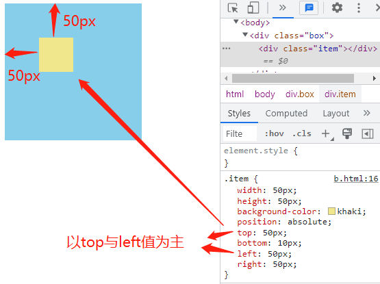
# 7、top 、 bottom 和 left 、 right 的优先级
TIP
在元素设置 宽高 情况下
- 同时设置 top 与 bottom,会以 top 值为主 bottom 不生效
- 同时设置 left 与 right,则以 left 为主,right 不生效
点击查看完整源代码
<style>
  .box {
    width: 200px;
    height: 200px;
    background-color: skyblue;
    /* 相对定位 */
    position: relative;
  }
  .item {
    width: 50px;
    height: 50px;
    background-color: khaki;
    /* 元素绝对定位 */
    position: absolute;
    /*
        通过以下值,元素会被自动拉宽和拉高,
        与相对定位元素上下 左右 10px间距
        */
    top: 50px;
    bottom: 10px;
    left: 50px;
    right: 50px;
  }
</style>
<body>
  <div class="box">
    <div class="item"></div>
  </div>
</body>
# 四、绝对定位应用场景
TIP
- 绝对定位与
margin配合,实现元素水平垂直居中 - 绝对定位用来制作 压盖、遮罩 效果
- 绝对定位可以结合 JS 和 transition 过渡,实现高级动画效果
- 绝对定位应用非常多,灵活性也很高,靠经验累积
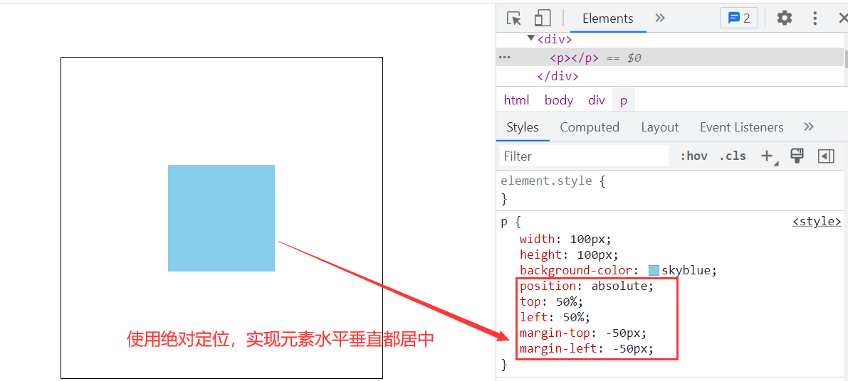
# 1、绝对定位的盒子垂直、水平居中(1)
TIP
实现绝对定位的盒子垂直和水平居中是一个非常实用的技术
实现原理如下
/* 垂直居中 */
position: absolute;
top: 50%;
margin-top: -自己高度一半;

/* 水平居中 */
position: absolute;
left: 50%;
margin-left: -自己宽度一半;
点击查看完整源代码
<style>
  * {
    margin: 0;
    padding: 0;
  }

  div {
    width: 300px;
    height: 300px;
    border: 1px solid #000;
    margin: 50px auto;
    /* 相对定位 */
    position: relative;
  }

  p {
    width: 100px;
    height: 100px;
    background-color: skyblue;
    /* 绝对定位 */
    position: absolute;
    top: 50%;
    left: 50%;
    /* 垂直居中:margin-top: -自己高度的一半; */
    margin-top: -50px;
    /* 水平居中 margin-left: -自己宽度的一半; */
    margin-left: -50px;
  }
</style>

<body>
  <div>
    <p></p>
  </div>
</body>
# 2、绝对定位的盒子垂直、水平居中(2)
<style>
.box {
    width: 200px;
    height: 100px;
    background-color: skyblue;
    position: relative; /* 相对定位 */
}
.item {
    width: 50px;
    height: 50px;
    background-color: tomato;
    position: absolute; /* 绝对定位 */
    left: 0;
    right: 0;
    top: 0;
    bottom: 0;
    margin: auto; /* 外边距 */
}
</style>
<div class="box">
<div class="item"></div>
</div>
# 3、元素中心定位在父元素的右上角
<style>
  .box {
    width: 200px;
    height: 200px;
    background-color: skyblue;
    position: relative;
  }
  .box .close-button {
    width: 30px;
    height: 30px;
    background-color: #000;
    border-radius: 50%;
    position: absolute;
    right: -15px;
    top: -15px;
  }
</style>
<div class="box">
  <div class="close-button"></div>
</div>

# 4、绝对定位实现黑色半透明遮罩层
点击查看完整源代码
<style>
  .box {
    width: 300px;
    height: 300px;
    position: relative;
  }
  .box::before {
    display: none;
    content: "";
    position: absolute;
    top: 0;
    bottom: 0;
    left: 0;
    right: 0;
    background-color: rgba(0, 0, 0, 0.5);
  }
  .box .icon-play {
    display: block;
    width: 80px;
    height: 80px;
    background: url(./images/play.png) no-repeat center;
    background-size: cover;
    position: absolute; /* 绝对定位 */
    left: 110px;
    top: 110px;
    display: none;
  }
  .box:hover::before {
    display: block;
  }
  .box:hover span {
    display: block;
  }
</style>
<body>
  <div class="box">
    <img src="./images/tx.png" alt="" />
    <span class="icon-play"></span>
  </div>
</body>
# 5、绝对定位实现带三角形的会话框
点击查看完整源代码
<style>
  .head {
    width: 124px;
    margin: 150px auto;
    position: relative;
  }

  /* 头像样式 */
  .head img {
    width: 100px;
    height: 100px;
    border-radius: 50%;
    border: 2px solid skyblue;
  }
  .head-txt {
    width: 200px;
    height: 140px;
    background-color: rgb(213, 241, 252);
    /*
            绝对定位
            left的距离=头像宽+左右border+三角形的宽
            top=(自身高-相对定位元素高)/2
         */
    position: absolute;
    left: 124px;
    top: -20px;
    border-radius: 20px;
    line-height: 100px;
    text-align: center;
    /* 最开始会话框隐藏 */
    display: none;
  }
  .head-txt::after {
    display: block;
    content: "";
    width: 0;
    border: 20px solid transparent;
    border-right-color: rgb(213, 241, 252);
    /*
            三角形相对的是.head-txt这个盒子定位
            top值 = (.head-txt高140-三角形高40)/ 2
            left值 = 三角形宽的2倍,因为左边还有一个透明的三角形
        */
    position: absolute;
    top: 50px;
    left: -40px;
  }
  .head:hover .head-txt {
    display: block;
  }
</style>
<body>
  <div class="head">
    <img src="images/tx.png" alt="" />
    <div class="head-txt">大家好,我是小美</div>
  </div>
</body>
# 6、鼠标移入展开动画

<style>
    a{
        text-decoration: none; /* 去掉下划线 */
        color:#000;
    }
    a{
        display: block;
        height:30px;
        width:130px;
        text-align: center; /* 文字水平居中 */
        line-height: 30px; /* 文字垂直居中 */
        position: relative; /* 相对定位 */
    }
    /* 绘制鼠标移入后展开的下划线,一开始下划线宽为0,不可见 */
    a::after{
        content: "";
        height:2px;
        background-color: rgb(31, 185, 246);
        position: absolute; /* 绝对定位 */
        left:50%;
        right:50%;
        bottom:0;
        /* 为left ,right属性添加过渡动画 ,后面css3动画会讲到 */
        transition: left .5s,right .5s;
    }
    a:hover::after{
        left:0;
        right:0;
    }
</style>

<a href="">点击进入主页</div>
# 五、固定定位
TIP
固定定位本质
- 固定定位是相对于浏览器窗口(视口)进行定位。但固定定位元素的祖先的
transform、perspective、filter或backdrop-filter属性非none时,固定位位相对于该祖先元素定位。 - 给需要添加固定定位的元素,加上
position: fixed; - 元素的位置通过(位置描述词):
"left","top","right","bottom"属性进行调整位置。属性值可以是正数,也可以是负数 - 固定定位除其位置是相对于浏览器窗口而言外,其它特性与绝对定位的一致
语法:
position: fixed; /* 固定定位 */
top: 100px; /* 与浏览器顶部距离 */
left: 100px; /* 与浏览器左边距离 */
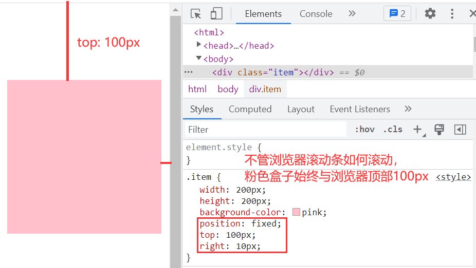
# 1、元素相对视口(浏览器窗口)固定定位
<style>
  body {
    height: 2000px;
  }
  .item {
    width: 200px;
    height: 200px;
    background-color: pink;
    /* 固定定位 */
    position: fixed;
    /* 与浏览器顶部100px */
    top: 100px;
    /* 与浏览器右边10px */
    right: 10px;
  }
</style>

<body>
  <div class="item"></div>
</body>
渲染效果:
# 2、元素相对祖先元素固定定位
TIP
当固定定位元素的祖先的 transform、perspective、filter 或 backdrop-filter 属性非 none 时,固定位位相对于该祖先元素定位。
.box {
  width: 200px;
  height: 200px;
  background-color: skyblue;
  /* 以下四行代码,设置元素相对浏览器窗口(视口)水平垂直居中 */
  position: fixed;
  top: 50%;
  left: 50%;
  transform: translate(
    -50%,
    -50%
  ); /* 向左和向上移动自身(可视宽)一半 ,这里是100px*/
  /*
    margin-left: -100px;  向左移动100px
    margin-top: -100px;  向上移动 100px
    */
}
.box .close {
  width: 30px;
  height: 30px;
  background-color: #000;
  border-radius: 50%;
  /* 推荐这种写法
    position: absolute;
    right: -15px;
    top: -15px;
    */

  /* 这里的固定定位,是相对于 box 元素来定位的,因为 box 元素中用到了 transform 属性 */
  position: fixed;
  right: -15px;
  top: -15px;
}
<div class="box">
  <div class="close"></div>
</div>

# 六、固定定位应用场景
TIP
不管浏览器的滚动条如何滚动,元素始终相对浏览器窗口的位置不变。
比如:返回顶部、楼梯式导航、右侧悬浮菜单,顶部与底部通栏广告等
# 1、固定定位实现返回顶部
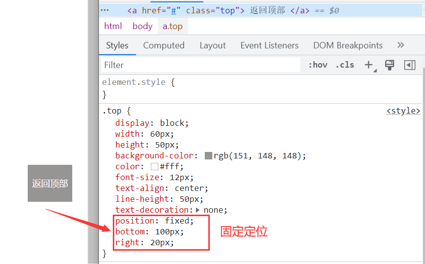
点击查看完整源代码
<style>
  html {
    scroll-behavior: smooth; /* 平滑滚动 */
  }
  body {
    /* 为演示有滚动条的效果,给body设置高度 */
    height: 2000px;
  }
  .top {
    display: block;
    width: 60px;
    height: 50px;
    background-color: rgb(151, 148, 148);
    color: #fff;
    font-size: 12px;
    text-align: center;
    line-height: 50px;
    text-decoration: none;
    /* 固定定位 */
    position: fixed;
    bottom: 100px;
    right: 20px;
  }
  .top:hover {
    background-color: gold;
  }
</style>

<body id="top">
  <a href="#top" class="top"> 返回顶部 </a>
</body>
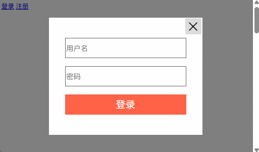
# 2、常见的登录弹窗效果
点击查看完整源代码
<style>
  body {
    height: 3000px;
  }
  .mask {
    width: 100%;
    height: 100%;
    background-color: rgba(0, 0, 0, 0.5);
    position: fixed;
    top: 0;
    left: 0;
  }
  .login {
    box-sizing: border-box; /* 怪异盒子模型 */
    width: 300px;
    /* height: 300px; 后面去掉 */
    /* background-color: blue; */
    background-color: #fff;
    position: fixed;
    top: 50%;
    left: 50%;
    /* margin-left: -150px;
        margin-top: -150px; */
    transform: translate(-50%, -50%);
    padding: 40px;
  }
  .login input {
    box-sizing: border-box; /* 怪异盒子模型 */
    width: 100%;
    height: 40px;
    outline: none;
    margin-bottom: 20px;
    border: 1px solid #ddd;
  }
  .login input::placeholder {
    font-size: 18px;
    position: relative;
    top: 3px;
  }
  .login input:focus {
    border: 1px solid tomato;
    border-radius: 2px;
  }
  .login .login-button input {
    background-color: tomato;
    border: none;
    border-radius: 5px;
    color: #fff;
    margin: 0;
    cursor: pointer;
  }
  .login .close-button {
    /* content: ""; */
    position: absolute;
    right: 2px;
    top: 2px;
    width: 20px;
    height: 20px;
    background-color: #ddd;
    background-image: url(./images/close.png);
    background-size: 15px;
    background-repeat: no-repeat;
    background-position: center;
    /* background-size: cover; */
    cursor: pointer;
  }
</style>

<a href="">登录</a>
<a href="">注册</a>
<!-- 黑色半透明遮罩层 -->
<div class="mask"></div>
<!-- 登录 -->
<div class="login">
  <span class="close-button"></span>
  <div class="user-name">
    <input type="text" placeholder="用户名" />
  </div>
  <div class="user-pwd">
    <input type="password" placeholder="密码" />
  </div>
  <div class="login-button">
    <input type="submit" value="登录" />
  </div>
</div>
# 3、左右固定,中间自适应布局

点击查看完整源代码
<style>
  body {
    margin: 0;
  }
  .left {
    width: 200px;
    /* 固定定位 */
    position: fixed;
    top: 0;
    bottom: 0;
    left: 0;
    background-color: skyblue;
  }
  .right {
    width: 150px;
    position: fixed; /* 固定定位 */
    right: 0;
    top: 0;
    bottom: 0;
    background-color: khaki;
  }
  .main {
    margin: 0 160px 0px 210px;
    background-color: tomato;
    min-height: 700px;
  }
</style>

<body>
  <div class="left"></div>
  <div class="main"></div>
  <div class="right"></div>
</body>
# 七、粘性定位
粘性定位解读
粘性定位相对离他最近的一个拥有“滚动机制”的祖先元素(当该祖先的overflow 是 hidden, scroll, auto, 或 overlay时)定位
粘性定位可以被认为是相对定位和固定定位的混合。元素在跨越特定阈值前为相对定位,之后为固定定位。
- 给需要添加粘性定位的元素,加上
position:sticky; - 元素的位置通过(位置描述词):
"left","top","right","bottom"属性进行调整位置。属性值可以是正数,也可以是负数
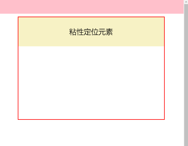
# 1、粘性定位元素,为 body 子元素
TIP
粘性定位相对离他最近的一个拥有“**滚动机制”**的祖先元素。body 标签默认内容溢出就会出现滚动条,所以 body 就是一个拥有“**滚动机制”**的祖先元素。
- 以下代码中的
.nav元素为body标签的子元素 - 给
.nav元素设置为sticky粘性定位 - 默认情况下,元素是按相对定位的状态显示(这种情况 top 值不能大于元素与浏览器顶部距离)。当滚动浏览器滚动条时,如果滚动高度大于元素与页面顶部高度时,则元素以固定定位显示;如果滚动高度小于元素与页面顶部高度时,则恢复至相对定位状态。
<style>
  body {
    margin: 0;
    height: 3000px;
  }
  .top {
    height: 100px;
    background-color: #000;
  }
  .nav {
    height: 100px;
    background-color: rgb(136, 209, 238, 0.5);
  }
  .sticky {
    position: sticky; /* 粘性定位 */
    top: 0px; /* 与顶部距离是0 ,你可以修改这个值来查看状态 */
  }
  .main {
    width: 800px;
    height: 1500px;
    background-image: linear-gradient(pink, yellow);
    margin: 0 auto;
  }
</style>
<body>
  <div class="top"></div>
  <!-- 粘性定位元素 -->
  <div class="nav sticky"></div>
  <div class="main"></div>
</body>
渲染效果:

# 2、 当 body 是离元素最近的拥有滚动机制的祖先元素
TIP
- 以下代码中的
.head元素为sticky粘性定位元素 - body 是离
.head元素最近的拥有“滚动机制”的祖先元素。 - 默认情况下,元素相对定位来呈现。当滚动浏览器滚动条时
- 如果滚动距离小于
.head元素与页面顶部距离时,一直以相对定位状态来呈现 - 如果滚动距离大于了
.head元素与页面顶部距离时,元素固定定位在浏览器最顶部 - 当滚动条滚动高度大于
.main底部与页面顶部距离时,.head相对.main元素一起被移走。
- 如果滚动距离小于
注意:粘性定位元素的直接父元素的高度一定要大于粘性定位元素时,才能看到粘性定位效果。
代码演示一
点击查看完整源代码
body {
  margin: 0;
  height: 2000px;
}
.top {
  height: 100px;
  background-color: pink;
}
.main {
  width: 1000px;
  margin: 20px auto;
  /* 这里的高度一定要大于.head元素的高度,否则看不到粘性定位效果 */
  height: 700px;
  border: 5px solid red;
}
.head {
  height: 200px;
  background-color: rgb(240, 230, 140, 0.5);
  font-size: 50px;
  text-align: center;
  line-height: 200px;
  /* 粘性定位 */
  position: sticky;
  top: 0px;
}
<body>
  <div class="top"></div>
  <div class="main">
    <!-- 粘性定位的元素 -->
    <div class="head">粘性定位元素</div>
  </div>
</body>
渲染效果:
# 3、元素的父级(非 body)是离元素最近的拥有“滚动机制”祖先元素
TIP
.head元素是粘性定位元素.main元素是离.head元素最近的拥有”滚动机制“的祖先(父)元素- 当滚动
.main元素的滚动条时,当滚动距离大于.head元素顶部到.main元素顶部距离时,.head元素固定在.main元素的顶部。
点击查看完整源代码
body {
  margin: 0;
  height: 2000px;
}
.main {
  width: 500px;
  margin: 50px auto;
  height: 500px;
  overflow: auto;
  border: 1px solid red;
}
.h100 {
  height: 100px;
  background-color: skyblue;
}
.head {
  height: 200px;
  background-color: rgb(240, 230, 140, 0.5);
}
.sticky {
  /* 粘性定位 */
  position: sticky;
  top: 0px;
}
.h700 {
  height: 700px;
}
<div class="main">
  <div class="h100">1111</div>
  <div class="head sticky">粘性定位元素</div>
  <div class="h700">222</div>
</div>
渲染效果:
# 4、通过 bottom 调整粘性元素位置
TIP
当离自己最近的拥有滚动机制的祖先元素的滚动高度小于元素与浏览器顶部距离时,元素相对浏览器固定定位,否则跟随内容一起移走(相对定位效果)。
<style>
  body {
    margin: 0;
    height: 3000px;
  }
  .top {
    height: 100px;
    background-color: pink;
  }
  .box {
    height: 100px;
    background-color: skyblue;
    position: sticky; /* 粘性定位 */
    bottom: 0px; /* */
  }
  .h800 {
    height: 1800px;
    width: 500px;
    background-image: linear-gradient(to bottom, red, yellow);
    margin: 0 auto;
  }
</style>

<body>
  <div class="top"></div>
  <div class="h800"></div>
  <div class="box"></div>
</body>
渲染效果:

# 八、粘性定位应用场景
TIP
类似吸顶盒效果、需要元素吸附指定位置的需求,一般会用到
# 1、头部和左侧吸顶盒效果
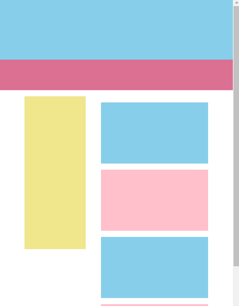
点击查看完整源代码
<style>
  body {
    margin: 0;
  }
  /* 清除浮动 */
  .clearfix::after {
    display: block;
    content: "";
    clear: both;
  }
  .top {
    height: 200px;
    background-color: skyblue;
  }
  .head {
    height: 100px;
    background-color: palevioletred;
    /* 粘性定位 */
    position: sticky;
    top: 0;
  }
  .main {
    width: 600px;
    margin: 20px auto;
  }
  .left {
    width: 200px;
    height: 500px;
    background-color: khaki;
    float: left;
    /* 粘性定位 */
    position: sticky;
    top: 120px;
  }
  .right {
    height: 2000px;
    width: 350px;
    float: right;
  }
  .right .item {
    height: 200px;
    margin: 20px 0px;
  }
  /* 偶数项背景色 */
  .right .item:nth-child(even) {
    background-color: pink;
  }
  /* 奇数项背景色 */
  .right .item:nth-child(odd) {
    background-color: skyblue;
  }
</style>
<body>
  <div class="top"></div>
  <!-- 粘性定位盒子 -->
  <div class="head"></div>
  <div class="main clearfix">
    <!-- 粘性定位盒子 -->
    <div class="left"></div>
    <!-- 右侧内容区 -->
    <div class="right">
      <div class="item"></div>
      <div class="item"></div>
      <div class="item"></div>
      <div class="item"></div>
      <div class="item"></div>
      <div class="item"></div>
      <div class="item"></div>
      <div class="item"></div>
    </div>
  </div>
</body>
# 2、字母排序显示效果
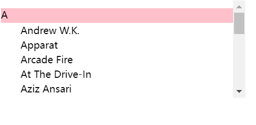
点击查看完整源代码
<style>
  .box {
    width: 500px;
    height: 300px;
    /* y轴方向溢出指定高度出现滚动条 */
    overflow-y: scroll;
  }
  dl dt {
    font-size: 20px;
    height: 30px;
    background-color: rgb(255, 192, 203);
    /* 粘性定位 */
    position: sticky;
    top: 0;
  }
  dl dd {
    line-height: 30px;
    font-size: 20px;
  }
</style>
<body>
  <div class="box">
    <dl>
      <dt>A</dt>
      <dd>Andrew W.K.</dd>
      <dd>Apparat</dd>
      <dd>Arcade Fire</dd>
      <dd>At The Drive-In</dd>
      <dd>Aziz Ansari</dd>
    </dl>
    <dl>
      <dt>C</dt>
      <dd>Chromeo</dd>
      <dd>Common</dd>
      <dd>Converge</dd>
      <dd>Crystal Castles</dd>
      <dd>Cursive</dd>
    </dl>
    <dl>
      <dt>E</dt>
      <dd>Explosions In The Sky</dd>
    </dl>
    <dl>
      <dt>T</dt>
      <dd>Ted Leo & The Pharmacists</dd>
      <dd>T-Pain</dd>
      <dd>Thrice</dd>
      <dd>TV On The Radio</dd>
      <dd>Two Gallants</dd>
    </dl>
  </div>
</body>
# 3、表格首行冻结(粘性定位实现)
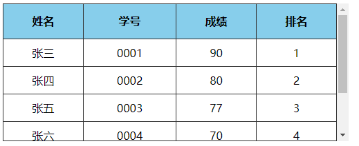
点击查看完整源代码
.box {
  width: 500px;
  height: 200px;
  /* y轴方向溢出,显示滚动条 */
  overflow-y: scroll;
}
table {
  width: 100%;
  /* 合并单元格边框线 */
  border-collapse: collapse;
}
table tr td,
table tr th {
  border: 1px solid #333;
}
table tr th {
  background-color: skyblue;
  height: 50px;
  /* 表格首行冻结 */
  position: sticky;
  top: 0;
  border-top: none;
}
table tr td {
  font-size: 16px;
  text-align: center;
  height: 40px;
}

/* 绘制表格最顶部的那一条线 */
.box::before {
  display: block;
  content: "";
  height: 1px;
  background-color: #333;
  position: sticky;
  top: 0px;
  left: 0;
  right: 0;
  z-index: 2; /* */
}
/* 绘制表格最底部的那一条线 */
.box::after {
  display: block;
  content: "";
  height: 1px;
  background-color: #333;
  position: sticky; /* 粘性定位 */
  bottom: 0px; /* 底部距离0 */
  left: 0;
  right: 0;
  z-index: 2;
}
/* 去掉最后一行表格的底边框线 */
table tr:last-child td {
  border-bottom-color: transparent;
}
<div class="box">
  <table>
    <tr>
      <th>姓名</th>
      <th>学号</th>
      <th>成绩</th>
      <th>排名</th>
    </tr>
    <tr>
      <td>张三</td>
      <td>0001</td>
      <td>90</td>
      <td>1</td>
    </tr>
    <tr>
      <td>张四</td>
      <td>0002</td>
      <td>80</td>
      <td>2</td>
    </tr>
    <tr>
      <td>张五</td>
      <td>0003</td>
      <td>77</td>
      <td>3</td>
    </tr>
    <tr>
      <td>张六</td>
      <td>0004</td>
      <td>70</td>
      <td>4</td>
    </tr>

    <tr>
      <td>张七</td>
      <td>0005</td>
      <td>67</td>
      <td>5</td>
    </tr>
    <tr>
      <td>张八</td>
      <td>0006</td>
      <td>65</td>
      <td>6</td>
    </tr>
  </table>
</div>
思考题
用粘性定位实现表格首列冻结的效果如何实现 ?
# 4、表格首列冻结(绝对定位实现)
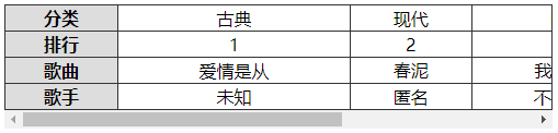
注:
表格首行、首列冻结,除了用前面学过的粘性定位实现,还可以用下面的方式来实现。
实现原理:
- 制作一个一模一样的表格首列副本,然后利用定位覆盖在当前表格首列上面
- 制作一个与表格高度一样大小的竖线,定位在表格的最右边,作为表格的右边框
点击查看完整源代码
<div class="container">
  <div class="scroll">
    <table class="music">
      <!-- 内容表格 -->
      <tr>
        <td class="header">分类</td>
        <td>古典</td>
        <td>现代</td>
        <td>DJ</td>
        <td>古筝</td>
      </tr>
      <tr>
        <td class="header">排名</td>
        <td>1</td>
        <td>2</td>
        <td>3</td>
        <td>4</td>
      </tr>
      <tr>
        <td class="header">歌曲</td>
        <td>爱情是从</td>
        <td>春泥</td>
        <td>我是DJ</td>
        <td>高山流水</td>
      </tr>
      <tr>
        <td class="header">歌手</td>
        <td>未知</td>
        <td>匿名</td>
        <td>不知道</td>
        <td>哈哈</td>
      </tr>
    </table>
  </div>
  <table class="header">
    <!--冻结列的布局-->
    <tr>
      <td>分类</td>
    </tr>
    <tr>
      <td>排行</td>
    </tr>
    <tr>
      <td>歌曲</td>
    </tr>
    <tr>
      <td>歌手</td>
    </tr>
  </table>
</div>
css 样式
.container {
  width: 500px;
  position: relative; /*相对定位*/
}
.scroll {
  width: 100%;
  overflow-x: scroll;
}
/* 制作表格右边框线 */
.container::after {
  content: "";
  display: block;
  width: 1px;
  position: absolute;
  left: 499px;
  top: 0px;
  bottom: 18px;
  background-color: #333;
}
.container table {
  border-collapse: collapse; /*合并单元格边框线*/
}
.container table.music {
  width: 800px;
}
/* 第一列宽 */
.container table tr td.header {
  width: 100px;
}
.container table tr td,
table tr th {
  border: 1px solid #333;
  text-align: center;
  font-weight: 400;
}
/*冻结列相对于最外面container绝对定位*/
table.header {
  position: absolute;
  left: 0px;
  top: 0px;
}
/*冻结列样式*/
table.header tr td {
  background-color: #ddd;
  font-weight: bold;
  width: 100px;
}
# 5、表格首行冻结(绝对定位实现)
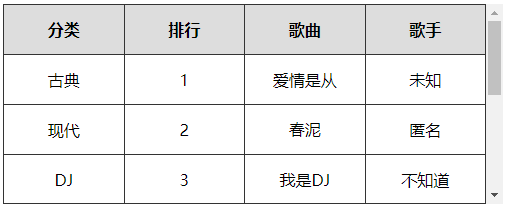
实现原理
- 制作一个一模一样的表格首行副本,然后利用定位覆盖在当前表格首行上面
- 制作一个与表格高度一样大小的横线,定位在表格的最上边,作为表格的上边框
点击查看完整源代码
<div class="container">
  <div class="scroll">
    <!-- 表格 -->
    <table class="music">
      <tr>
        <th>分类</th>
        <th>排行</th>
        <th>歌曲</th>
        <th>歌手</th>
      </tr>
      <tr>
        <td>古典</td>
        <td>1</td>
        <td>爱情是从</td>
        <td>未知</td>
      </tr>
      <!-- 省略更多行数据 -->
    </table>
    <!--冻结行的布局-->
    <div class="row">
      <table>
        <tr>
          <th>分类</th>
          <th>排行</th>
          <th>歌曲</th>
          <th>歌手</th>
        </tr>
      </table>
    </div>
  </div>
</div>
css 样式
.container {
  position: relative; /*相对定位*/
  width: 800px;
}
.scroll {
  overflow-y: scroll; /*x轴超出部分显示滚动条*/
  height: 200px;
}
/* 制作表格下边框线 */
.container::before {
  content: "";
  display: block;
  height: 1px;
  background-color: #333;
  position: absolute;
  bottom: 0px;
  left: 0px;
  right: 17px;
}
.container table {
  width: 100%;
  border-collapse: collapse; /*合并单元格边框线*/
}
.container table tr td,
table tr th {
  border: 1px solid #333;
  text-align: center;
  font-weight: 400;
  height: 50px;
  width: 25%;
}
/* 冻结行样式 */
.row {
  position: absolute;
  left: 0px;
  right: 17px;
  top: 0px;
}
.row table tr th {
  background-color: #ddd;
  font-weight: bold;
  width: 25%;
}
# 九、定位的总结
| 定位类型 | 描述 | 应用场景 |
|---|---|---|
| 相对定位 relative | 相对自身原来的位置定位,占着原来的位置 | 微调元素的位置,但还占据原来空间 只想提元升素的层级,但还是占原来的空间 |
| 绝对定位 absolute | 相对离自己最近的定位的父元素定位,原来的位置被释放,相当于悬浮在页面中,会覆盖在其它元素的上面显示 | 一个元素想覆盖在另一个元素上面 配合 JS 来实现动画效果 |
| 固定定位 fixed | 相对浏览器窗口进行定位 | 你想让一个元素相对浏览器的位置一直不动 |
| 粘性定位 sticky | 相对离自己最近的拥有滚动机制的父元素定位 | 导航吸附效,表格首行冻结效果 |
# 十、z-index 设置定位元素层叠顺序
TIP
定位的元素脱离了正常文档流,他相当于漂浮在文档上面。那如果有很多个元素都用了定位,那如何确定这些元素的层叠顺序呢?
z-index就是用来指定 定位元素 的堆叠顺序。
同一层叠上下文中 z-index值的特性
默认情况下,所有没有包含在定位元素中的 html 元素,都在 html 根层叠上下文中
- z-index 的默认值是
auto - z-index 值可以是正,也可以是负
- z-index 值越大,元素越在上面显示
- z-index 值相同的元素,写在后面的会覆盖前面的
- z-index 只针对定位元素有效,对其它元素效
关于什么是层叠上下文,你暂时不需要了解,接下来后面就会讲到。在这里你只要简单的理解 在同一层叠上下文中
z-index可以用来控制定位元素的堆叠顺序
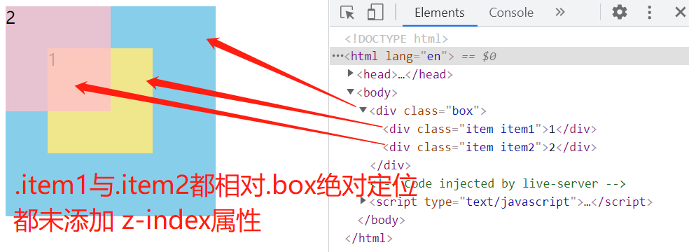
# 1、z-index 值相同时,写在后面的覆盖在前面的上面
以下案例中的
.item1与.item2都未设置z-index值时,默认都为auto,写在后面的会覆盖在前面的上面- 所以
.item2会显示在.item1的上面。
点击查看完整源代码
<style>
  .box {
    width: 200px;
    height: 200px;
    background-color: skyblue;
    position: relative;
  }
  .item {
    width: 100px;
    height: 100px;
    position: absolute;
  }
  /*
    .item1与.item2都是相对于.box绝对定位
    .item1与.item2在都未设置z-index时,默认值都 auto ,
    写在后面会覆盖在前面的上面
  */
  .item1 {
    background-color: khaki;
    left: 40px;
    top: 40px;
  }
  .item2 {
    background-color: rgb(255, 192, 203, 0.8);
    top: 0;
    left: 0;
  }
</style>
<body>
  <div class="box">
    <div class="item item1">1</div>
    <div class="item item2">2</div>
  </div>
</body>
渲染效果:
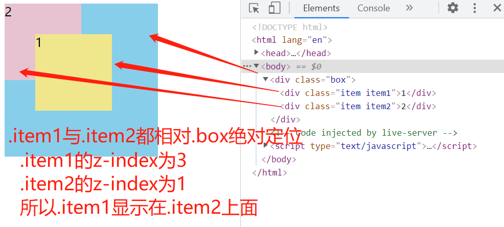
# 2、z-index 的值越大,越在最上面显示
TIP
下面案例中
.item1的 z-index 为 3,.item2的 z-index 为 1,z-index 值越大,越在最上面显示- 所以
.item1显示在.item2的上面。
点击查看完整源代码
<style>
  .box {
    width: 200px;
    height: 200px;
    background-color: skyblue;
    position: relative;
  }
  .item {
    width: 100px;
    height: 100px;
    position: absolute;
  }
  /*
          .item1与.item2都是相对于.box绝对定位
          .item1的z-index为3
          .item2的z-index为1
          3>1,所以.item1会显示在item2的上面
      */
  .item1 {
    background-color: khaki;
    left: 40px;
    top: 40px;
    z-index: 3;
  }
  .item2 {
    background-color: rgb(255, 192, 203, 0.8);
    top: 0;
    left: 0;
    z-index: 1;
  }
</style>
<body>
  <div class="box">
    <div class="item item1">1</div>
    <div class="item item2">2</div>
  </div>
</body>
渲染效果:
# 3、z-index 值为负数
TIP
z-index 值为负数,会显示在当前层叠上下文中所有元素的最下面。因此这种方式也可以用来隐藏一个元素
点击查看完整源代码
.box {
  width: 200px;
  height: 200px;
  background-color: rgb(135, 208, 236, 0.5);
  position: relative;
}
.item {
  width: 100px;
  height: 100px;
  position: absolute;
}
/*
    .item1与.item2都是相对于.box绝对定位
    .item1的z-index为-1
    .item2的z-index为-2
    -1>-2,所以.item1会显示在item2的上面
    但因为z-index是负值,所以会显示在 box盒子的下面
*/
.item1 {
  background-color: khaki;
  left: 150px;
  top: 150px;
  z-index: -1;
}
.item2 {
  background-color: rgb(255, 192, 203, 0.8);
  top: 160px;
  left: 100px;
  z-index: -2;
}
<div class="box">
  box
  <div class="item item1">1</div>
  <div class="item item2">2</div>
</div>
渲染效果:

# 十一、CSS 中的层叠上下文
TIP
深入浅出 CSS 中的层叠上下文
# 1、什么是“层叠上下文”
TIP
层叠上下文(stacking context),是 HTML 中一个三维的概念。
- 在 css2.1 规范中有明确强调,每个 css 盒模型都是处在一个三维空间里面,他们分别处在平面的 X 轴 ,Y 轴 以及表示层叠的 Z 轴 。
- 如下图所示的三个盒子,他们分别在处在 X 轴 和 Y 轴 ,同时在 Z 轴 上发生层叠。
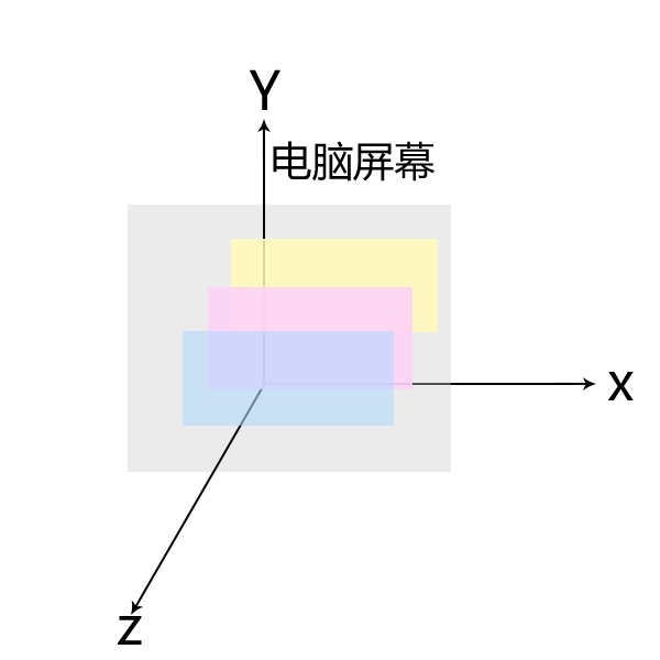
但
- 我们都知道,默认情况下,HTML 元素在页面是沿 X 轴 和 Y 轴 平铺。所以并不是所有的盒子都会在Z 轴发生层叠。
- 如下图所示:元素默认从上往下,从左往右依次排列。所以我们察觉不到它们在 Z 轴 上的层叠关系。
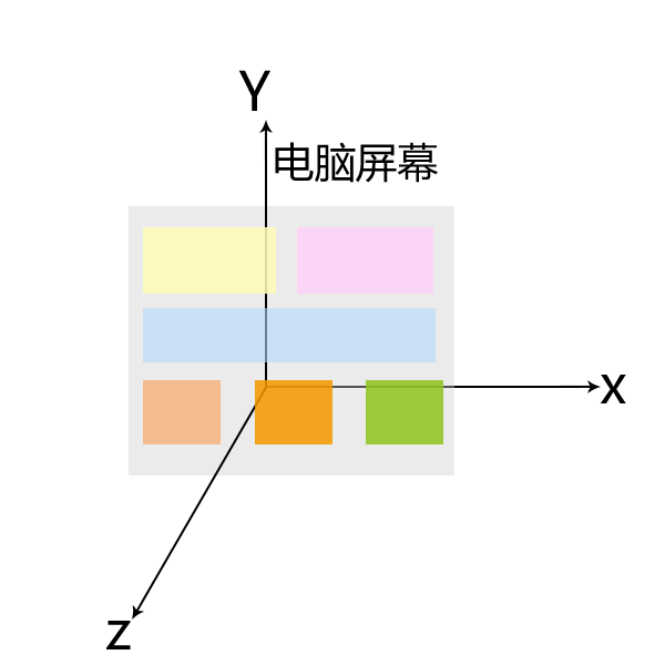
TIP
而一旦元素发生堆叠,我们就会感受到一个元素覆盖了另一个元素,这时我们就能感受到Z 轴的存在。但是实事上,不管元素发不发生重叠,Z 轴都存在。
- 理解了上面内容之后,那我们回过头来理解下,到底什么是层叠上下文?
- 你可以把层叠上下文理解为 HTML 元素的一个属性,一但 HTML 元素拥有了这个属性,我们可以理解为这个 HTML 元素在Z 轴上就“高人一等”,也就是在 Z 轴上会显示在更上一层,。
怎么个具象化法理解 ?
你可以把「层叠上下文」理解为当官:网页中有很多很多的元素,我们可以看成是真实世界的芸芸众生。真实世界里,我们大多数人是普通老百姓们,还有一部分人是做官的官员。OK,这里的“官员”就可以理解为网页中的层叠上下文元素。
- 换句话说,页面中的元素有了层叠上下文,就好比我们普通老百姓当了官,一旦当了官,相比普通老百姓而言,离皇帝更近了。
- 同理,当元素有了层叠上下文,就相当于他比网页中其它元素的级别更高了,在 Z 轴上的位置就就高了,离我们用户(屏幕)更近了,显示在更上一层。
# 2、层叠上下文的创建
TIP
层叠上下文也基本上是有一些特定的 CSS 属性创建的。
怎么个具象化法理解 ?
你可以把这些特定的 CSS 属性,比喻成古代官员的玉佩。如何判定你是当官,那就看你有没有对应的玉佩,拥有不同类型的玉佩,就表明你是此类官员,你就比普通老百姓高人一等
层叠上下文,主要由以下 3 种
- html 根元素:页面根元素天生具有层叠上下文,称之为“根层叠上下文”。
- 定位元素的传统层叠上下文(z-index 值为数值时才会创建层叠上下文,z-index:auto 不会创建层叠上下文)。
- 其他一些 CSS3 属性,可以创建层叠上下文
# 2.1、根层叠上下文
TIP
指的是页面根元素,也就是页面滚动条的默认的始作俑者<html>元素。
- 这就是为什么,绝对定位元素在
left/top等值定位的时候,如果没有其他定位元素限制,会相对浏览器窗口或 body 定位的原因。 - 我们写在 body 中的 HTML 标签,默认的就是处在 HTMl 这个根层叠上下文中,在这个层叠上下文中各元素在Z 轴上有着自己的排列顺序,具体如何排列,后面层叠顺序会讲到。
# 2.2、定位元素的传统层叠上下文
TIP
对于包含有
position:relative/position:absolute的定位元素,当其z-index值不是auto的时候,会创建层叠上下文。position值为fixed(固定定位)或sticky(粘滞定位)的元素温馨提示
当我们给元素添加定位 和
z-index时,元素就会显示在其它元素的上面,本质就是因为他拥有了自己的层叠上下文,在 Z 轴上要比其它未拥有层叠上下文的元素更高一等。
# 2.3、CSS3 与新时代的层叠上下文
TIP
当元素添加以下 CSS3 属性时,元素会创建自己的层叠上下文
如下:
z-index值不为auto的flex项(父元素display:flex|inline-flex)- 元素的
opacity值不是1 - 元素的
transform值不是none - 元素
mix-blend-mode值不是normal - 元素的
filter值不是none - 元素的
isolation值是isolate will-change指定的属性值为上面任意一个- 元素的
-webkit-overflow-scrolling设为touch
# 3、什么是层叠顺序
我们都知道
除了定位的元素会覆盖在其它元素的上面之外,还有很多情况下元素会发生重叠,那发生重叠时元素是以什么样的顺序来重叠的呢?这就是我们接下来要讲的元素的层叠顺序。
- “层叠顺序”英文称作”stacking order”,表示元素发生层叠时候有着特定的垂直显示顺序。
- 我们页面中的元素有: 块级元素,行内元素,行内块元素,浮动元素,定位元素,还有后面学到的一些 CSS3 属性,当元素添加相关属性后,元素的层级也会发生改变。
以下图只列出了目前学到的相关元素,在同一层叠上下文中的层叠顺序。
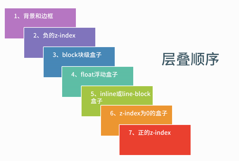
同一层叠上下文,元素的层叠顺序,参考上图,由上到下分别
- 背景和边框:建立当前层叠上下文元素的背景和边框。
- 负的 z-index:当前层叠上下文中,z-index 属性值为负的元素。
- 块级盒:文档流内非行内级非定位后代元素。
- 浮动盒:非定位浮动元素。
- 行内盒:文档流内行内级非定位后代元素。
z-index:0;层叠级数为 0 的定位元素。- 正
z-index:z-index属性值为正的定位元素。
# 3.1、案例 1:当元素都处在 html 层叠上下文中时
点击查看完整源代码
<style>

    html{
        background-color: #ddd;
    }
    body {
        margin: 0;
    }
    .container {
        width: 400px;
        height: 600px;
        background-color: rgba(0,0,0,.5);
        margin: 50px;
        position: relative; /* 相对定位 */
        /* z-index: auto;  不会创建自己的层叠上下文 */
        /* z-index:0; 会创建自己的层叠上下文 */
    }
    .box {
        width: 300px;
        height: 100px;
    }
    .box1 {
        background-color: orchid;
        position: absolute;
        z-index: -1;
        top: -20px;
        left: -20px;
    }
    .box2 {
        background-color: aquamarine;
        margin-left: 20px;
    }
    .box3 {
        background-color: pink;
        float: left;
        margin-top: -50px;
        margin-left: 30px;
    }
    .box4 {
        background-color: khaki;
        display: inline-block;
        margin-left: 50px;
        margin-top: -50px;
    }
    .box5 {
        background-color: orange;
        position: absolute;
        left: 110px;
        top: 180px;
        z-index: 0;
    }
    .box6 {
        background-color: rgb(225, 55, 197);
        position: absolute;
        left: 90px;
        top: 260px;
        z-index: 1;
    }
</style>
</head>
<body>
    <div class="container">
        <!-- 定位 z-index:-1 -->
        <div class="box box1">定位 z-index:-1</div>
        <!-- 块级元素 -->
        <div class="box box2">block块元素</div>
        <!-- 浮动元素 -->
        <div class="box box3">float浮动元素</div>
        <!-- 行内块级元素 -->
        <div class="box box4">行内块级元素</div>
        <!-- 定位元素 z-index:0 -->
        <div class="box box5">定位元素 z-index:0</div>
        <!-- 定位元素 z-index:1 -->
        <div class="box box6">定位元素 z-index:1</div>
    </div>
</body>
以上代码中的所有元素都处在 html 根层叠上下文中
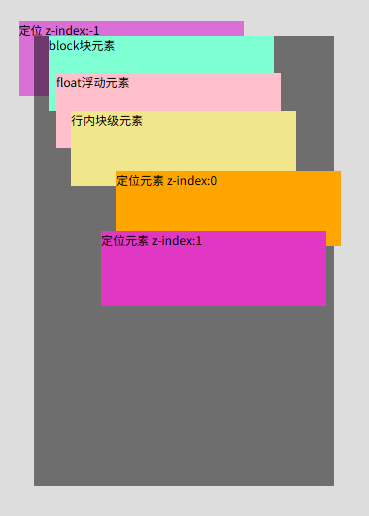
你可以修改上面的代码,在 .container 选择器中的添加 z-index:0 。此时,.container 元素会创建自己的层叠上下文,最终所有.container 中的子元素都在 .container 元素所创建的层叠上下文中。
.container {
  /* 省略部分代码,具体见前面 */
  /* z-index: auto;   默认值 不会创建自己的层叠上下文 */
  z-index: 0; /* 会创建自己的层叠上下文 */
}
最终显示效果如下
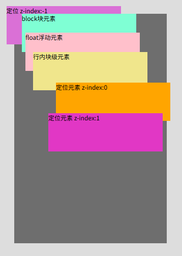
重点提示:
- 如果元素的等级一样,则写在后面的会覆盖在前面的上面。
- 如块级和块级,浮动和浮动,行内块与行内块,定位与定位元素,发生重叠时,默认的写在后面的会在最上面显示
# 3.2、案例 2:当元素处在定位元素的层叠上下文中
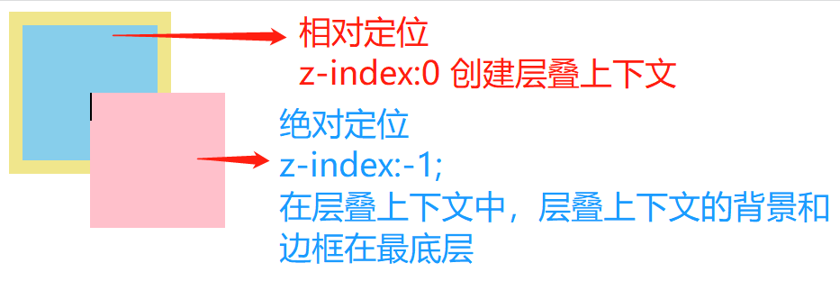
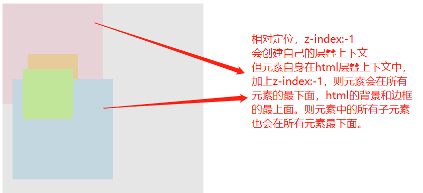
TIP
- 当相对定位元素处在 html 层叠上下文中,设置
z-index:-1时,元素会在所有元素的下面显示。 - 当相对定位元素处在定位元素(
z-index>=0)的层叠上下文中,设置z-index-1;时,元素会在当前层叠上下文元素中所有元素的最下面。
点击查看完整源代码
<style>
  .box,
  .item {
    width: 100px;
    height: 100px;
  }
  /*box为创建层叠上下文元素*/
  .box {
    background-color: skyblue;
    border: 10px solid khaki;
    position: relative;
    z-index: 0; /*创建层叠上下文-关键代码*/
    /* z-index: auto; 不会创建自己的层叠上下文 */
  }
  .item {
    background-color: pink;
    position: relative;
    top: 50px;
    left: 50px;
    /*元素的层级*/
    z-index: -1;
  }
</style>
<body>
  <div class="box">
    <div class="item"></div>
  </div>
</body>
| .box 添加 z-index:0; 创建层叠上下文 | .box 未添加 z-index 属性 |
|---|---|
 |  |
# 3.3、案例 3:不同层叠上下文中的子元素层叠顺序
TIP
如下图的 B 和 C 都创建了自己的层叠上下文,那 B 中的子元素和 C 中的子元素的层叠顺序是怎么样的?
- 如果 C 在 B 的上面,那 C 中所有子元素都会在 B 的子元素上面显示
- 如果 C 在 B 的下面,那 C 中所有子元素都会在 B 的子元素下面显示
怎么个具象化法理解 ?
- 就好比 B 的官位高于 C,则 B 家里的所有人(包括丫鬟、门卫) 都要比 C 家中所有的人高人一等。下人的等级本质是由他们所在的官家的等级决定的。
点击查看完整源代码
<style>
  .container {
    width: 400px;
    height: 500px;
    background-color: rgb(221, 219, 219, 0.7);
  }
  .box {
    width: 200px;
    height: 200px;
    position: relative;
    z-index: 0;
    /* 如果z-index为-1,他处在html层叠上下文中,其会显示在当前上下文的块级元素的下面显示 */
    /* z-index: -1;*/
  }
  .box1 {
    background-color: pink;
    /*
            当z-index值为2时,box1在.box2上面
            其box1的子元素永远在box2上面
        */
    /* z-index: 2; */
  }
  .box2 {
    background-color: skyblue;
    top: -50px;
    left: 20px;
  }
  .item {
    width: 100px;
    height: 100px;
    position: absolute;
  }
  .item1 {
    background-color: orange;
    top: 100px;
    left: 50px;
    z-index: 22;
  }
  .item2 {
    background-color: chartreuse;
    top: -20px;
    left: 20px;
    z-index: 2;
  }
</style>
<body>
  <div class="container">
    <div class="box box1">
      <div class="item item1"></div>
    </div>
    <div class="box box2">
      <div class="item item2"></div>
    </div>
  </div>
</body>
.box 加 z-index:0;创建自己的层叠上下文,效果如下
.box 未添加 z-index 属性,未创建自己的层叠上下文,效果如下:
如果.box 的 z-index 的值为-1,则.box 中的所有内容都会在灰色块下面显示
# 4、何确定两个元素的的层叠顺序
TIP
- 在比较两个元素的层叠顺序时,会先比较他们所在的层叠上下文的层叠顺序
- 如果他们所在的是同一层叠上下文,则按同一层叠上下文中的元素排列顺序来计算。
- 如果不在同一层叠上下文中,则他们所在层叠上下文的顺序决定了他们的顺序及其后代元素的层叠上下文顺序。
- 即 A 层叠上下文要高于 B 叠上下文,则 A 中的所有子孙元素都会高于 B 中的所有子孙元素。B 中子孙元素的
z-index再大也没有办法在层级上高于 A 元素中子元素。,因为z-index只能控制同一层叠上下文中的元素堆叠关系。
- 即 A 层叠上下文要高于 B 叠上下文,则 A 中的所有子孙元素都会高于 B 中的所有子孙元素。B 中子孙元素的
# 5、总结:层叠上下文
TIP
- 什么是层叠上下文
- 层叠上下文理解为 HTML 元素的一个属性,一但 HTML 元素拥有了这个属性,我们可以理解为这个 HTML 元素在Z 轴上就“高人一等”,也就是在 Z 轴上会显示在更上一层,。
- 如何创建层叠上下文
- html 根层叠上下文 (默认的,不需要创建)
- 定位元素的传统层叠上下文(如何创建,见前面)
- css3 与新时代的层叠上下文(如何创建,见前面)
- 同一层叠上下文中,元素的层叠顺序
z-index可以调节同一层叠上下文中 定位元素的层叠顺序- 如何确定两个元素的层叠顺序
# 十二、iconfont 阿里矢量图标库
TIP
iconfont 是国内功能很强大且图标内容很丰富的矢量图标库,提供矢量图标下载、在线存储、格式转换等功能。
阿里巴巴体验团队倾力打造,设计和前端开发的便捷工具。
# 1、官网
TIP
iconfont 阿里矢量图标库官网地址:https://www.iconfont.cn (opens new window)
# 2、搜索对应图标
TIP
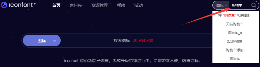
在首页搜索框,搜索对应的图标名,比如"购物车",然后回车,就会显示我们想要的小图标
# 3、下载小图标直接使用
TIP
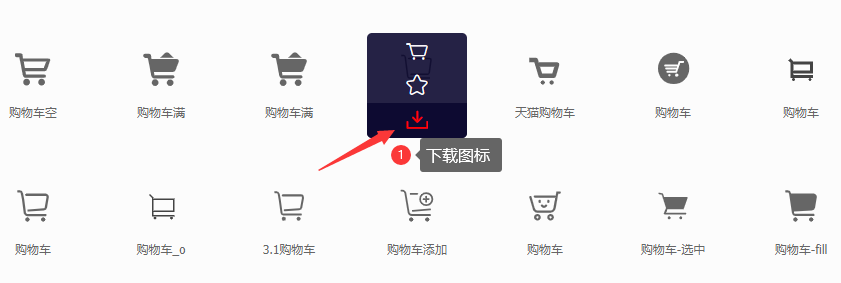
在下图中,我们可以选择自己喜欢的小图标,点击下面的下载按扭,进行下载使用
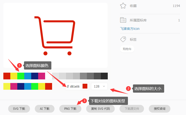
点击下载后,就会弹出如下界面,我们可以在界面中调剌图标的颜色、大小,然后选择下载的图标类型
图片下载后,我们就可以使用了。
企业最佳实践
在实际的项目开发中,我们并不会一张一张的去下载图片应用,而是会把项目中需要用到的图标先统一加入到购物车,然后再添加到项目中,下载对应的项目代码来使用。
这样我们就可以通过 CSS 代码来控制图标的大小,颜色等。
# 4、iconfont 在实际开发中的应用
TIP
在搜索框中,搜索 “购物车”,然后回车,进入到下面这个页面,在这个页面中,我们把图标加入到购物车
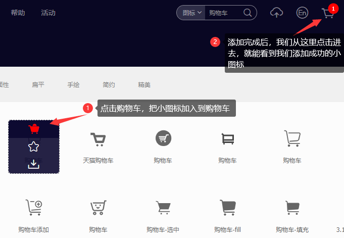
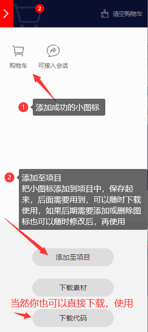

- 点击上面的确定按扭,就会跳转到以下页面,可以下载对应项目中的图标使用
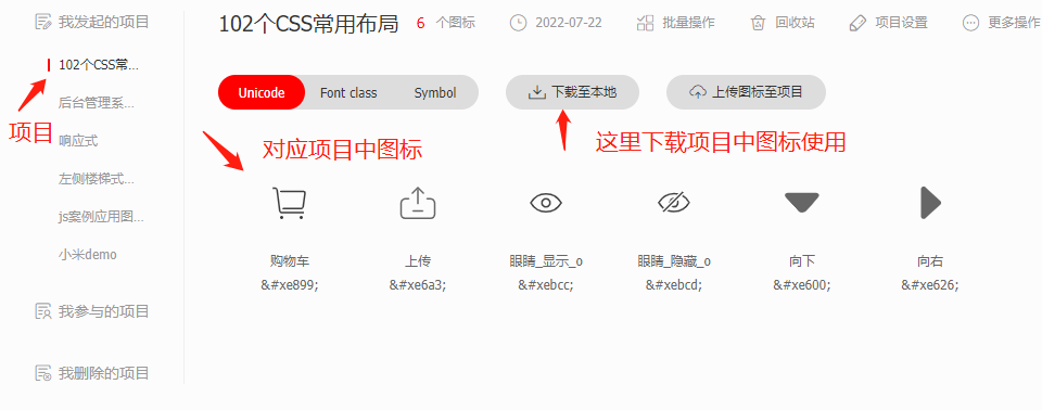
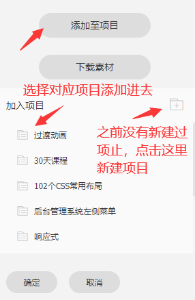
- 项目文件下载到本地后,把以下文件内容放在一个新建的
iconfont文件夹中,然后把iconfont文件放项目根目录下
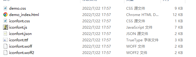
- 关于如何使用阿里图标,双击下面的网页文件,里面提供了三种使用方法
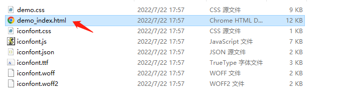
- 第二种方式使用的最多,具体使用方式,参考以下教程步骤
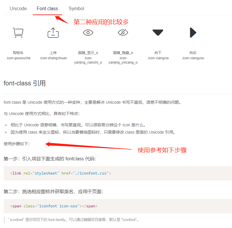
在使用时,要特别注意
iconfont.css文件在我们项目中的引用地址。
# 5、二维码生成网站-草料网
TIP
当我们希望他人通过扫描二维码进到我们网站时,我们可以把网站的网址生成对应的二维码,这样他人在扫描二维码时,就可以进入到我们的网站。
接下来给大家分享的 草料网,他可以帮我们实现把网址生成对应二维码。
使用教程
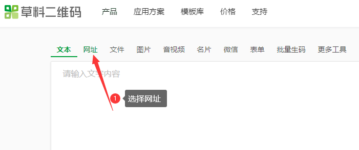
①、进到草料网首页,选择网址
②、选择网址跳转活码,在输入框中输入对应的网址,然后点击生成跳转活码,就会出现步骤 3 中的效果
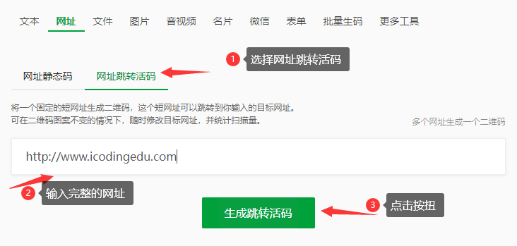
③、如果想要美化下二维码图片,可以上传 logo 和做相关样式美化,最后下载图片就可以用了
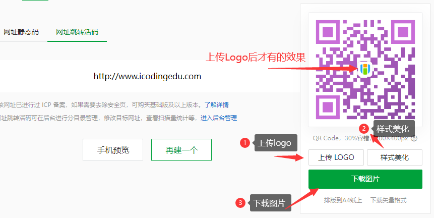
④、大家可以拿 出 手机微信扫一下这个二维码,就可以跳转到我们艾编程的官网了。
更多功能,大家可以自己去这个平台研究。
# 十三、综合实践
TIP
深入浅出理解定位的层叠顺序,通过一个综合案例来加深理解。
# 1、流光按扭
利用相对定位,调整文字的层级。
点击查看完整源代码
<style>
  body {
    background-color: #000;
  }

  a.button {
    display: block;
    width: 160px;
    height: 50px;
    background-color: #333;
    text-align: center;
    line-height: 50px;
    text-decoration: none;
    color: #666;
    font-weight: bold;
    border-radius: 5px;
    overflow: hidden;
    position: relative; /* 相对定位 */
  }
  a.button:hover {
    color: yellow;
  }
  a.button::before {
    content: "";
    display: block;
    width: 300px;
    height: 300px;
    background-image: radial-gradient(yellow, transparent 40%);
    position: absolute;
    /* left: 0px;
        top: 0px; */
    left: var(
      --left
    ); /* 使用自定义属性 --left 来控制彩色毛毛球的位置(水平方向)*/
    top: var(
      --top
    ); /* 使用自定义属性 --top 来控制彩色毛毛球的位置(垂直方向)*/
    margin-left: -150px;
    margin-top: -150px;
    display: none;
  }
  a.button:hover::before {
    display: block; /* 鼠标移入时显示彩色毛毛球 */
  }

  a.button::after {
    content: "";
    display: block;
    position: absolute; /* 绝对定位 */
    left: 2px;
    right: 2px;
    top: 2px;
    bottom: 2px;
    background-color: #333;
    border-radius: 5px;
  }
  .m-center {
    margin: 50px auto;
  }
  a.button span {
    position: relative; /* 相对定位 */
    z-index: 1; /* z-index: 1; 提高层级,确保文字在最上层显示 */
  }
</style>

<a href="#" class="button m-center">
  <span>加入购物车</span>
</a>
如果要实现 JS 动画效果,则添加以下 JS 和修改以下 CSS
<script>
  // 获取所有按扭
  const button = document.querySelector("a.button");
  // 遍历按扭,给每个按扭添加鼠标移入事件监听器

  button.onmousemove = function (e) {
    const pageX = e.pageX; // 获取鼠标与浏览器左边距离
    const pageY = e.pageY; // 获取鼠标与浏览器顶部距离
    const left = this.offsetLeft; // 获取按扭距离浏览器左边距离
    const top = this.offsetTop; // 获取按扭距离浏览器左边距离

    // 计算得到 鼠标相对于按扭左边和上边距离
    const x = pageX - left;
    const y = pageY - top;

    // 给伪元素设置自定义属性 --left 和 --top,用来控制彩色毛毛球的位置
    this.style.setProperty("--left", x + "px");
    this.style.setProperty("--top", y + "px");

    // 注意这一步,要将  button::before css 选择器的 中的 top 和 left 修改为
    // top:var(--top);  left:var(--left);
  };
</script>
将 毛毛球的 css 修改成如下
a.button::before {
  /* 省略部分CSS - 具体见前面 */
  /* left: 0px;
    top: 0px; */
  /* 将 left 和 top 的值修改为以下方式 */
  left: var(--left); /* 引用 自定义属性值 */
  top: var(--top); /* 引用 自定义属性值 */
}
# 2、带悬停效果的导航


<style>
body,
ul {
margin: 0;
}
ul {
padding: 0;
list-style: none;
}
a {
text-decoration: none;
color: #000;
}
.nav {
height: 50px;
background-color: skyblue;
text-align: center;
margin-top: 50px;
}
.nav ul {
/* background-color: khaki; */
width: 1200px;
margin: 0 auto; /* 水平居中 */
height: inherit; /* 继承父元素值 */
}
.nav ul li {
float: left;
font-size: 16px;
height: inherit; /* 继承父元素值 */
}
.nav ul li a {
display: block;
padding: 0px 20px;
line-height: 50px;
position: relative; /* 添加相对定位 */
z-index: 0; /* 创建自己的层叠上下文 */
}
.nav ul li a::after {
content: "";
position: absolute; /* 相对a标签绝对定位*/
left: 0;
right: 0;
top: -5px;
bottom: -5px;
background-color: rgb(2, 139, 194);
display: none;
z-index: -1; /* 让滑块显示在文字下面 */
}
.nav ul li a:hover {
color: #fff;
}
.nav ul li a:hover::after {
display: block;
}
</style>
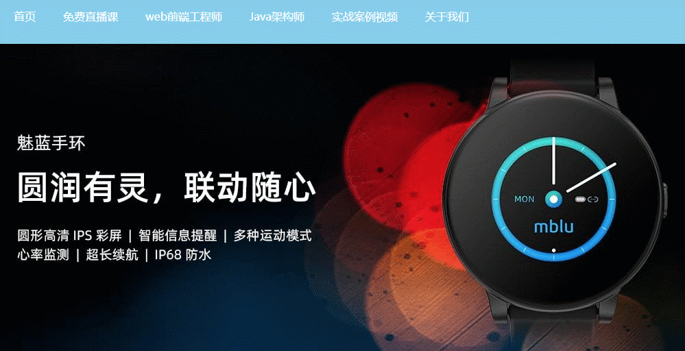
<body>
<div class="nav">
<ul>
<li><a href="#">首页</a></li>
<li><a href="#">免费直播课</a></li>
<li><a href="#">web前端工程师</a></li>
<li><a href="#">Java架构师</a></li>
<li><a href="#">实战案例视频</a></li>
<li><a href="#">关于我们</a></li>
</ul>
</div>
</body>
# 3、 弹性滑动导航
TIP
相对定位与绝对定位结合,同时需要配合 z-index 来调节滑块与文字的层级级关系

点击查看完整源代码
<style>
  body,
  ul {
    margin: 0;
  }
  ul {
    padding: 0;
    list-style: none;
  }
  a {
    text-decoration: none;
    color: #000;
  }
  .nav {
    height: 50px;
    background-color: skyblue;
    text-align: center;
    margin-top: 50px;
  }
  .nav ul {
    width: 1200px;
    margin: 0 auto;
    height: inherit;
    position: relative; /* 相对定位 */
    z-index: 0; /* 创建自己的层叠上下文 */
  }
  .nav ul li {
    float: left;
    font-size: 16px;
    height: inherit; /* 继承 */
  }
  .nav ul li a {
    display: block;
    padding: 0px 20px;
    line-height: 50px;
  }

  .nav ul li:first-child a {
    color: #fff;
  }
  .nav ul li:last-child {
    width: 72px;
    height: 60px;
    background-color: rgb(3, 135, 187);
    /*这个li用来做底部蓝色滑块,需要相对ul进行绝对定位*/
    position: absolute;
    left: 0px;
    top: -5px;
    z-index: -1;
    /* 添加过渡动画 */
    transition: left 0.3s, width 0.3s;
  }
  /* 这里的功能需要用js来实现,
    以下只是用css简单演示实现原理 */
  .nav ul li:hover ~ .move {
    width: 110px;
    left: 348px;
  }
</style>

<div class="nav">
  <ul>
    <li><a href="#">首页</a></li>
    <li><a href="#">免费直播课</a></li>
    <li><a href="#">web前端工程师</a></li>
    <li><a href="#">Java架构师</a></li>
    <li><a href="#">实战案例视频</a></li>
    <li><a href="#">关于我们</a></li>
    <!--这个li是用来做深蓝色的小滑块-->
    <li class="move"></li>
  </ul>
</div>
查看完整效果,可以添加下面的 js
<script>
  const move = document.querySelector(".move");
  const oUl = document.querySelector(".nav ul ");
  // 用来保存前一个鼠标移入的元素 (最开始为第一个li中的a )
  let prevA = document.querySelector(".nav ul li:first-child a");
  oUl.addEventListener("mouseover", function (e) {
    // 获取鼠标移入到的元素是否是 a
    const target = e.target;
    if (target.tagName.toLowerCase() !== "a") return;
    // 如果是a元素,则获取a元素的宽、高、与 ul左边的距离
    const width = target.offsetWidth;
    const height = target.offsetHeight;
    const left = target.offsetLeft;
    // 动态设置 move的宽度,高度和 left值
    move.style.width = width + "px";
    move.style.height = height + 10 + "px";
    move.style.left = left + "px";
    // 当前a标签文字颜色变为白色,其它的全还原
    if (prevA) {
      console.log(prevA);
      prevA.style.color = "#000";
    }
    move.style.display = "block";
    target.style.color = "#fff";
    prevA = target;
  });
</script>
提示
- 要实现以上完整的动画导航效果,需要用 JS 来实现,JS 部分代码此处省略。
- 以上代码只是用简单的 css3 动实现这个原理,并不完整。主要是让大家理解相对定位的应用场景。
# 4、二级下拉菜单 漂浮在 轮播图上
点击查看完整源代码
body,
ul,
li {
  margin: 0;
  padding: 0;
}
li {
  list-style: none;
}
a {
  text-decoration: none;
  color: #fff;
}
.menu {
  height: 80px;
  background-color: skyblue;
}
.menu-list {
  width: 1000px;
  margin: 0 auto;
}
.menu-list > li {
  float: left;
  position: relative;
  /* z-index: 1; 创建层叠上下文 */
}
.menu-list > li > a {
  display: block;
  padding: 0 20px;
  line-height: 80px;
  color: #fff;
}
.menu-list > li .submenu {
  display: none;
  position: absolute;
  left: 0;
  right: 0;
  top: 80px;
  z-index: 2;
}
.menu-list > li:hover {
  background-color: rgb(54, 172, 219);
}
.menu-list > li:hover .submenu {
  display: block;
}
.menu-list > li .submenu a {
  display: block;
  line-height: 50px;
  text-align: center;
  background-color: skyblue;
}
.menu-list > li .submenu a:hover {
  background-color: rgb(54, 172, 219);
}
.banner {
  width: 1000px;
  margin: 0 auto;
}
.banner-content {
  position: relative;
  /* z-index: 0; 创建层叠上下文 */
}
.banner-content img {
  width: 1000px;
  position: absolute;
  left: 0;
  top: 0;
  display: none;
}
.banner-content img:first-child {
  display: block;
}
<div class="menu">
  <ul class="menu-list">
    <li><a href="#">首页</a></li>
    <li><a href="#">免费直播课</a></li>
    <li>
      <a href="#">web前端工程师</a>
      <!-- 二级下拉菜单 -->
      <ul class="submenu">
        <li><a href="#">HTML5+CSS3</a></li>
        <li><a href="#">JavaScript</a></li>
        <li><a href="#">Vue3</a></li>
      </ul>
    </li>
    <li><a href="#">Java架构师</a></li>
    <li><a href="#">实战案例视频</a></li>
    <li><a href="#">关于我们</a></li>
  </ul>
</div>

<div class="banner">
  <div class="banner-content">
    <img src="images/xm1.jpg" />
    <img src="images/xm2.jpg" />
    <img src="images/xm3.jpg" />
    <img src="images/xm4.jpg" />
  </div>
</div>
# 十四、CSS 定位专项案例训练(作业)
TIP
根据课程进度完成以下针对性案例开发,开发过程要求:
具体开发流程
- 利用 PS 软件标记好切图 -> 导出至蓝湖(国内企业用的多)中
- 前端开发人员在蓝湖打开设计稿 ->下载网页开发所需的素材 -> 在蓝湖中量取尺寸 -> 即可开发静态页面
PSD 的源文件设计稿
- 以下案例对应的 PS 设计稿,已发布到钉钉群作业中。
- PS 与蓝湖结合标注、切图开发相关视频教程已上传至钉钉群
视频讲解
有任何疑问可以联系添加的助理老师(或博客右侧的晓冉老师)
我们把 CSS/CSS3 基础知识全部学习完之后,会有 4 大项目开发(PC 端,响应式,移动端)会按照企业真实团队协作的方式,用 4 个项目来完整的实践。
切记
学习阶段一定要按照以上的流程学习,提前熟悉工具和整个开发步骤,企业真实项目开发就是这样的流程
# 1、酷狗音乐精选歌单效果
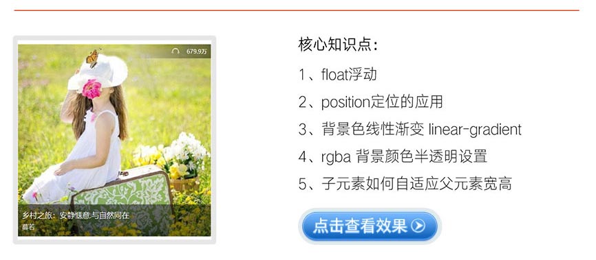
点击查看完整版视频讲解
# 2、小米商城右侧悬浮菜单
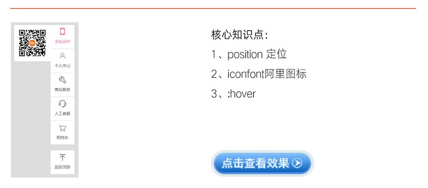
点击查看完整版视频讲解
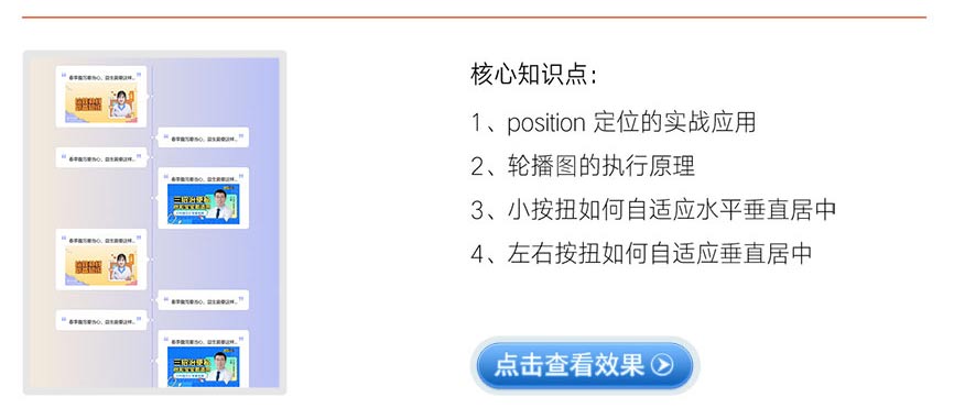
# 3、带左右按扭的自动轮播图效果布局
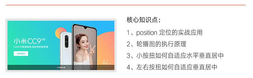
点击查看完整版视频讲解
# 4、CSS 实现二级导航下拉菜单
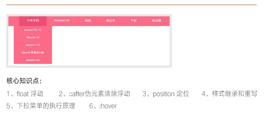
点击查看完整版视频讲解
# 5、CSS 时间轴效果布局
点击查看完整版视频讲解
大厂最新技术学习分享群

微信扫一扫进群,获取资料
X